Common font styles
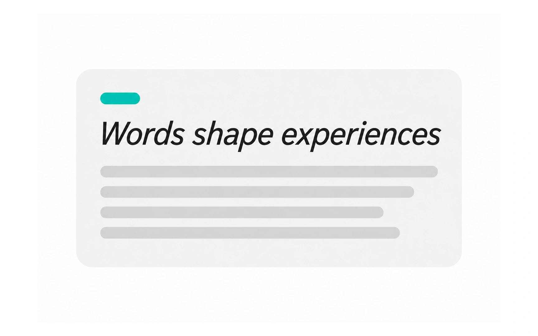

Regular is the everyday style of a typeface. It is the most comfortable for long reading, which makes it the default for body text.
Bold uses thicker strokes to add emphasis. It is the usual choice for headings, because it builds a clear hierarchy at a glance.
Italic slants the letters to the right. It suits light emphasis inside a sentence and titles of books or films, but an italic heading looks weaker than a bold one, as the comparison shows.

