Image Properties
Learn how images fit their frames, how many pixels they need on screen and in print, and how overlays and alt text keep them usable.
Placing an image is only the start. You also decide how it fits its frame, how many pixels it needs, and how it works with text and assistive technology. Get these right and images look sharp, load quickly and stay usable for everyone.
Image fill
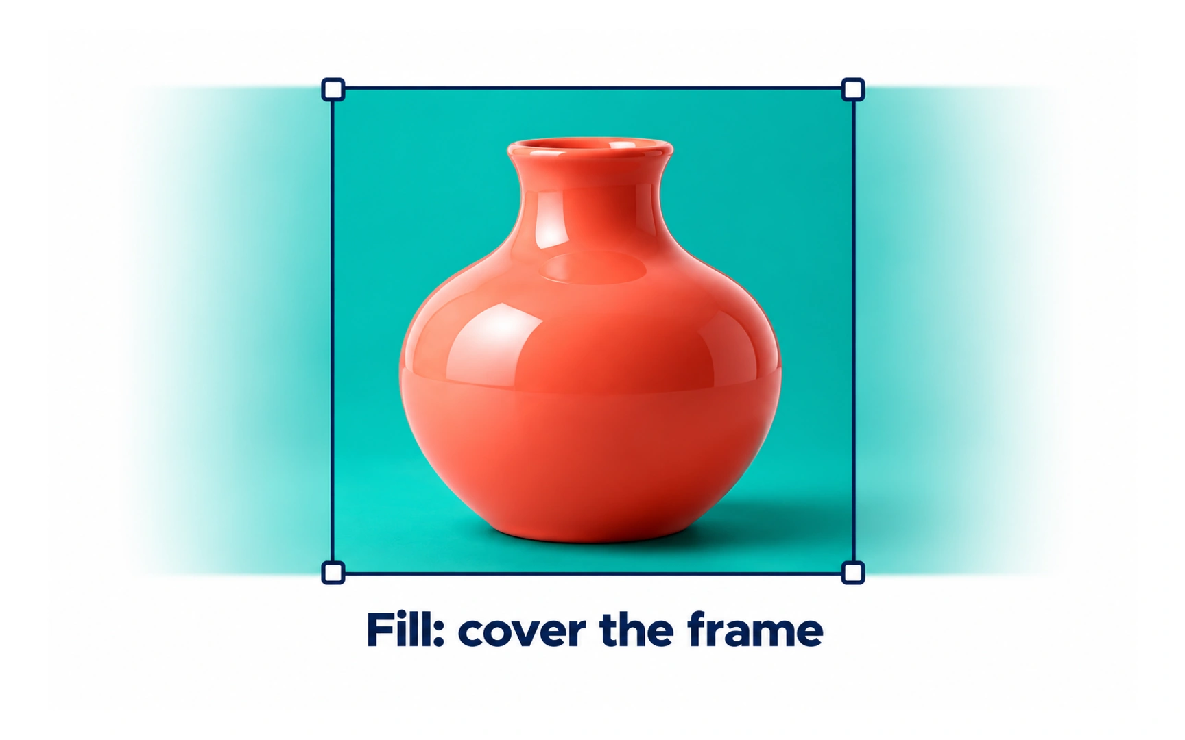
Fill scales an image until it covers the whole frame, keeping its proportions. In the example, the coral vase covers the frame completely, and the parts that do not fit are cropped away.
Use fill when every frame in a set should look the same, such as product cards or photo grids.
Because fill crops, keep the important part of the image near the center. Pro tip: most design tools let you move the image inside the frame to choose what stays visible.
Image fit
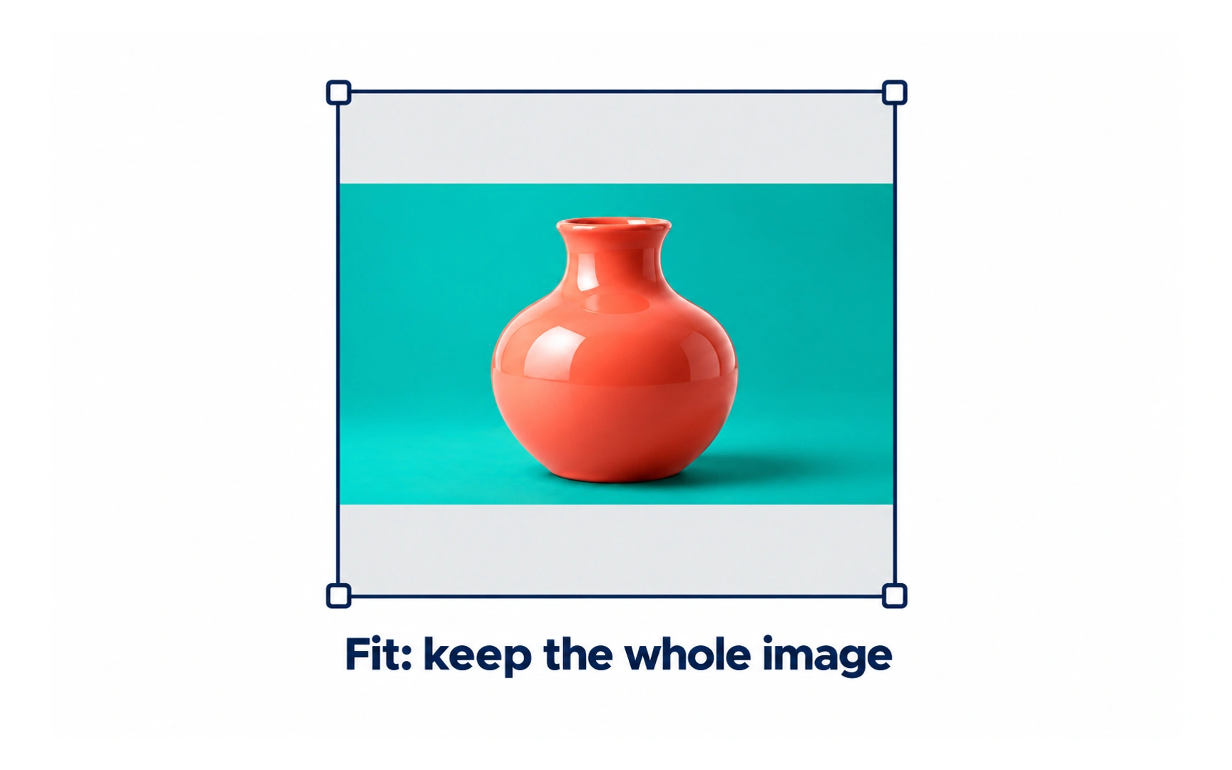
Fit scales an image until the whole picture is visible inside the frame, keeping its proportions. Nothing is cropped.
If the image and the frame have different shapes, empty bands appear, like the gray strips above and below the vase.
Use fit when every part of the image matters, such as a product photo, a diagram or a logo.
Image stretch
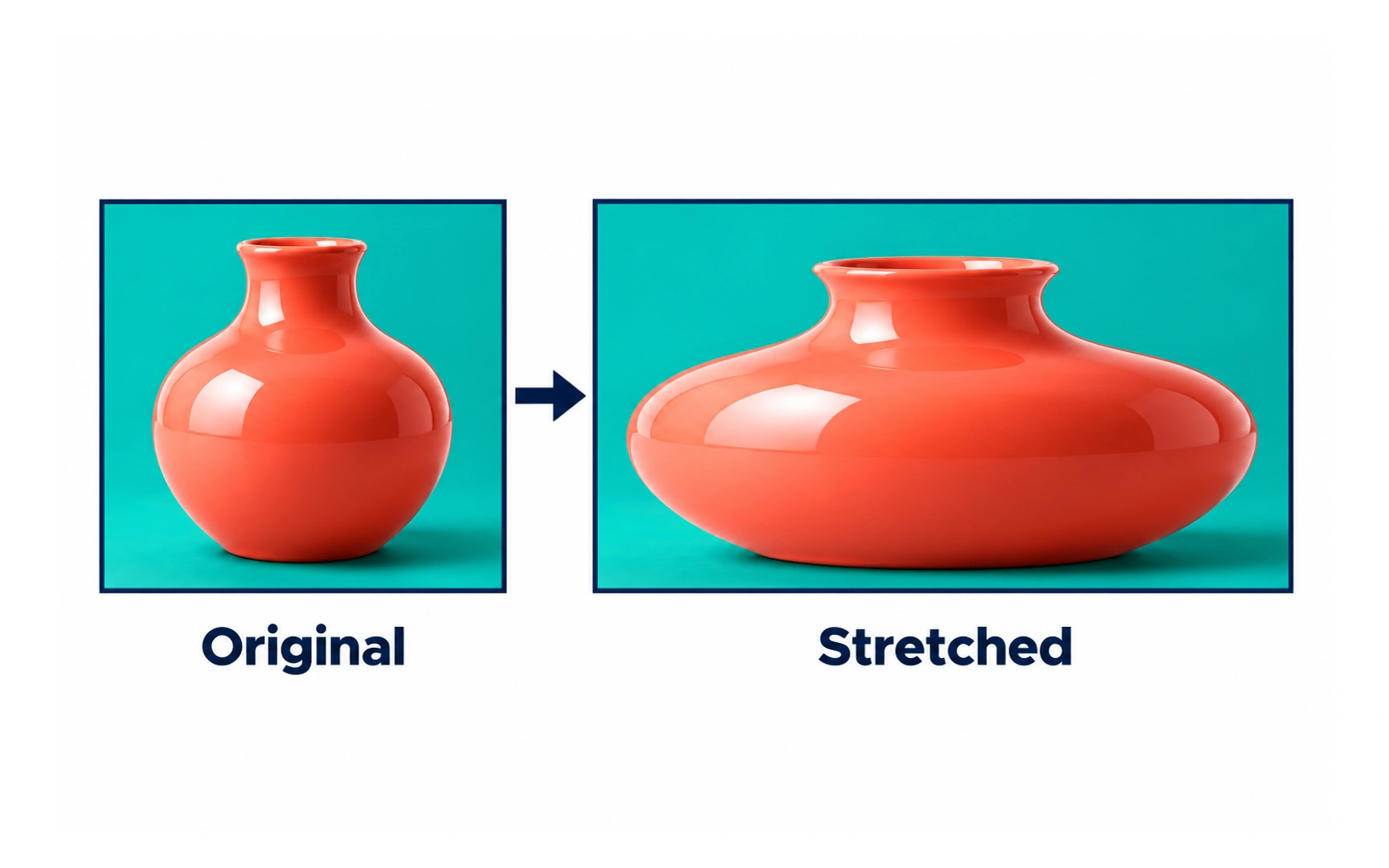
Stretch forces an image to match the frame’s width and height exactly, even if that changes its proportions.
The frame is always filled, but the image can distort. In the example, the round vase becomes wide and flat.
Avoid stretching photos of real things, people or logos. It can work for abstract textures where exact proportions do not matter.
Image tile
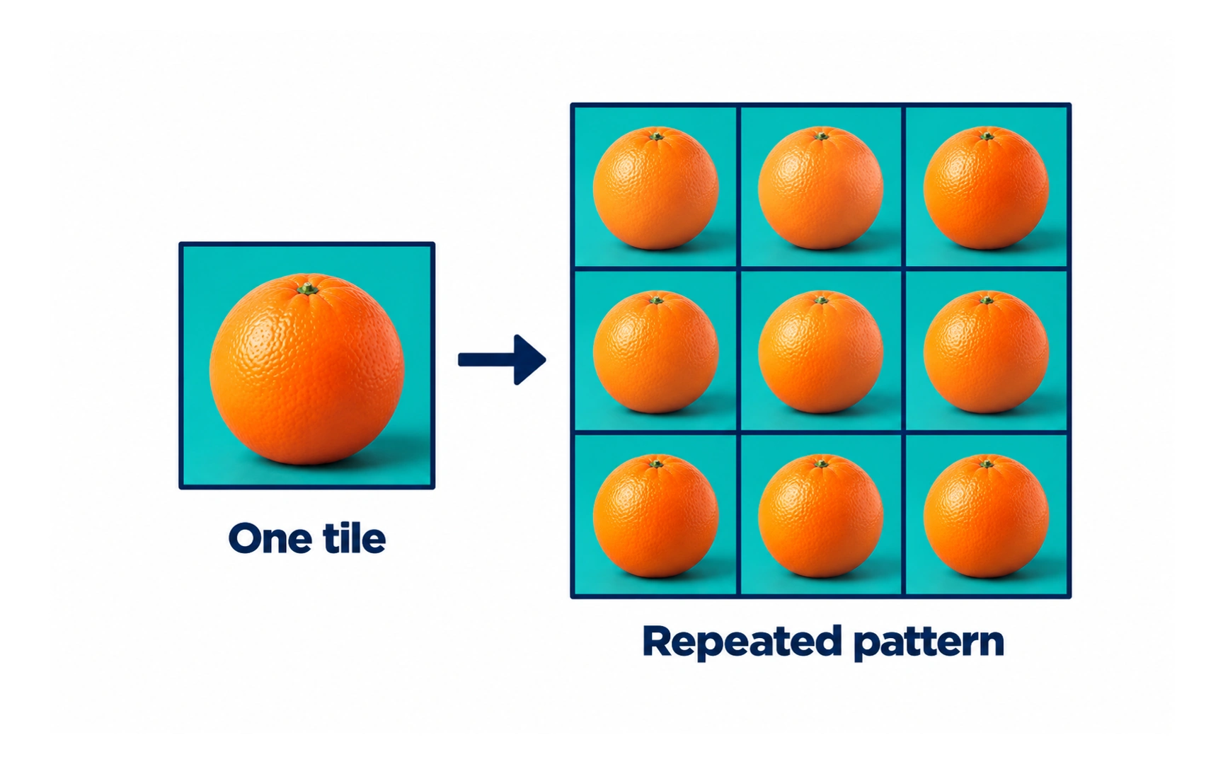
Tile repeats a small image across and down the frame, like the single orange that becomes a grid of oranges.
Each copy keeps its original size and proportions, so nothing is stretched or cropped.
Tiling is a light way to create patterns and textured backgrounds, because one small file covers a large area.
Background image
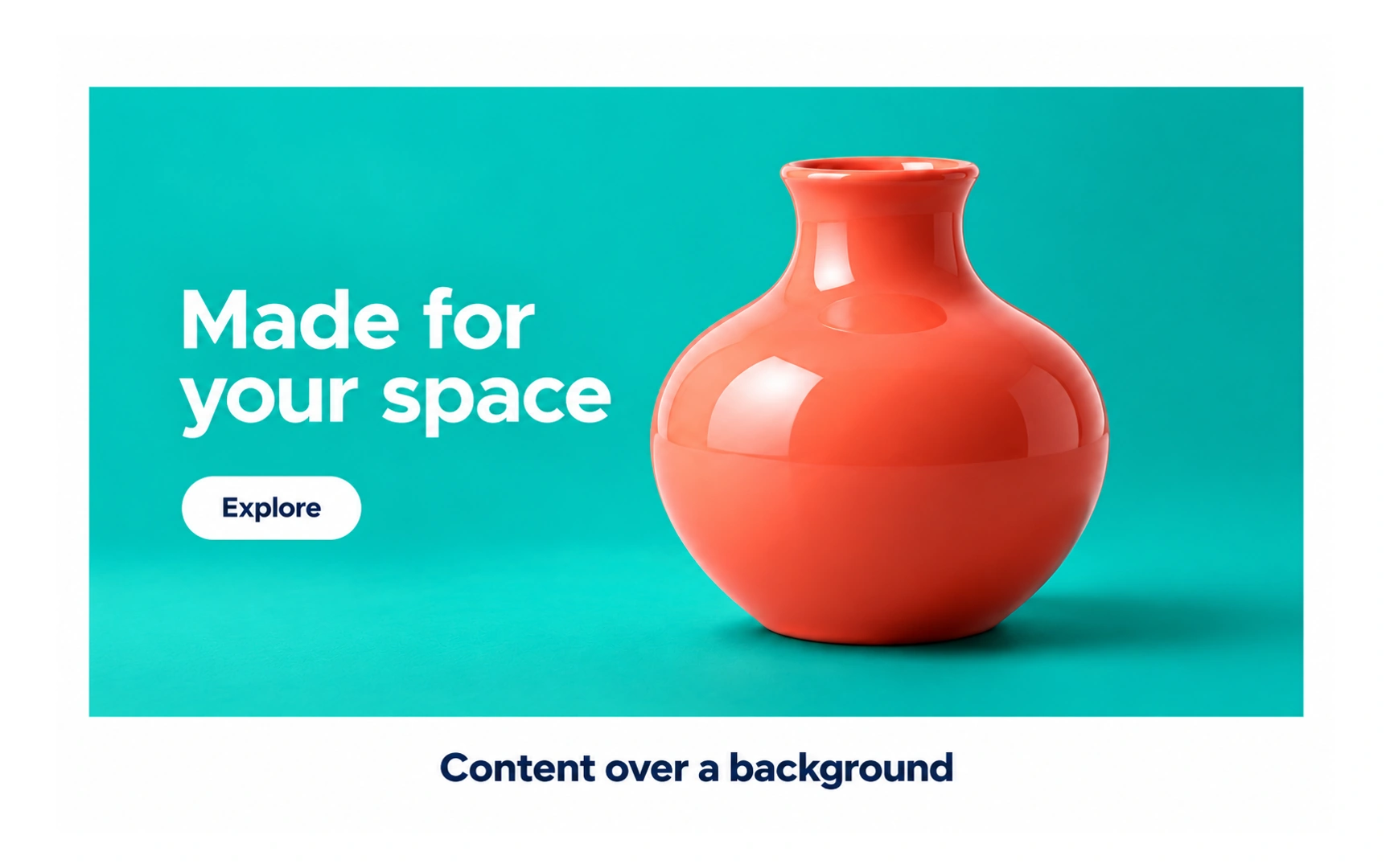
A background image sits behind other content, like the vase behind "Made for your space" and the Explore button.
It sets the mood, but the content in front is what people came for. Choose a simple, relevant image with calm areas where text can sit.
Pro tip: check the background on narrow and wide screens. As the frame changes shape, the crop changes too, and text may end up on a busy part of the image.
Web resolution
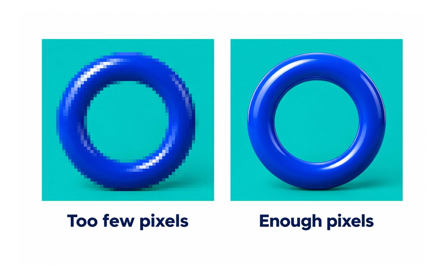
On screens, what matters is an image’s pixel dimensions, such as 1200 × 1200. With too few pixels, edges look blocky, like the left ring; with enough, they look smooth.
You may hear that web images should be 72 PPI. The PPI number stored in a file does not change how a browser shows it; only the pixel dimensions and the display size do.
High-density phone and laptop screens pack more pixels into the same space, so images need more pixels to stay sharp. Balance sharpness against file size, since bigger images load slower.
Print resolution
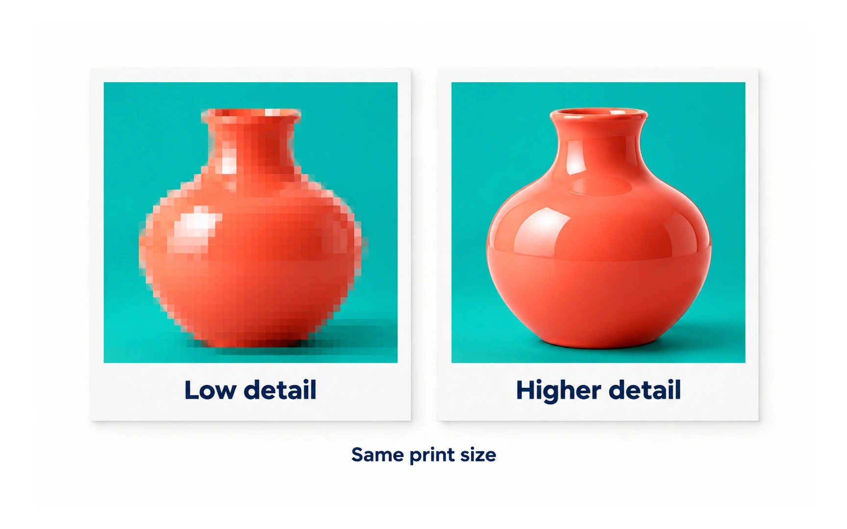
Printers place dots of ink, so print resolution is measured in dots per inch (DPI).
At the same printed size, an image with more detail looks crisp, while one with too little looks soft or blocky, as the two vases show.
A common standard for sharp printing is 300 DPI at the final print size. Pro tip: before sending a file to print, zoom in to check it still looks clear.
Export size
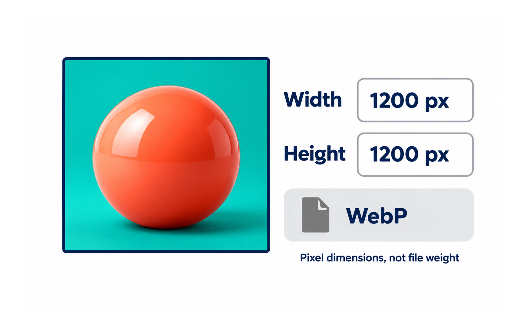
Many screens show more than one physical pixel for each pixel in a design. To stay sharp, images are exported at several scales.
@1x is the base size. @2x has twice the width and height, for high-density screens; @3x has three times, for the densest phone screens.
Export the scales your target devices need, and set the pixel dimensions on purpose, as in the 1200 × 1200 WebP example. Choosing pixel dimensions and choosing file weight are separate decisions.
Image overlay
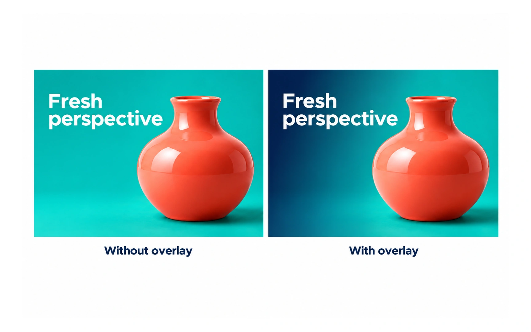
An overlay is a semi-transparent layer of color placed over an image.
Its most common use is to make text readable. In the example, "Fresh perspective" is hard to read on the plain photo, and clear on the version with a dark blue overlay.
Overlays can also make an image less prominent so other content stands out. Pro tip: after adding an overlay, check the text contrast on the darkest and lightest parts of the image.
Alt text
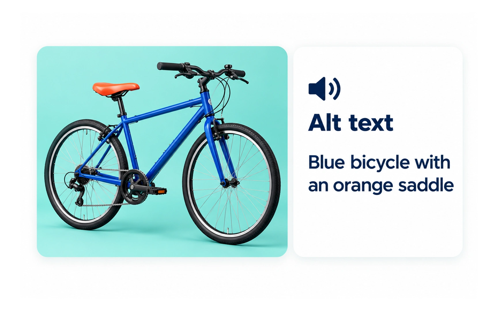
Alt text is a short written description of an image. Screen readers read it aloud, and browsers show it if the image fails to load.
Good alt text says what matters about the image in its context, like "Blue bicycle with an orange saddle" for a product photo.
Keep it short, skip phrases like "image of", and do not repeat text that is already next to the image. Purely decorative images should have empty alt text, so screen readers skip them.
REFERENCES
TOPICS
FROM COURSE