How Color Works
Learn the color wheel, color temperature, and the RGB, CMYK and hex systems behind every design.
Color is one of the first things people notice in a design. This lesson covers how hues are organized on the color wheel, how warm, cool and neutral colors feel, how screens and print create color, and the hex and RGB codes you will use every day.
Color wheel
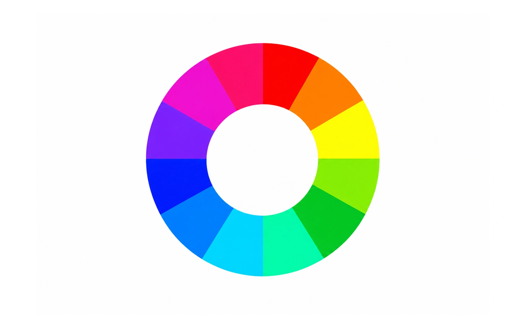
A color wheel arranges hues in a circle so you can see how they relate. Isaac Newton drew an early version in his book Opticks (1704) by joining the two ends of the visible spectrum into a loop.
The wheel most designers use has 12 hues: 3 primary, 3 secondary and 6 tertiary. Neighboring colors tend to blend calmly; colors on opposite sides create strong contrast.
There are two families of wheels. Screens mix light, with red, green and blue as primaries; print mixes ink, with cyan, magenta and yellow. Pro tip: the wheel suggests combinations, but always check that text stays readable on its background.
Warm colors
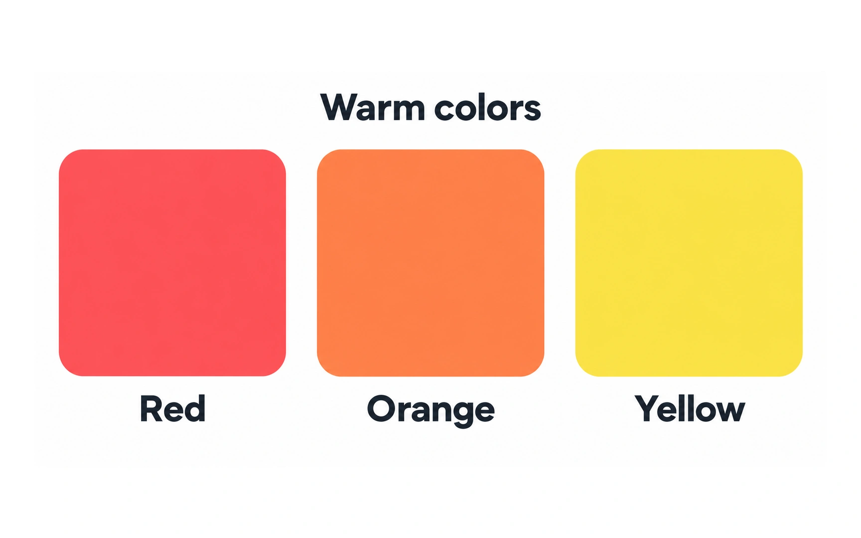
Red, orange and yellow are warm colors. They remind people of fire and sunlight, and tend to feel energetic, lively and cozy.
Warm colors grab attention, so they work well for accents such as a sale badge or an important button.
Use them in small doses. Large areas of saturated red or orange can feel loud and tiring, so balance them with neutral or cool colors.
Cool colors
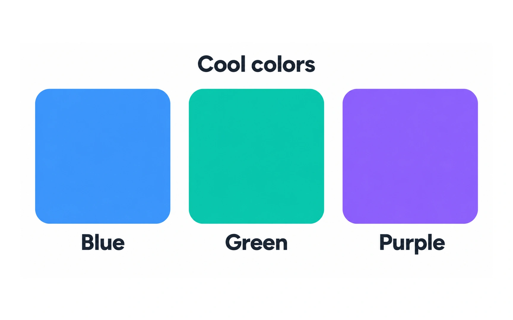
Blue, green and purple are cool colors. They recall water, sky and plants, and tend to feel calm, steady and trustworthy.
That calm, reliable feeling is one reason many banks, health services and productivity tools build their brands around blue or green.
Blue has also been the default color for text links on the web for decades, so people often read blue text as clickable. Pro tip: if you use blue text for decoration, make sure it does not look like a link.
Neutral colors
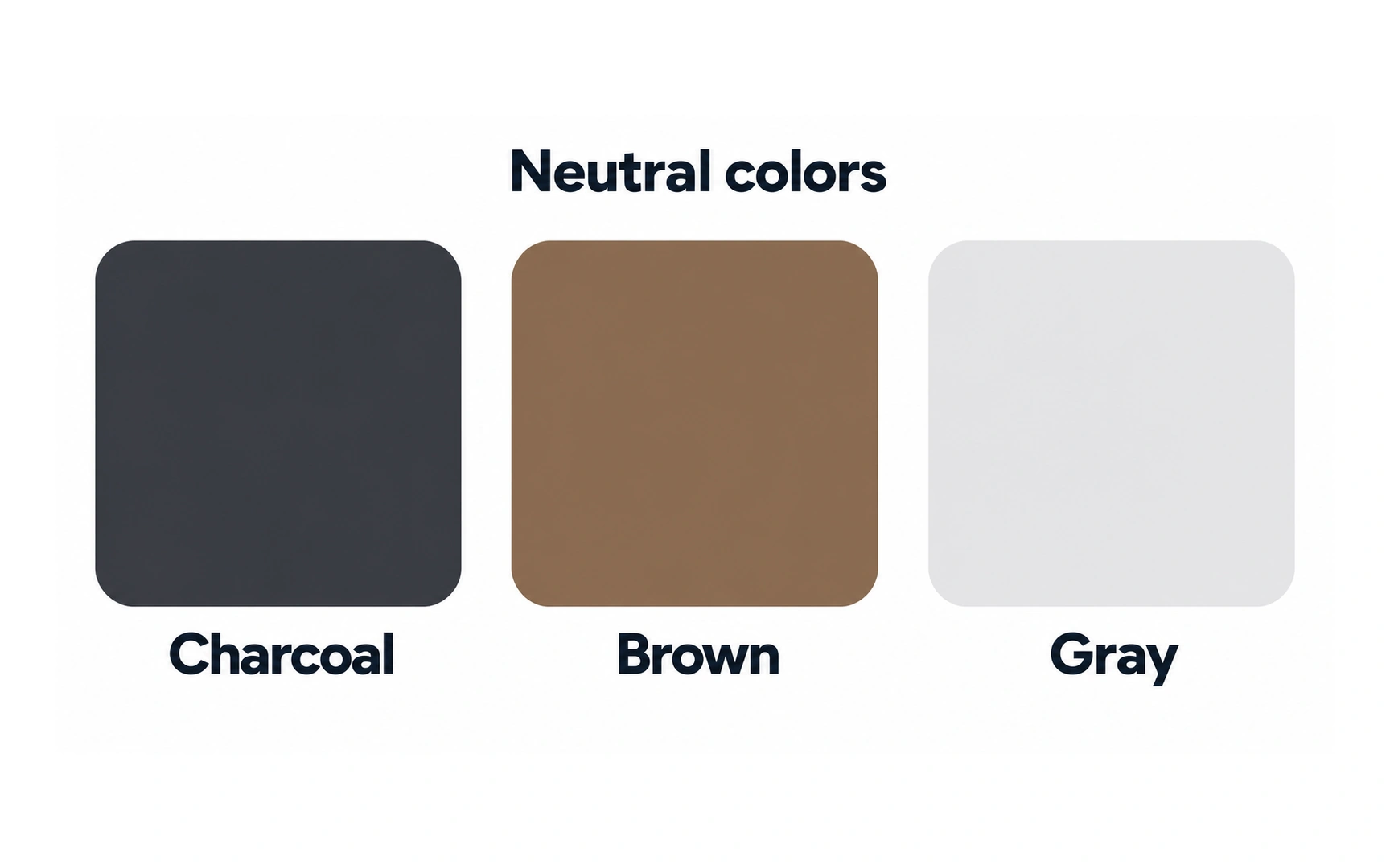
Neutral colors are black, white, grays and muted browns such as beige. Dark charcoal grays are neutrals too. They carry little color of their own.
Neutrals do most of the quiet work in an interface: backgrounds, body text, borders and wireframes.
Because they stay in the background, neutrals let accent colors stand out. On a mostly neutral screen, one bright button is easy to spot.
Color palette
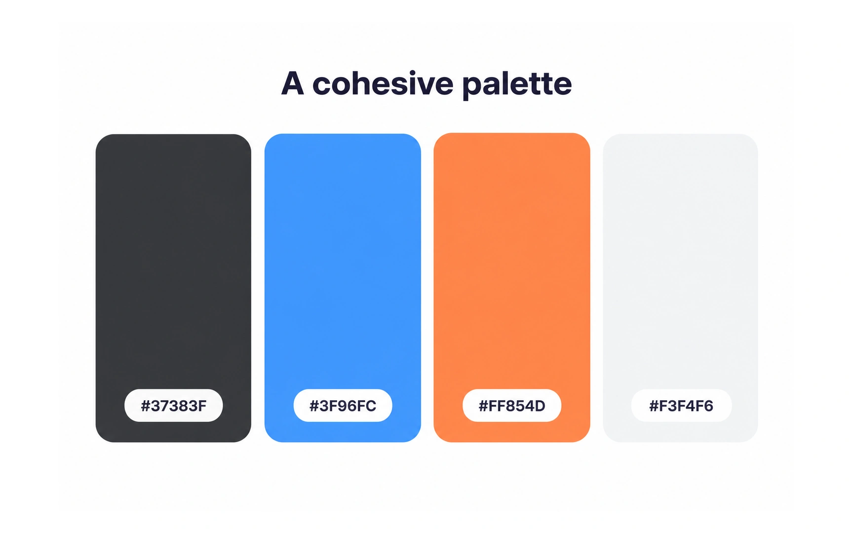
A color palette is the small set of colors a product uses, each with a job. The palette shown here uses charcoal for text, blue for main actions, orange for highlights and a light gray for backgrounds.
Giving each color a fixed role keeps a product consistent. When blue always means "main action", people learn it once and recognize it everywhere.
Products from the same company often share one palette, so they feel like one family. An established brand usually has a brand guide that already defines its palette, so check it before creating a new one.
Additive color model
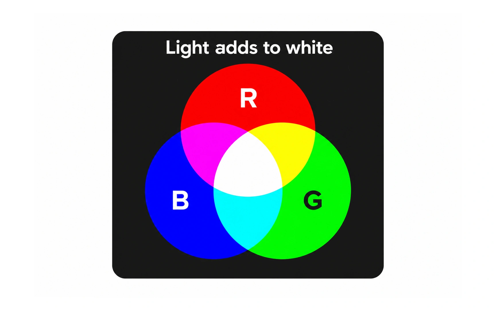
Screens create color by mixing light. This is the additive model, and its primary colors are red, green and blue (RGB).
It is called additive because adding light makes colors brighter. Red and green light make yellow, and all three at full strength make white.
In 1861, physicist James Clerk Maxwell showed a color photograph at the Royal Institution in London, made by combining red, green and blue filtered images. Every screen still relies on the same idea.
Subtractive color model
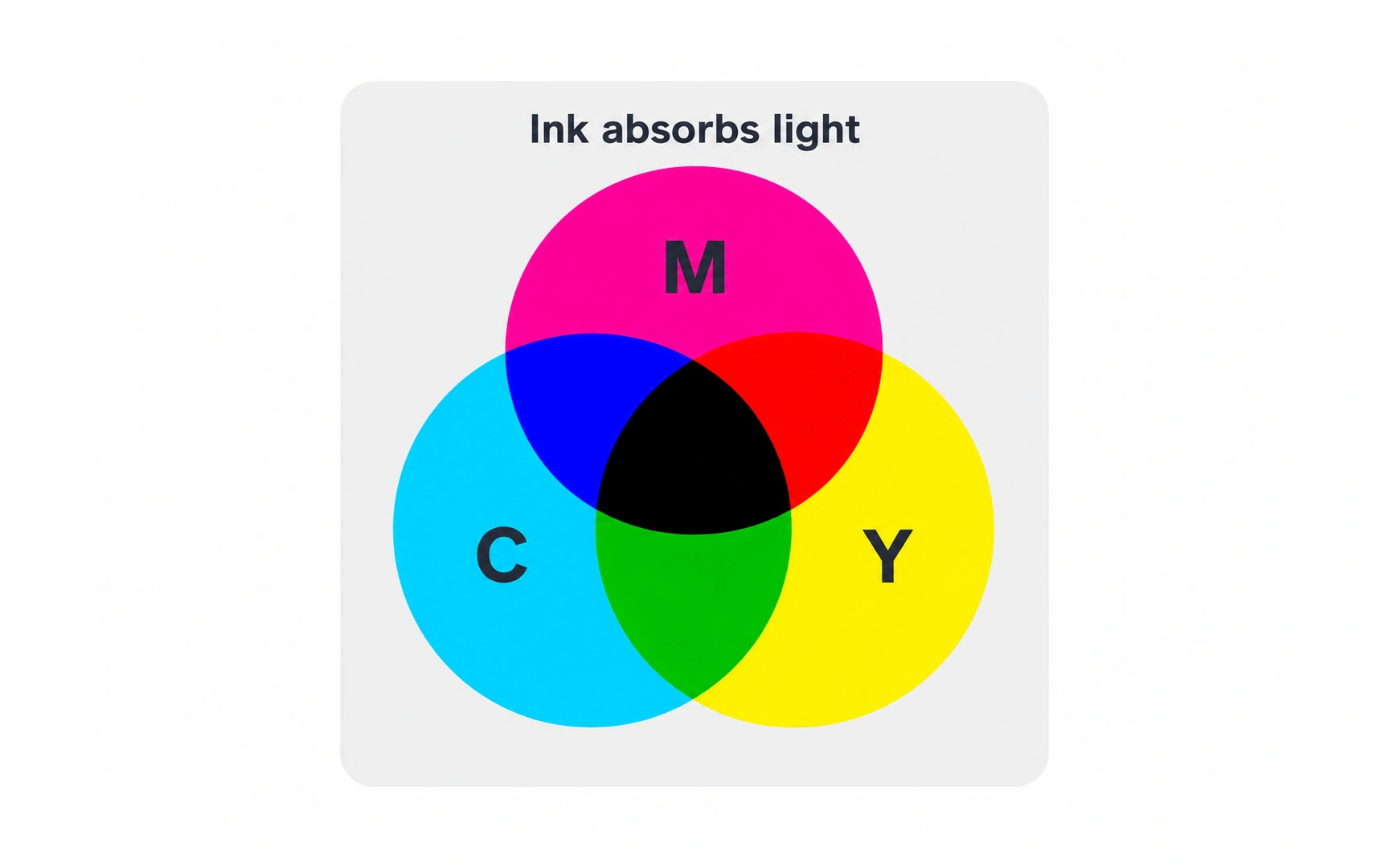
Print and paint create color with pigments that absorb light. This is the subtractive model: each ink subtracts some of the light that would otherwise reflect back to your eyes.
The more inks you mix, the less light reflects, so the mix gets darker. Where cyan, magenta and yellow all overlap, you get a dark, near-black color.
Printers add black, called key, to cyan, magenta and yellow (CMYK), because black ink gives deeper blacks and sharper text. In art class, painters traditionally learn red, yellow and blue as primaries.
Primary colors
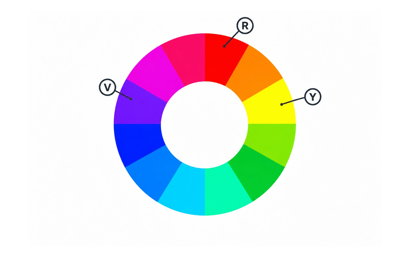
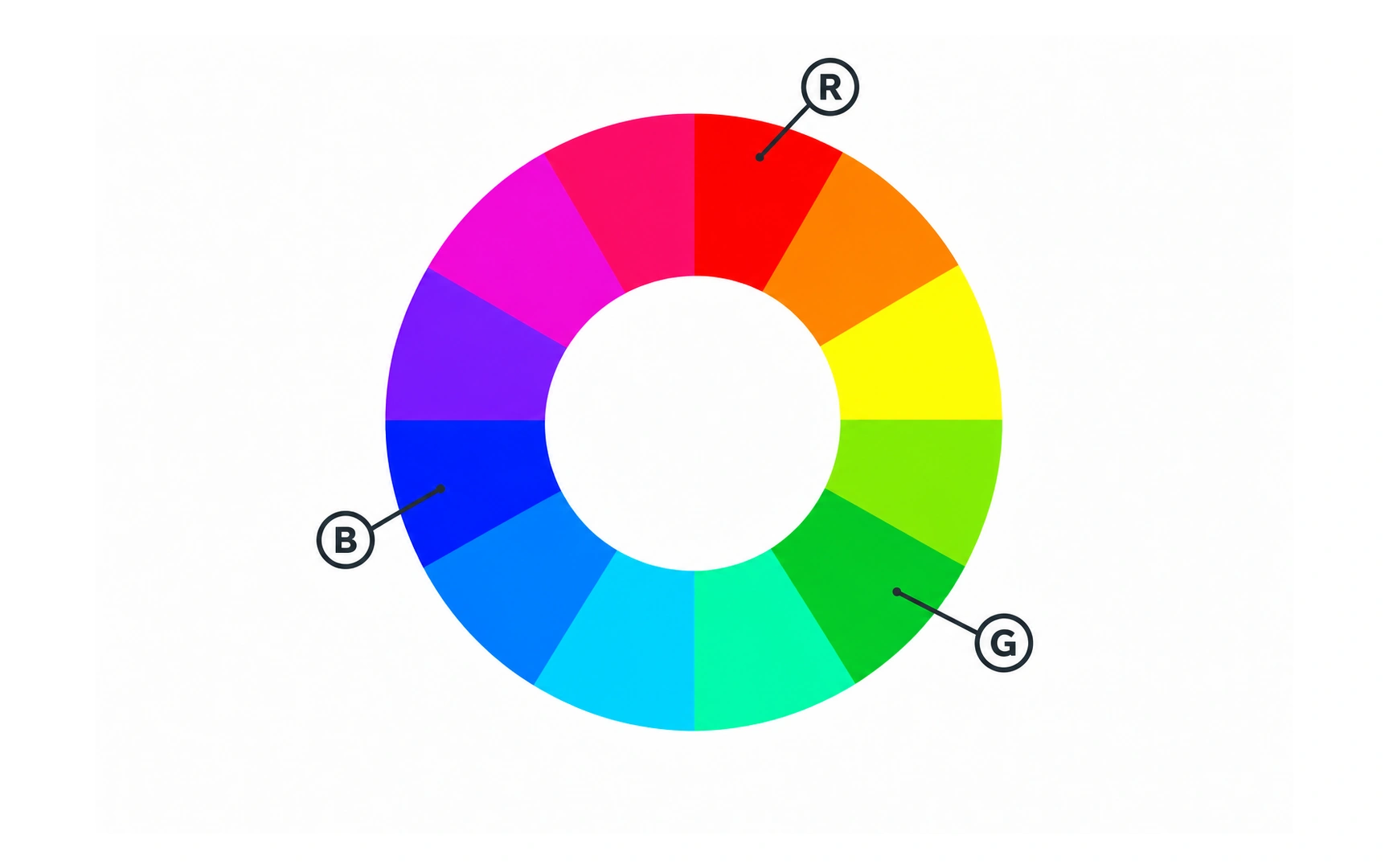
Primary colors are the starting points of a color model. You can mix the other colors from them, but you cannot mix them from other colors.
Screens use red, green and blue as primaries. Print uses cyan, magenta and yellow.
Pure primaries are very intense. In interfaces they work best in small areas, such as an alert or a key button, rather than as large backgrounds.
Secondary colors
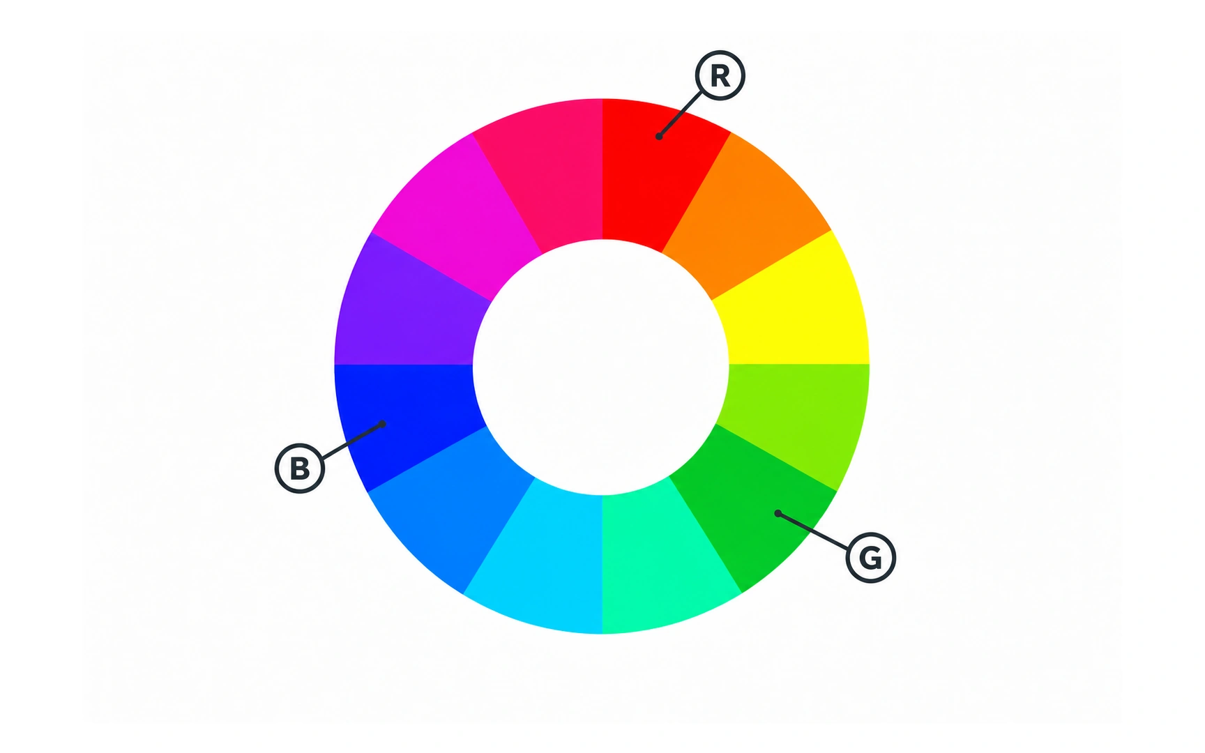
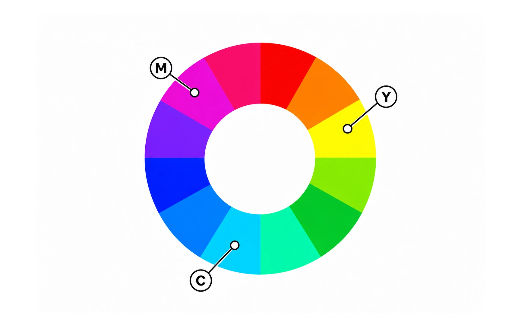
A secondary color is made by mixing two primary colors equally.
On screens, red and green make yellow, green and blue make cyan, and blue and red make magenta. In print it works the other way round: mixing two of cyan, magenta and yellow gives red, green or blue.
Notice the mirror: the primaries of one model are the secondaries of the other. That is because one model adds light and the other takes it away.
Tertiary colors
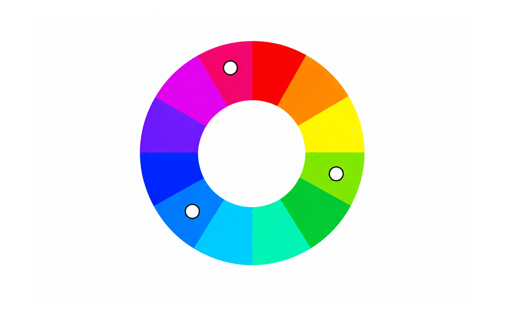
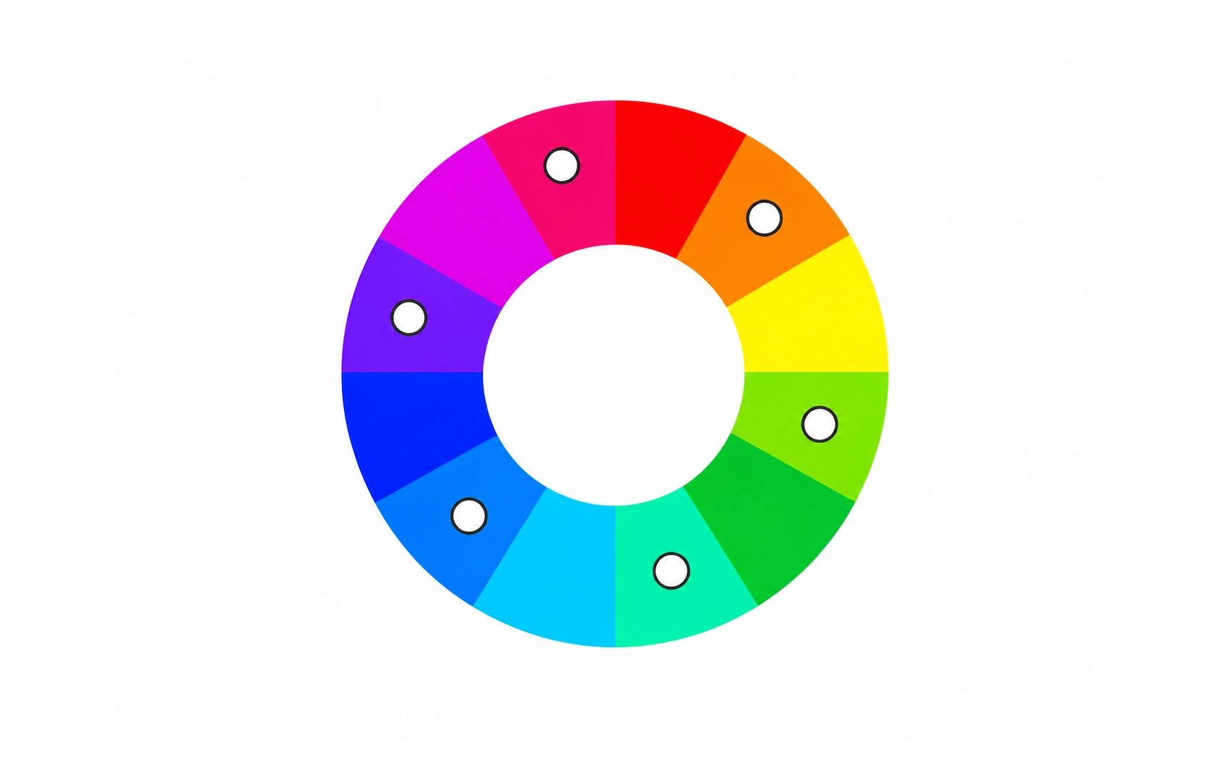
A tertiary color sits between a primary and a secondary color on the wheel, and is made by mixing the two.
A 12-hue wheel has six tertiary colors: orange, chartreuse, spring green, azure, violet and rose. Both color models give the same six, because they share the same six primary and secondary hues.
Tertiary colors give you more specific options than primaries, such as a warm orange accent or an azure that sits between blue and cyan.
Hex colors
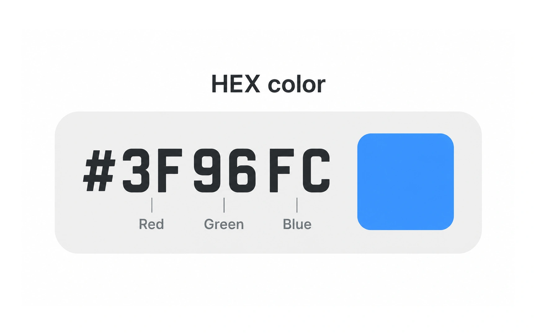
Hex codes are a short way to write RGB colors, used widely in CSS and design tools. A hex code starts with # followed by six characters, in the pattern #RRGGBB.
Each pair sets one channel, from 00 (none) to FF (full). In #3F96FC, 3F is a little red, 96 is medium green and FC is almost full blue, which makes a bright blue. #000000 is black and #FFFFFF is white.
Hex counts with 16 digits: 0 to 9, then A to F. You may also see three-character shorthand, where #F00 means #FF0000, or eight characters, where the last pair sets opacity.
RGB values
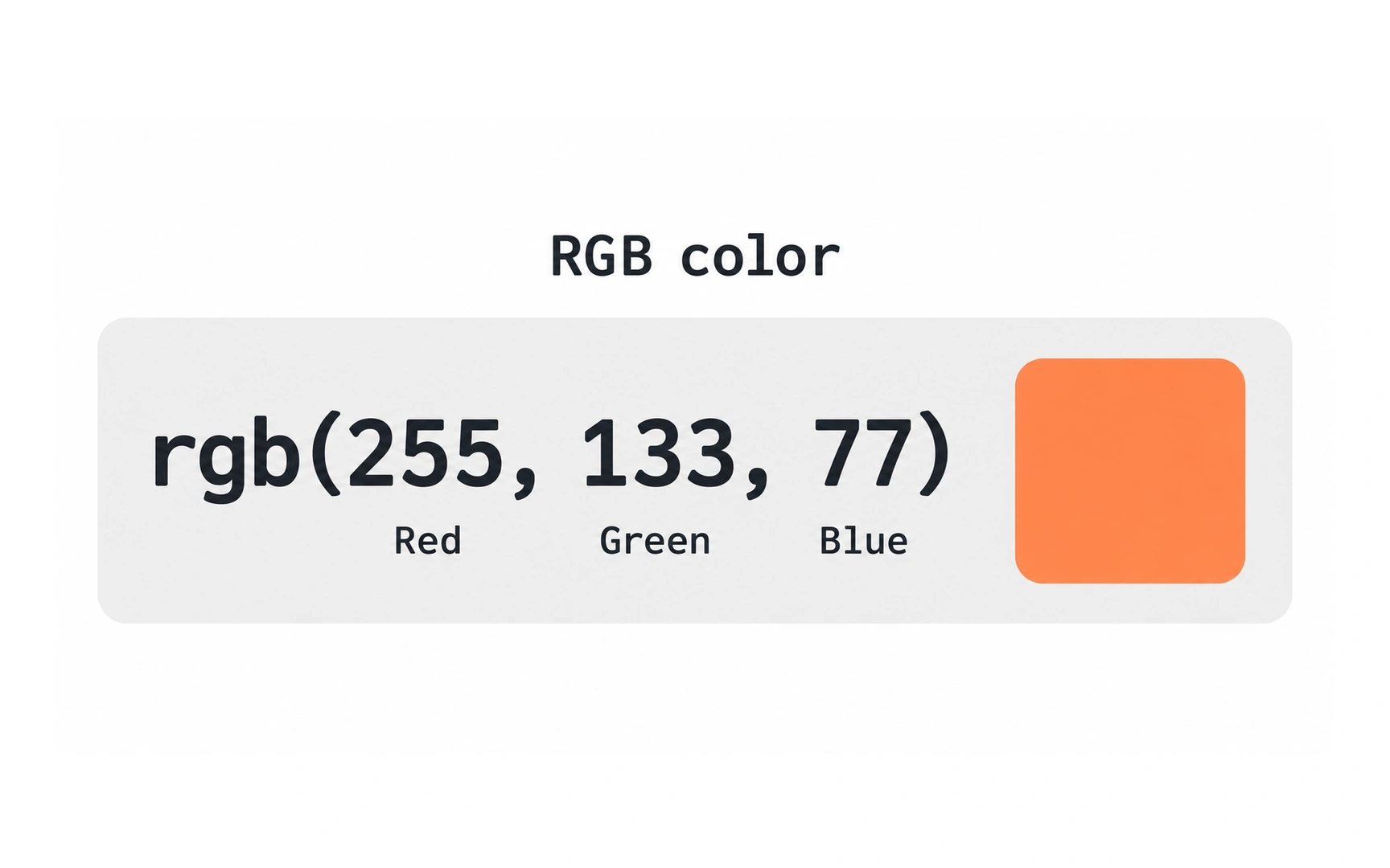
RGB values describe a color as three numbers: how much red, green and blue light to mix. Each runs from 0 (none) to 255 (full), so rgb(255, 133, 77) is full red, some green and a little blue, a warm orange.
With 256 levels per channel, RGB can describe 256 × 256 × 256 = 16,777,216 colors.
The same RGB values can look slightly different on different screens, because displays vary. Pro tip: check important brand colors on more than one device.
TOPICS
FROM COURSE