The Building Blocks of UI
Learn how color, space, type, text, motion, images, icons and layout work together on every screen.
Every screen is built from the same small set of elements: color, space, type, short pieces of text, motion, elevation, images, icons, components and layout. This lesson looks at what each element does and how to use it well. When they work together, people can see what matters, understand what is happening and know what to do next.
Color
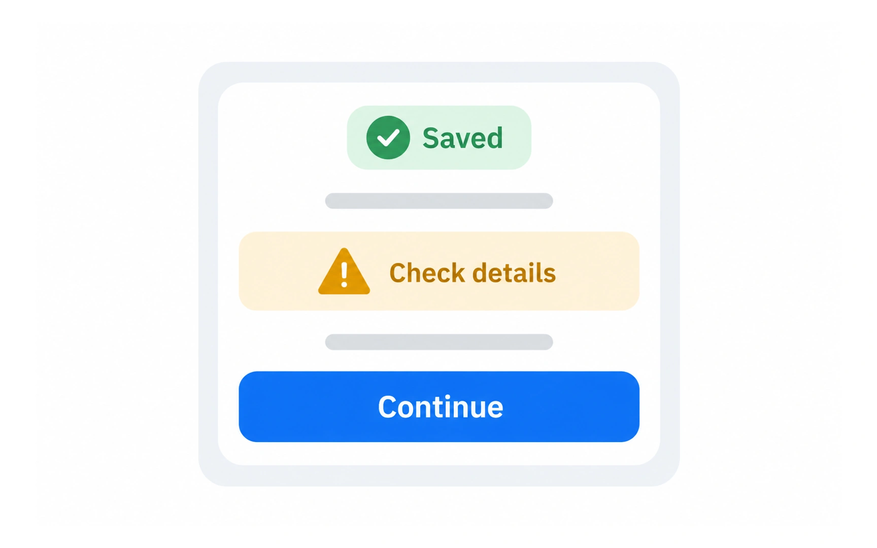
Color can distinguish status, establish a product’s personality and draw attention to an action. In the illustration, green supports the saved state, amber draws attention to a warning, and blue emphasizes Continue.
Color meanings depend on context and culture. Pair status colors with understandable words and symbols: the checkmark and Saved label communicate the result even when someone cannot distinguish the hue.
Choose colors for a purpose. A screen with many equally strong accents makes it harder to tell which action matters most.
Positive and negative space
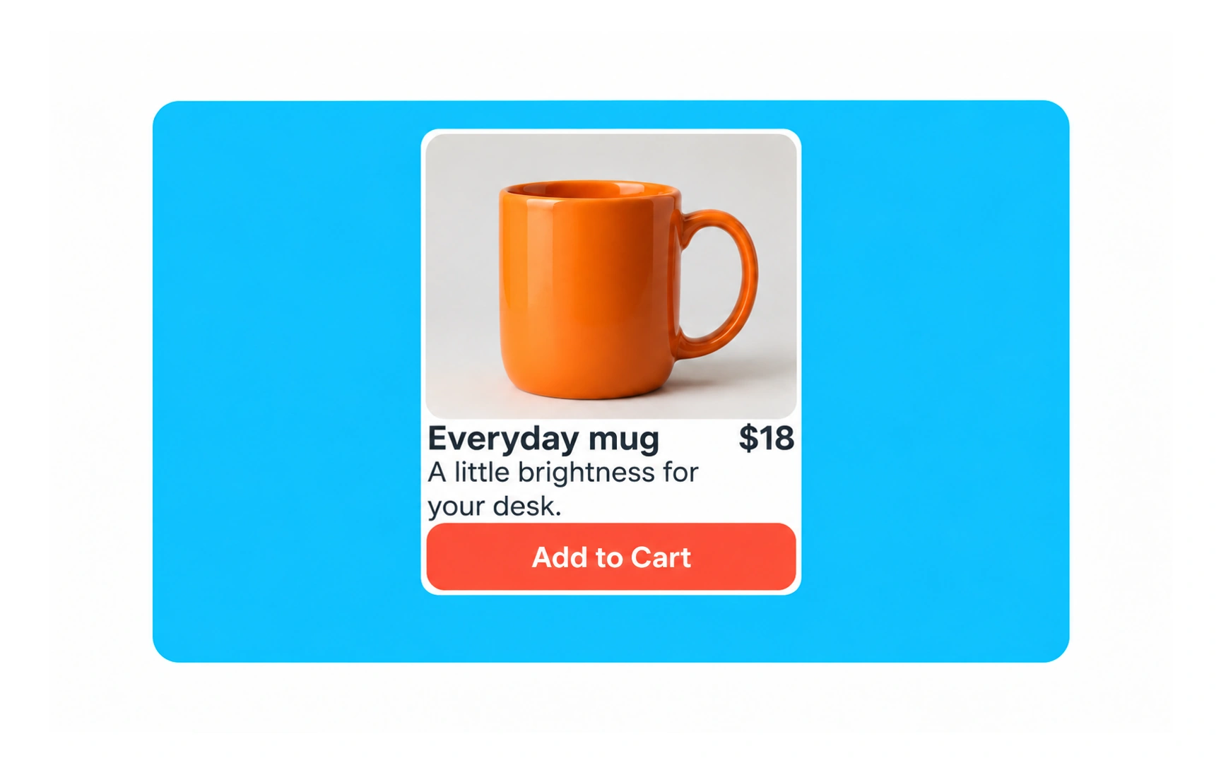
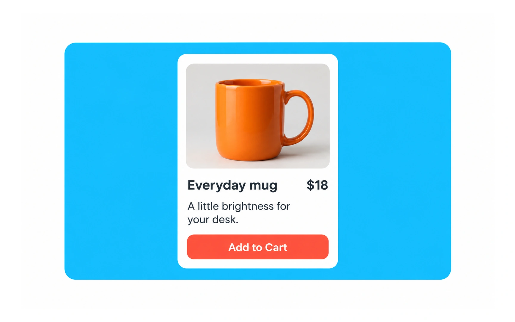
Positive space is occupied by content, such as the mug photograph, product name, price and button. Negative space is the empty area inside and around those elements. It does not have to be white.
Compare the two product cards. Space around the title, description and action separates the groups and helps people scan the information. Tight packing makes the same content harder to distinguish.
Use spacing to express relationships: keep related items close and leave more room between different groups. More space is not automatically better; preserve enough information for the task.
Typography
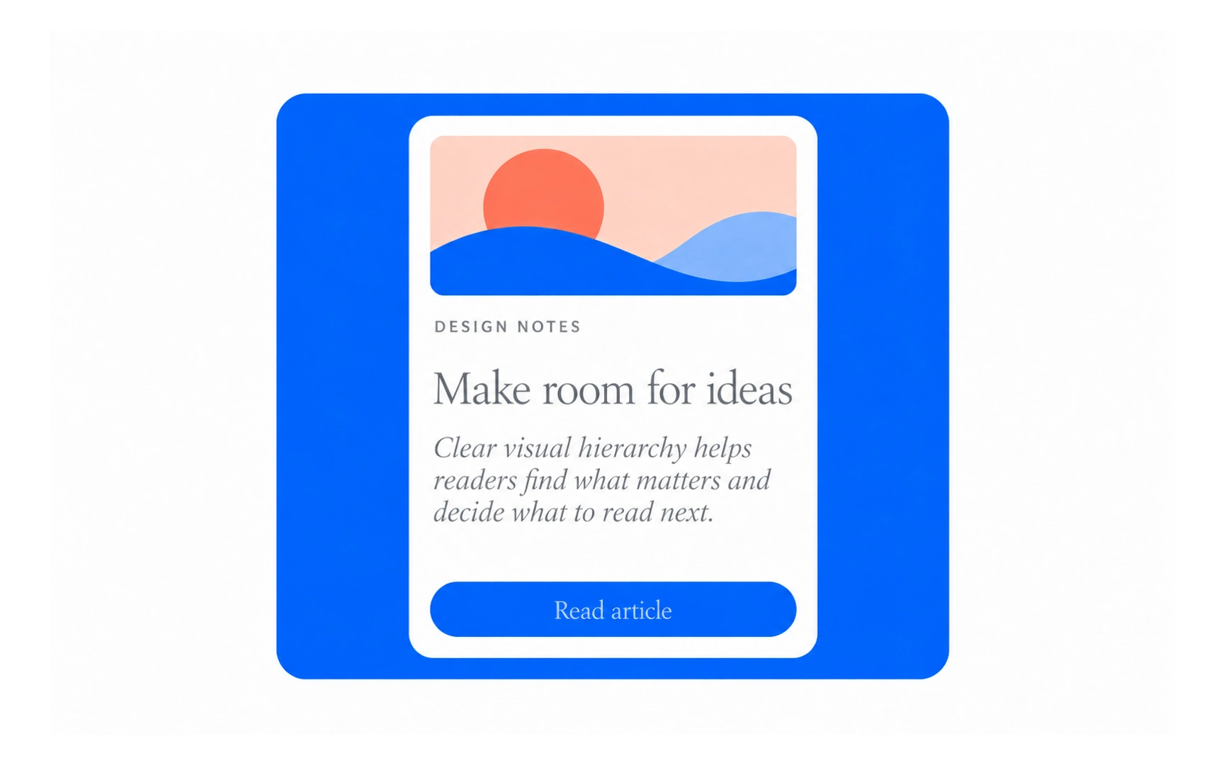
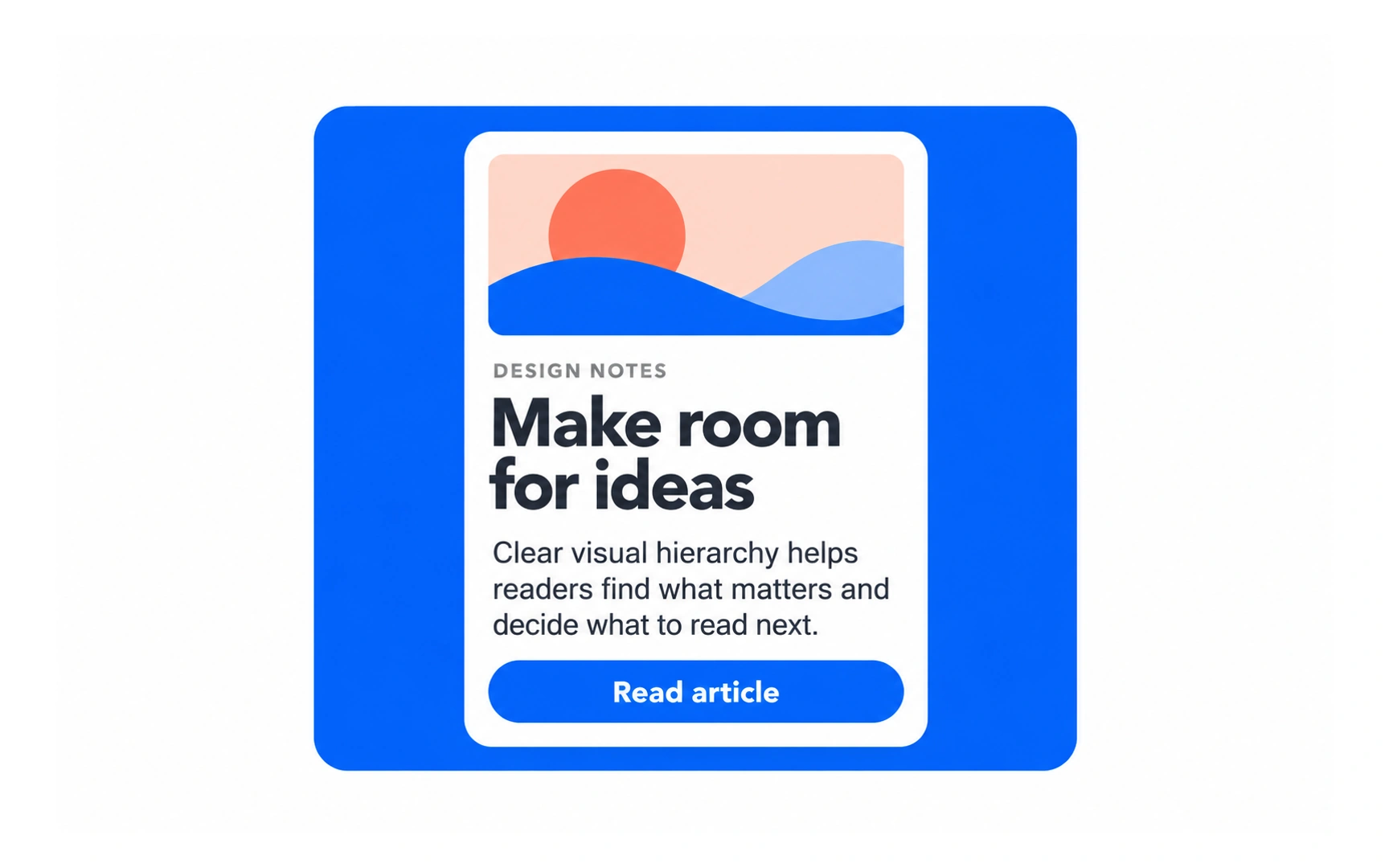
Typography shapes how people read an interface. Typeface, size, weight, line spacing and contrast work together to distinguish a heading, supporting text and an action.
In the article previews, the words and illustration stay the same while the type treatment changes. A clear heading and readable body text make the structure easier to scan.
Do not judge readability from the typeface category alone. Check the complete treatment at the size people will use, including on small screens.
Microcontent
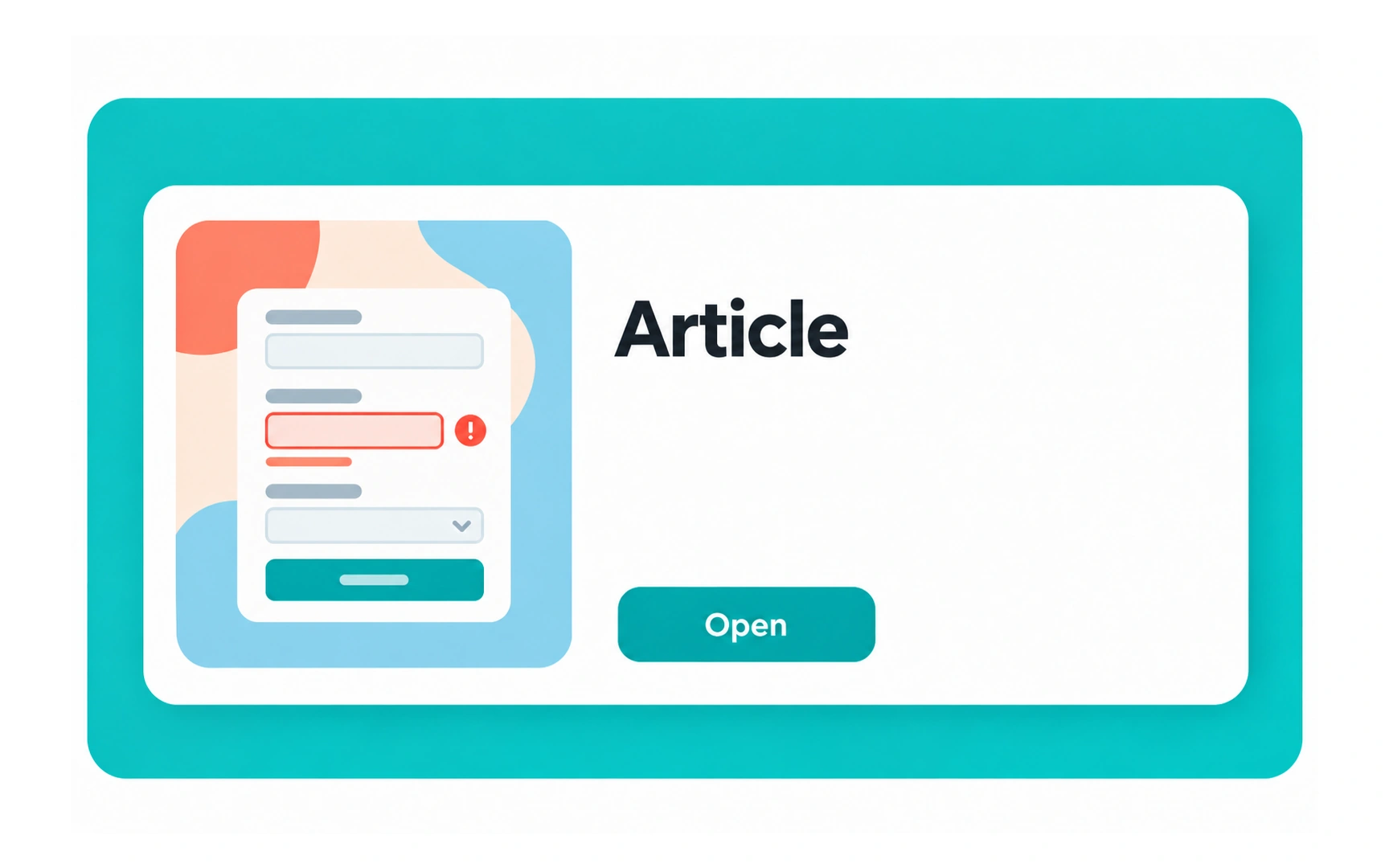
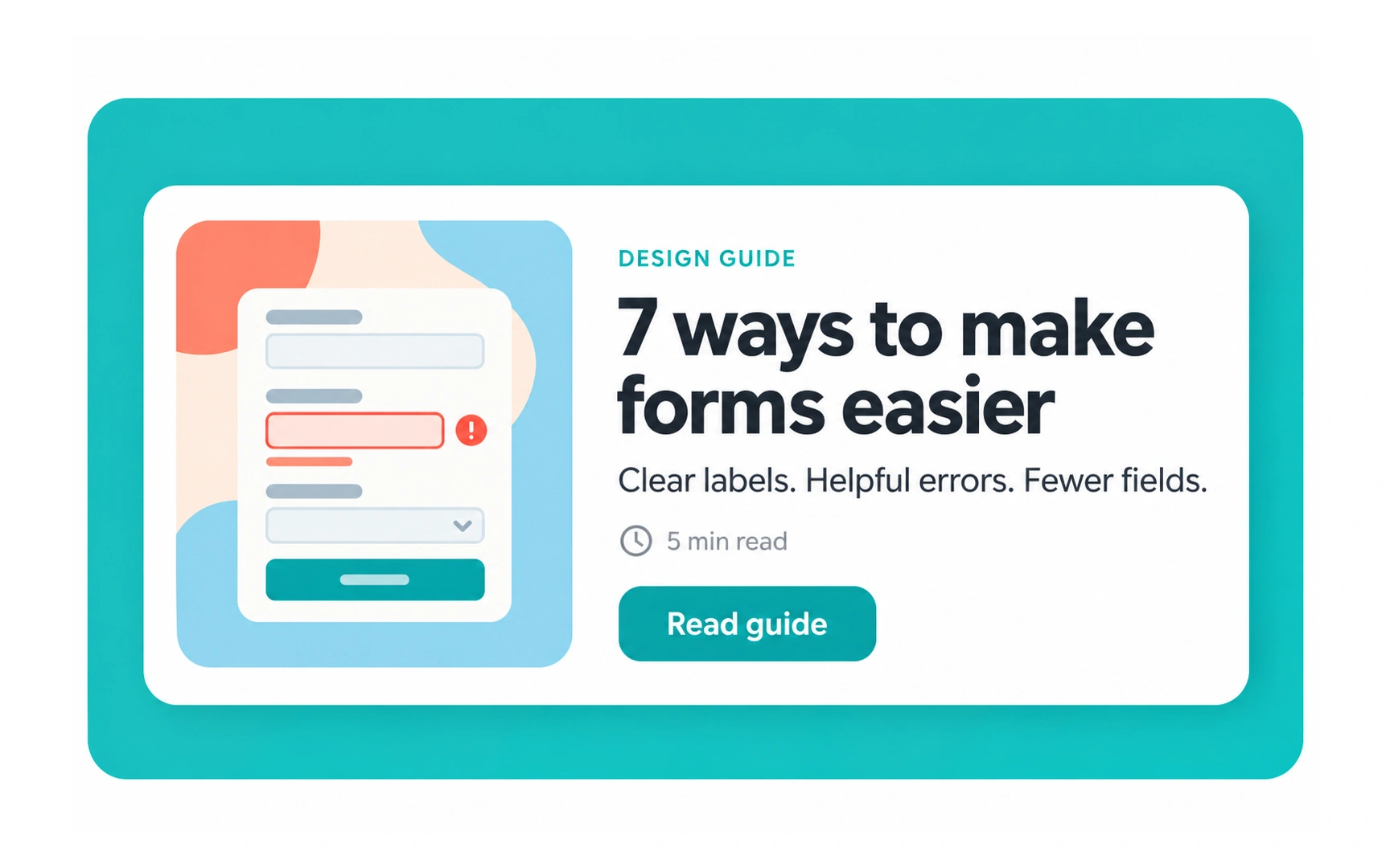
Microcontent is a short piece of content that helps people understand a larger item. Examples include a headline, email subject, summary or search-result snippet.
The illustrated guide preview names the topic and gives concrete benefits: clearer labels, helpful errors and fewer fields. Readers can judge whether the guide is relevant before opening it. Article and Open provide much less context.
Write specific, concise previews. The purpose is to help readers choose, not to squeeze the whole article into a card.
Microcopy
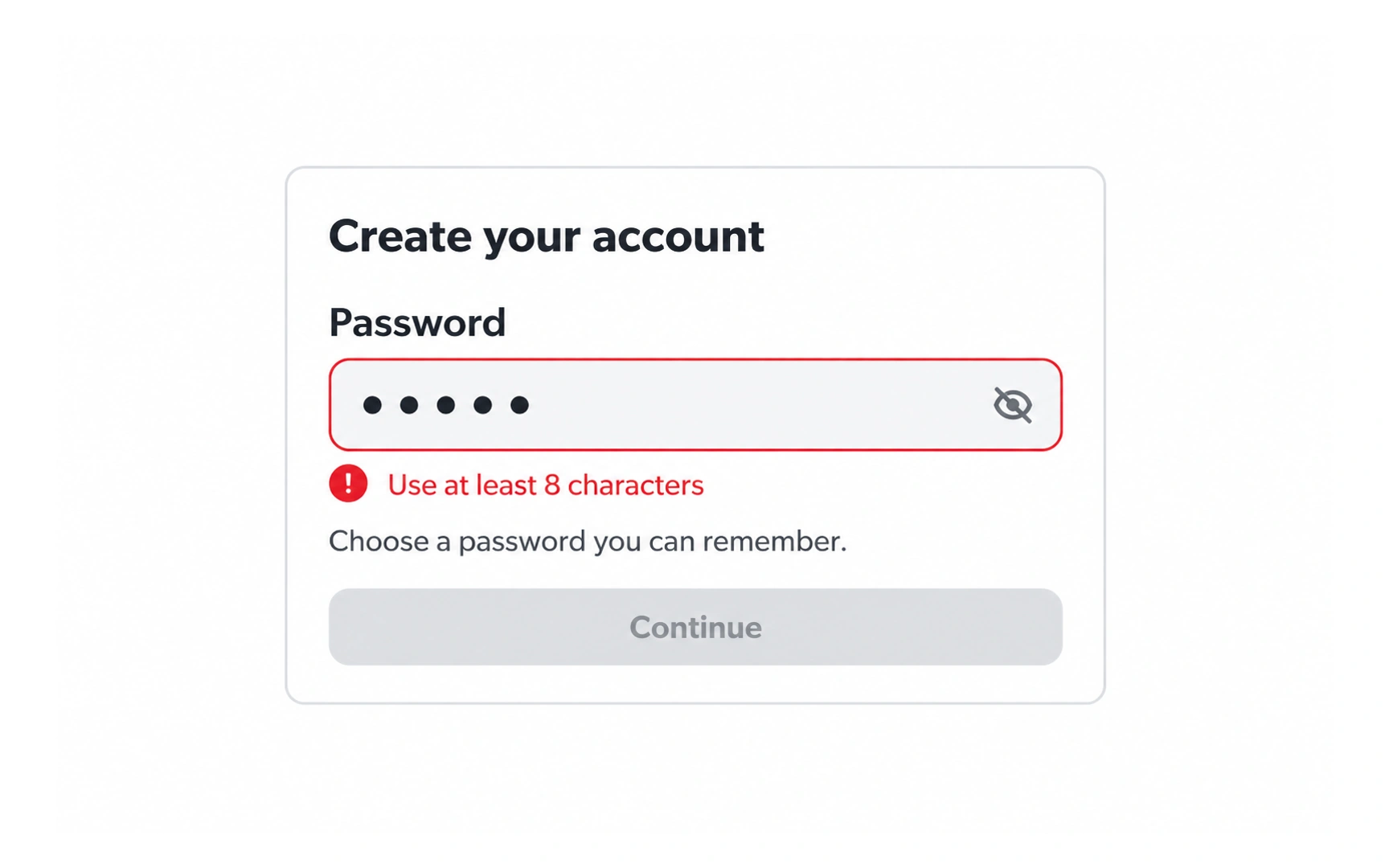
Microcopy is short interface text that helps someone act or recover from a problem. Button labels, input hints and error messages are common examples.
The password message Use at least 8 characters states the unmet requirement beside the relevant field. A message such as Invalid input would leave the user to guess what to change.
Explain the next useful action in familiar language. Keep the tone appropriate to the situation and avoid blaming the person.
Motion
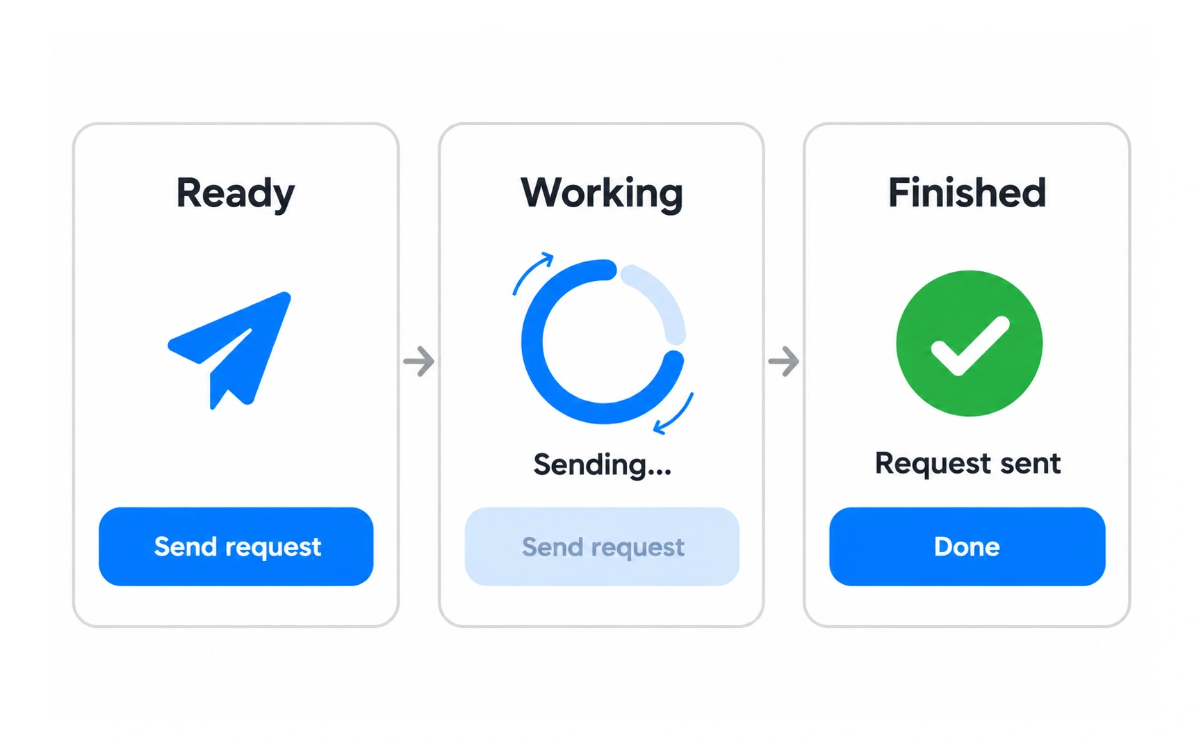
Motion can communicate a change or show that the system is working. In the illustration, the request moves from Ready to Sending and then Request sent.
A loading indicator acknowledges the action while the request is pending. The final confirmation tells the user the operation finished. A spinner alone cannot communicate every possible outcome, so pair it with meaningful status text.
Keep motion purposeful and support reduced-motion preferences. An animation that obscures controls or delays the next action can make the experience worse.
Elevation
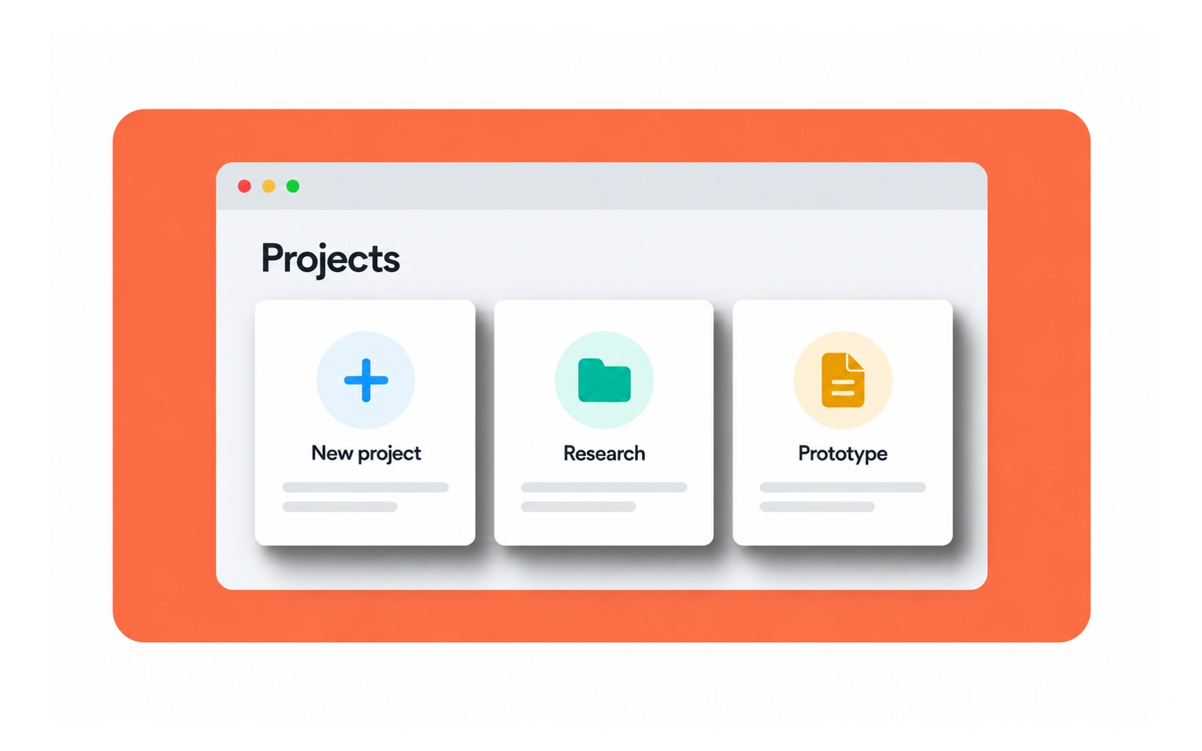
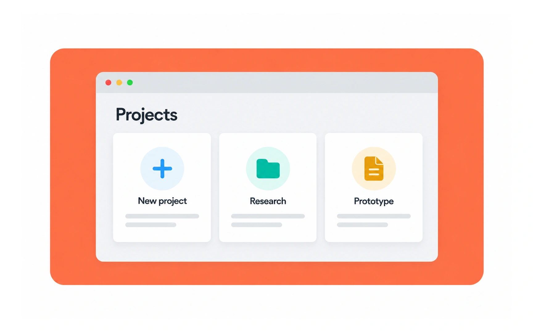
Elevation is the appearance of one surface sitting above another. Shadows, overlapping edges and tonal differences can help communicate layers.
Compare the project cards: restrained shadows separate them from the background, while strong dark shadows compete with their contents. The amount of shadow should support the layer relationship.
Use a consistent elevation system. A shadow does not prove that an element is interactive; labels, shape, position and interaction states must also communicate its behavior.
Imagery
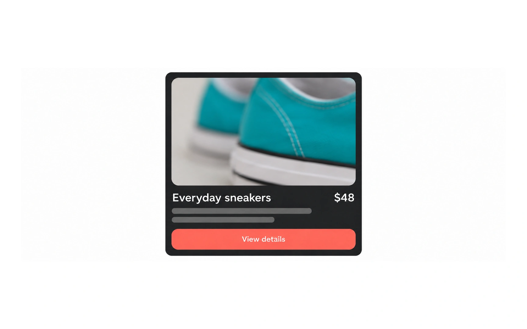
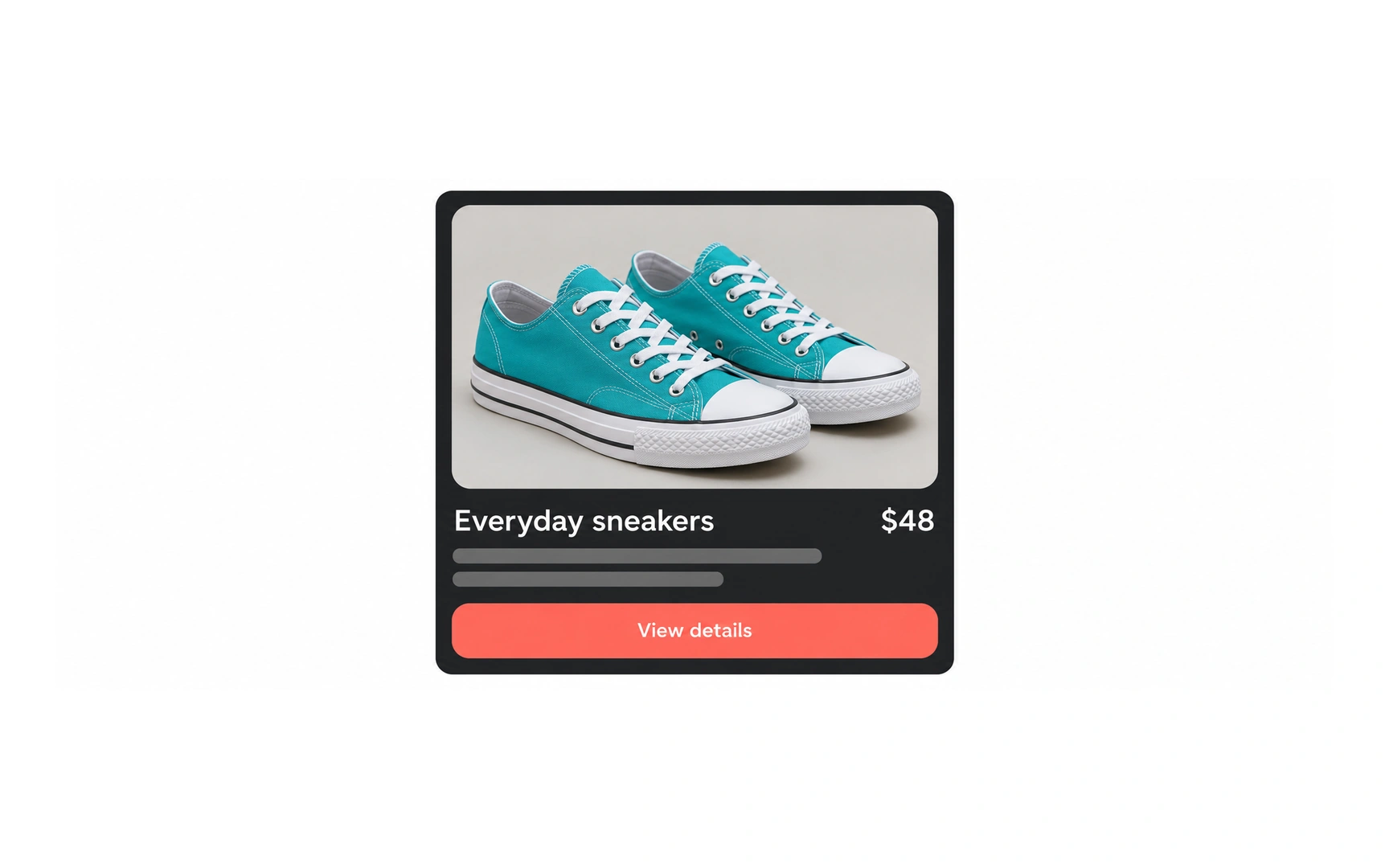
Imagery can explain a product, establish a mood or make an abstract idea concrete. Its purpose should determine the subject, crop and level of detail.
The full sneaker photograph shows shape, laces and sole. The blurry close crop hides information a shopper needs to judge the item. A dramatic crop is not useful when it removes the details required for the task.
Use relevant images and provide a suitable text alternative for meaningful content. Decorative images should not add unnecessary screen-reader narration.
Icons
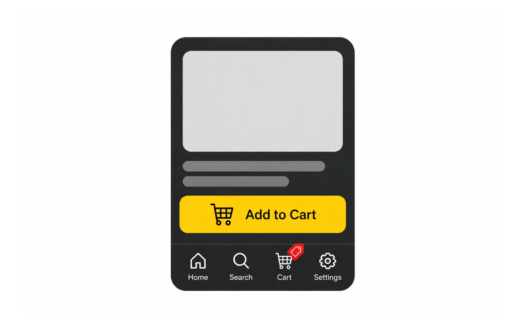
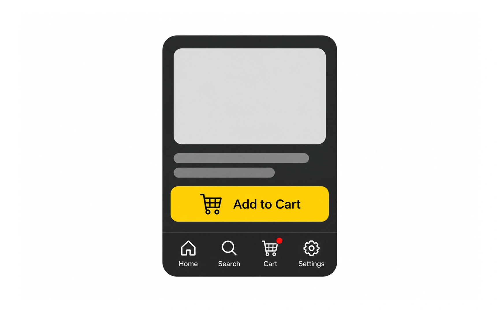
Icons are compact visual cues for objects, actions and destinations. Familiar symbols and visible labels can make controls easier to recognize.
In these shopping examples, the cart icon already identifies Cart. A simple dot can indicate an update; adding a price-tag symbol introduces a different meaning that may be mistaken for a sale or pricing action.
Keep icon style consistent and check meaning in context. Familiarity is not universal, so use labels when the action could be ambiguous.
Components
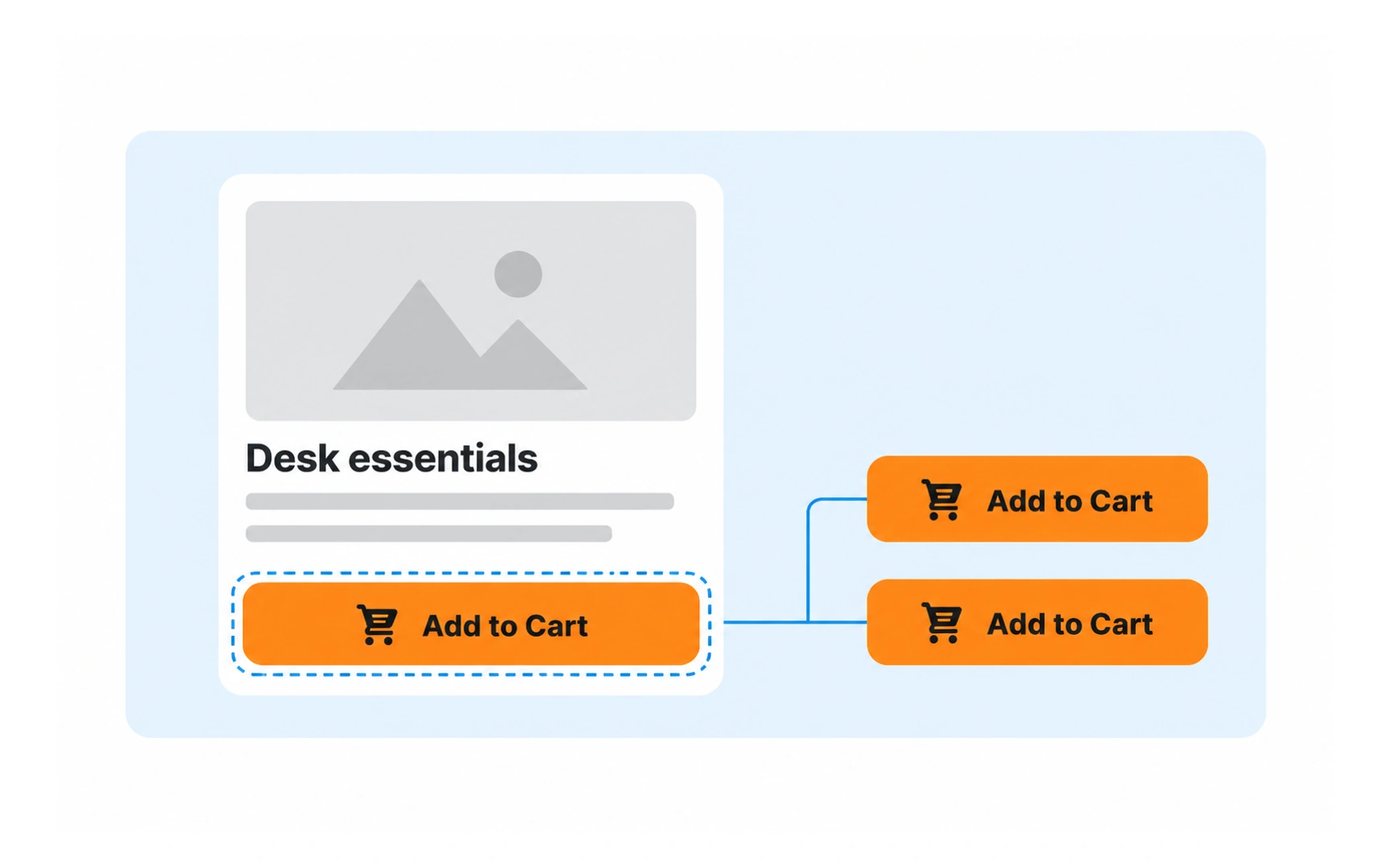
A UI component is a reusable building block, such as a button, input, card or navigation item. Components can contain other components; not every component is interactive.
The illustration isolates an Add to Cart button from a larger product card and shows it reused. Its label, icon, shape and behavior should remain predictable wherever that action appears.
Define relevant interaction states as well as the default appearance. Reuse saves effort only when the component still works with different content and input methods.
Layout
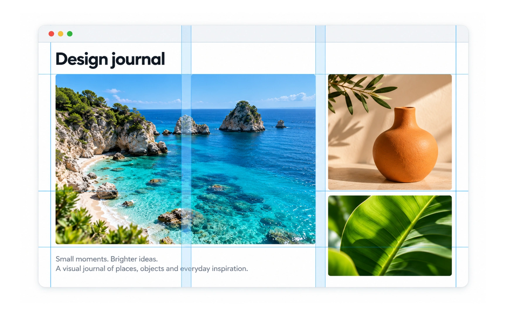
Layout is the arrangement of content within a screen. It determines which elements sit together, where attention goes and how a page is scanned.
The Design journal illustration uses column guides to align a large photograph, smaller images and supporting copy. The grid provides shared edges and spacing without making every item the same size.
Choose a structure that suits the content and task. A grid is a useful organizing tool, not a guarantee of good composition; check that the layout still works when text wraps or the viewport narrows.
REFERENCES
- 1. Negative Space in UI Design: Tips and Best Practices | Medium
- 2. Material Design | Material Design
- 3. Microcontent: How to Write Headlines, Page Titles, and Subject Lines | Nielsen Norman Group
- 4. The Role of Animation and Motion in UX | Nielsen Norman Group
- 5. Icon Usability | Nielsen Norman Group
- 6. Material Design | Material Design
TOPICS
FROM COURSE