Intro to UX Copy
Learn ten practical guidelines for writing clear, specific interface text.
The words in an interface are part of its design. This lesson covers microcopy, the short text on buttons, labels and messages, and ten practical guidelines for making it clear, specific and easy to scan.
What is microcopy
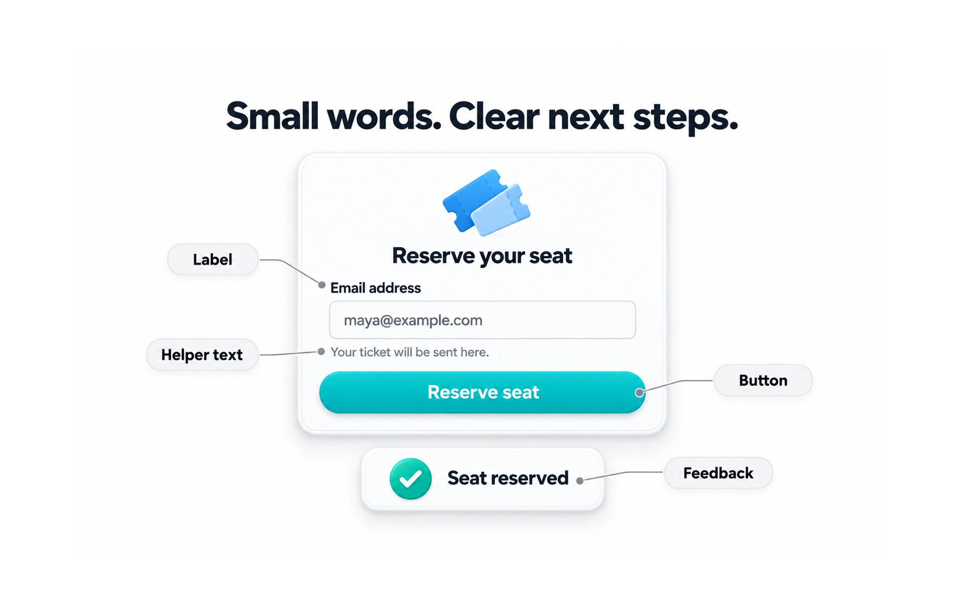
Microcopy is the small text that helps people use an interface: button labels, field hints, error messages, tooltips and confirmations.
A hint such as "We’ll only use this to send your receipt" under an email field answers a question before the person has to ask it.
Good microcopy removes doubt at the moment it appears. It tells people what to do, what will happen next and how to fix a problem.
Use plain words
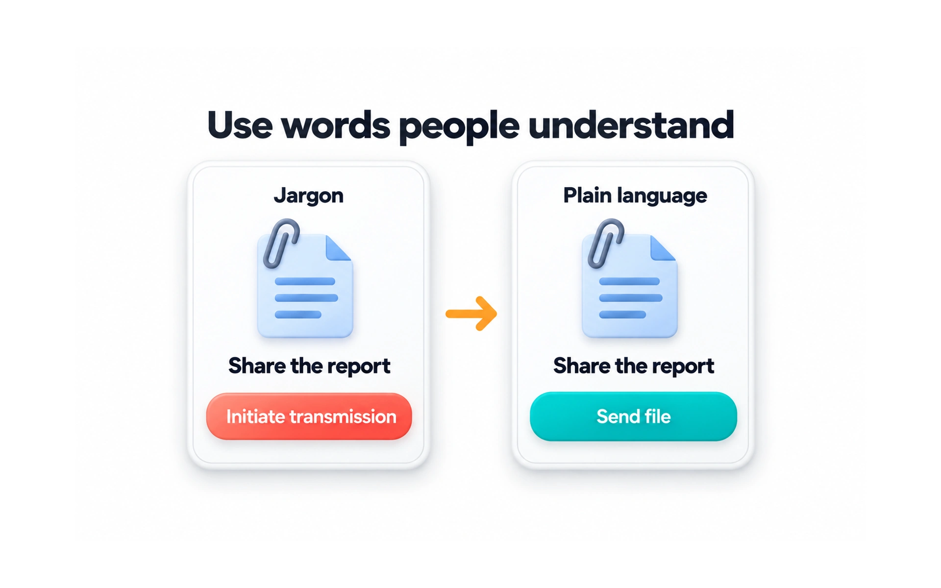
Unclear words slow people down. Jargon, technical terms and slang are especially hard for newcomers and for people reading in a second language.
Choose everyday words. "Allow this app to use your location" is clearer than "Authorize utilization of location services."
A simple test: read the text out loud. If it sounds stiff or you stumble over it, simplify it.
Be specific
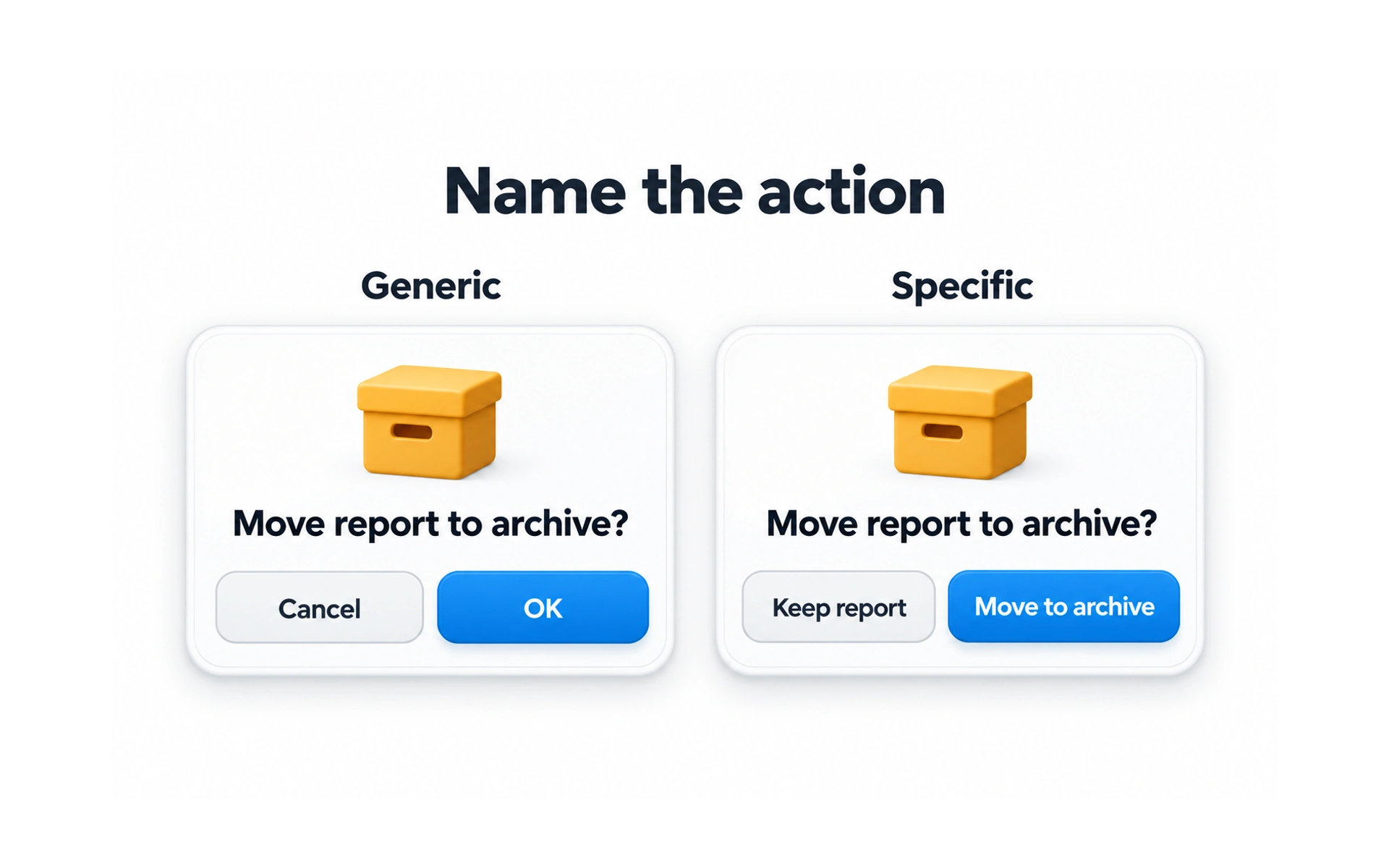
Generic labels such as "OK", "Yes", "Submit" and "Click here" don’t say what will happen.
Ask yourself: would someone understand this button without reading anything else on the screen? If not, the label is too vague.
Name the action instead: "Send invitation", "Pay $25" or "Delete project". Specific labels set clear expectations.
Avoid double negatives
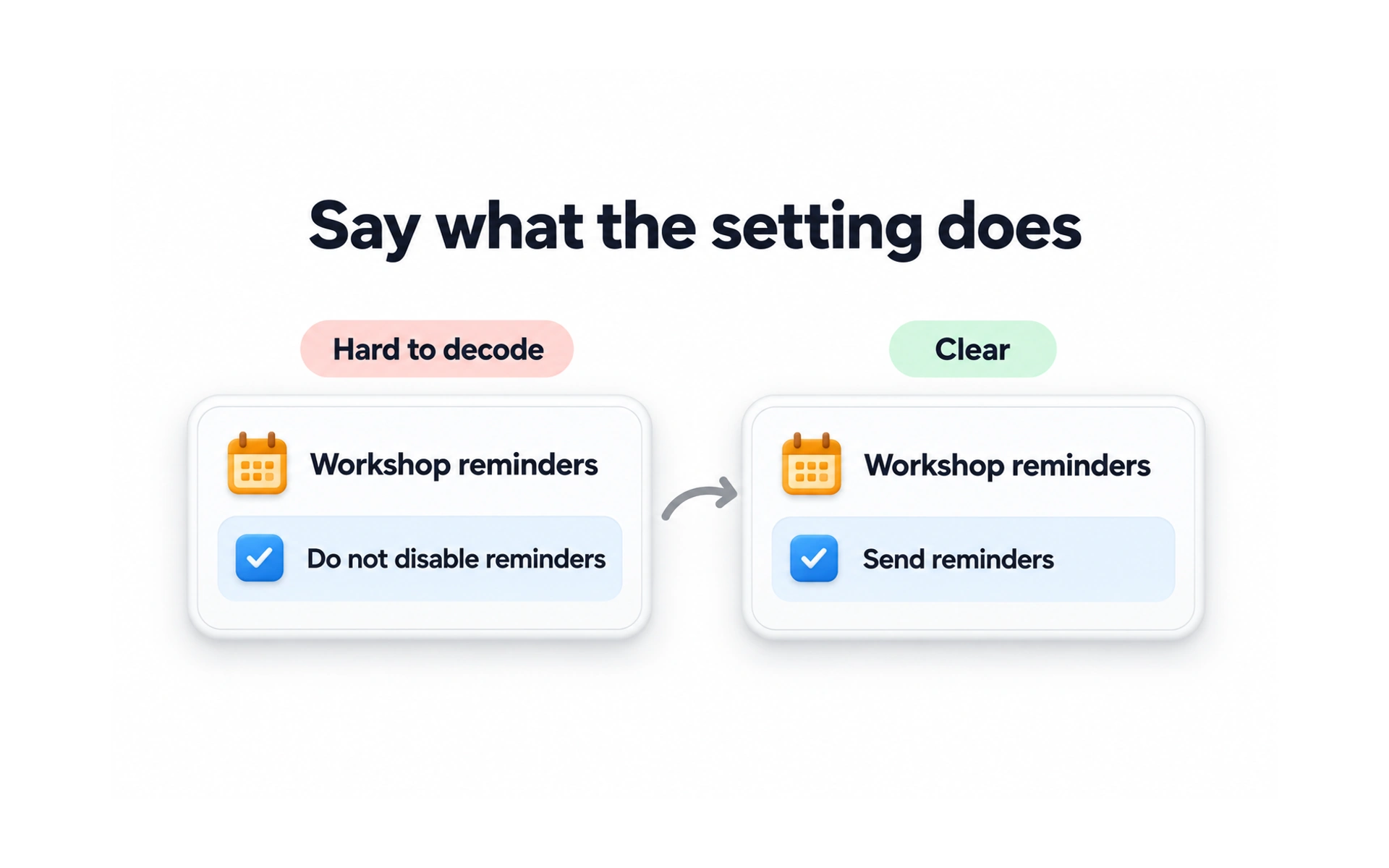
A double negative uses two negative words in one sentence, such as "Don’t not send me updates". People have to stop and work out what it means.
In settings and consent questions, double negatives can make people choose the opposite of what they want, which damages trust.
State things positively. "Send me updates" with a checkbox is clear at a glance.
Skip unnecessary politeness
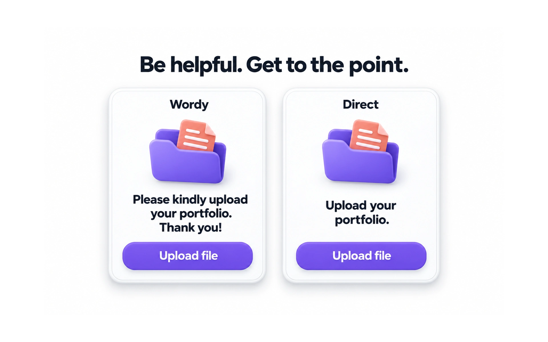
Being friendly is good, but extra words slow people down. "Please click here to continue, thank you" says the same thing as "Continue".
Overusing "please" and "thank you" in every label can sound robotic and clutter the interface.
Save politeness for moments where it matters, such as apologizing for an error or thanking someone after a purchase.
Don’t overuse your brand name
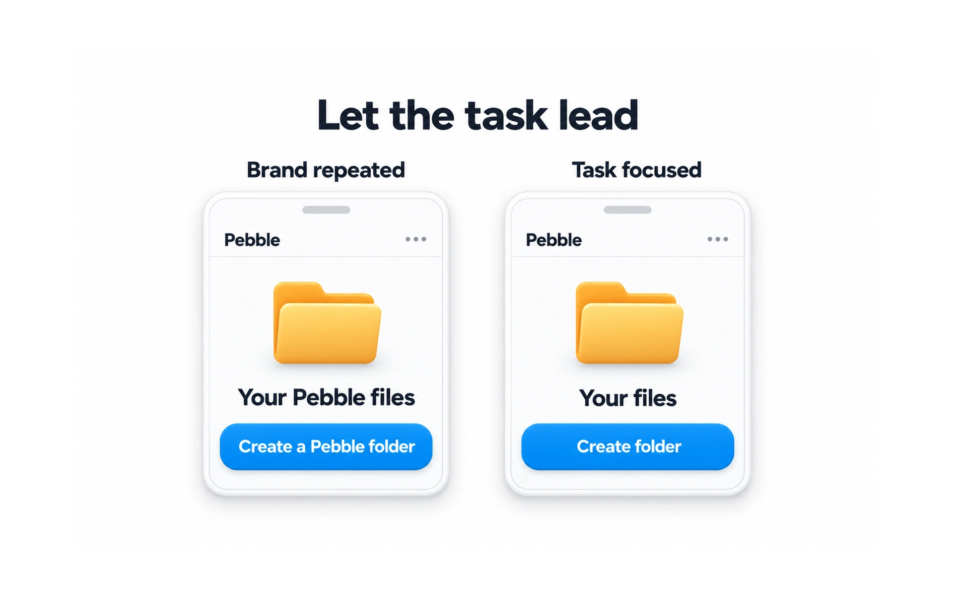
People already know which product they are using. Repeating the brand name in every label, such as "Explore BrandX’s BrandX features", adds noise.
It also makes labels longer and harder to scan, and can feel self-promotional.
Use the brand name where it helps, such as on the sign-in screen or in a welcome message, and keep everyday labels short.
Use active voice
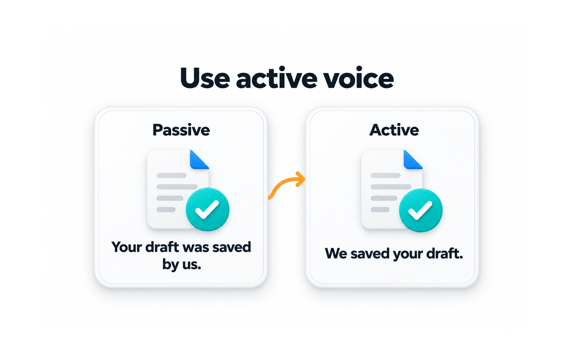
In active voice, the subject does the action: "We sent your receipt." In passive voice, it is hidden: "Your receipt has been sent."
Active voice is shorter and clearer about who does what, which makes it easier to read.
Passive voice still has uses, for example when the person responsible doesn’t matter or to avoid blaming the user in an error message.
Keep it concise
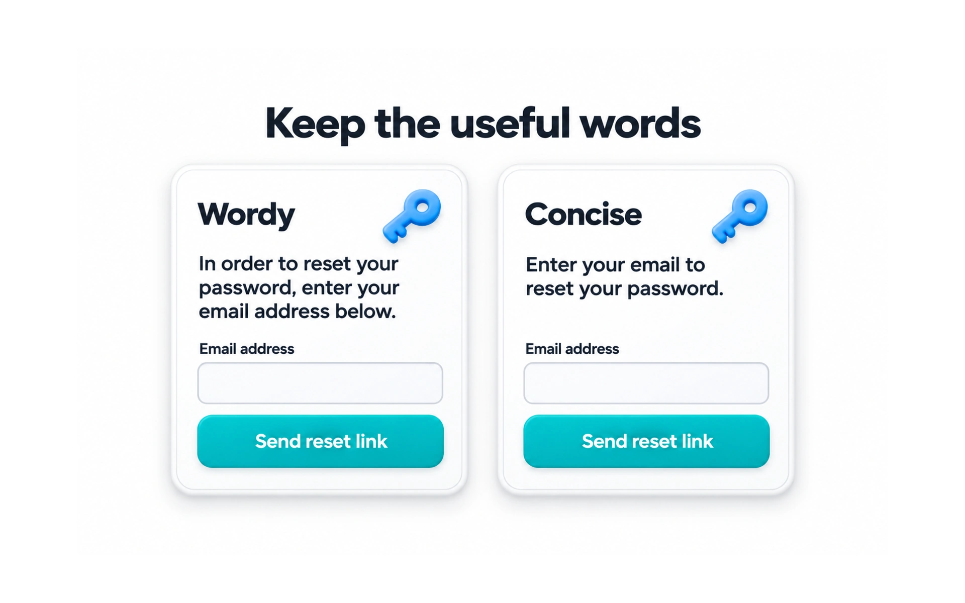
People scan interfaces; they rarely read every word. Short phrases are faster to take in than long sentences.
Cut words that add nothing. "Click on the button below to continue to the next step" can become "Continue".
Concise does not mean incomplete. Keep the information people need to make a safe decision, such as what a payment will cost.
Use numerals
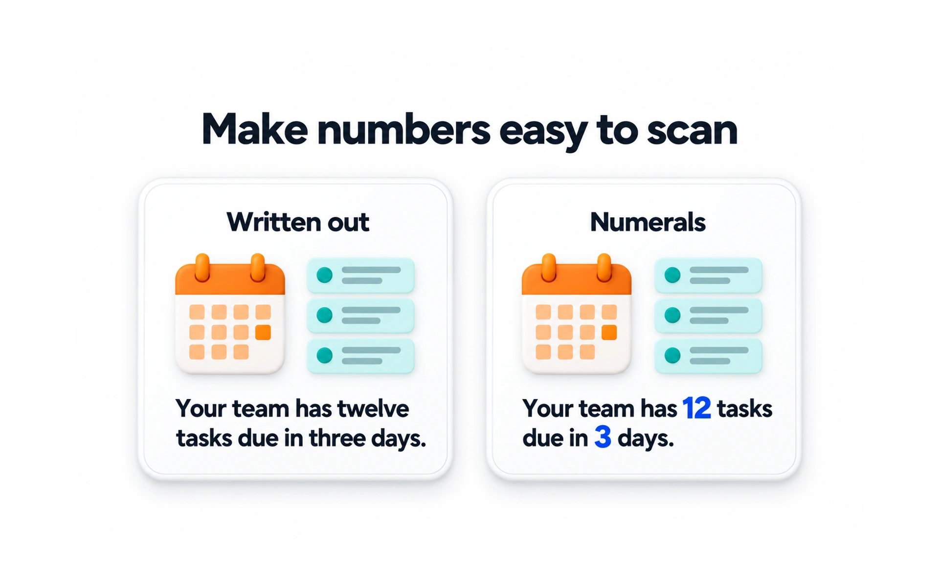
In interfaces, write numbers as numerals: "3 items" instead of "three items".
Numerals have clear benefits:
- They stand out, so people can scan for them.
- They take up less space on small screens.
- They are easier to compare at a glance.
This applies to prices, dates, quantities and times, which people often scan for.
Use a consistent case
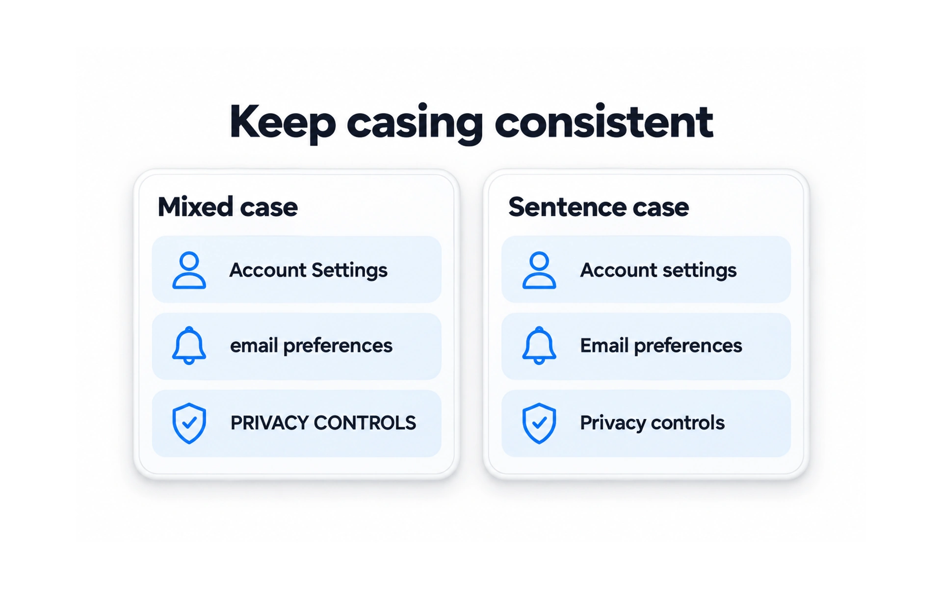
Case is how letters are capitalized. Mixing styles, such as "Add to Cart" next to "View profile", makes an interface look careless.
The common choices are:
- Sentence case: only the first word is capitalized, as in "Add to cart". Many products use it because it is easy to read.
- Title case: most words are capitalized, as in "Add to Cart".
- All caps: every letter is capitalized. Use it sparingly, because it is harder to read.
Pick one style for each kind of text, such as buttons or headings, and use it everywhere.
TOPICS
FROM COURSE