

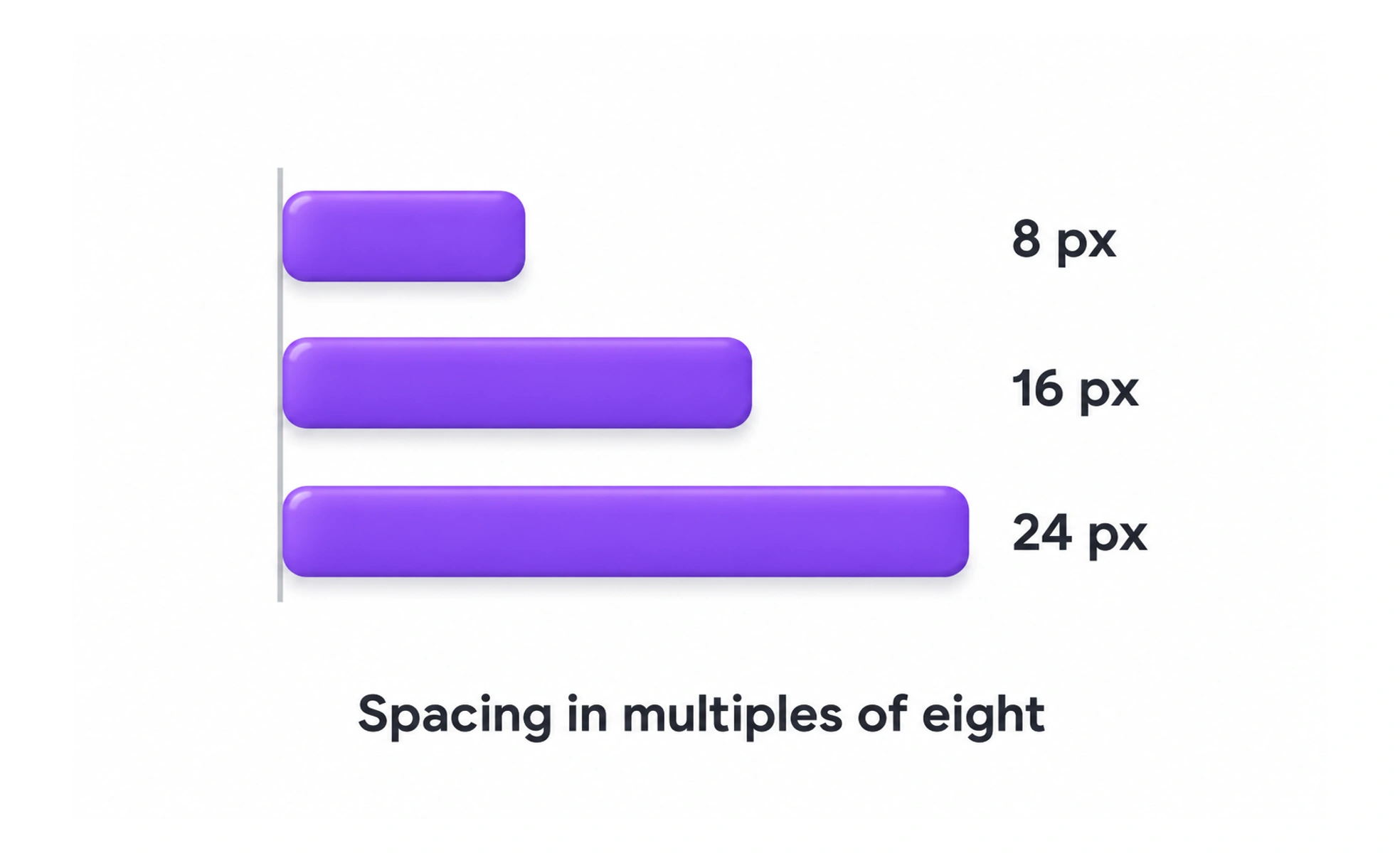
Using steps like 8px, 16px, 24px, 32px, 48px, and 64px creates consistent visual cadence. Because most digital display resolutions are divisible by 8, it prevents sub-pixel rendering blur across screen densities.
Think of it as graph paper with 8mm squares: everything you draw snaps neatly to the lines, ensuring that different elements always align in pleasing proportions.
How it works
Every layout offset, component height, and container padding adheres to multiples of 8. A 4px sub-grid is permitted for tighter elements like small icon padding and compact microcopy line heights.
When to use it
Adopt it as the foundational spacing scale for web and mobile design systems to align UI design files directly with frontend CSS utility tokens.
Common mistakes
Introducing random, arbitrary numbers like 13px or 27px into spacing, which ruins visual rhythm and creates friction during developer handoff.
Frequently asked questions
Key takeaways
- Eliminates arbitrary spacing decisions and arguments over pixel measurements.
- Scales cleanly across high-DPI Retina screens without fractional pixels.
- Unifies designers and engineers around a shared mathematical spacing token system.