

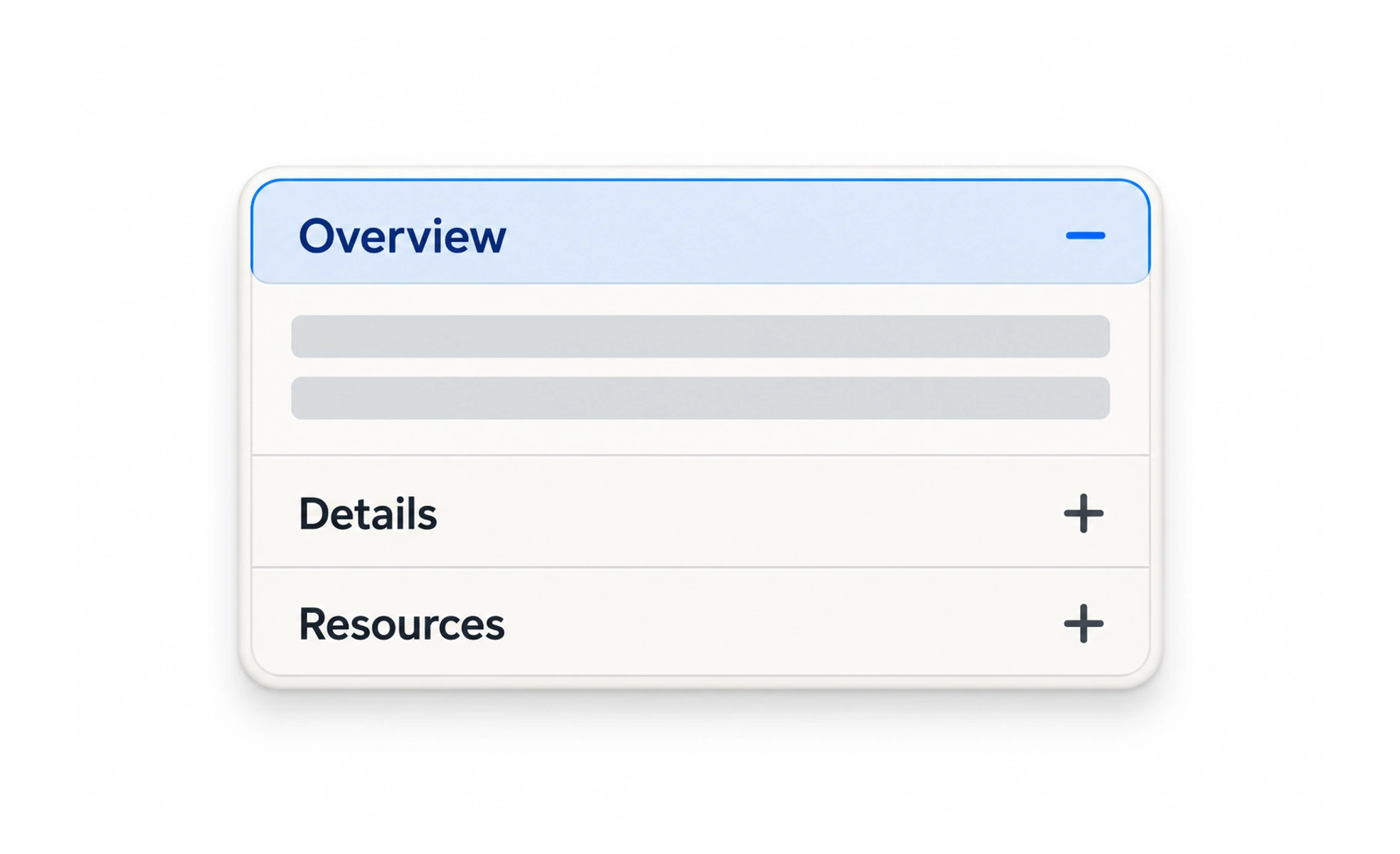
An accordion is a set of headings that reveal or hide their associated sections. It can make a long page easier to scan when people need only some of the details at a time.
It is like a set of labeled folders: each label tells you what is inside before you open it.
Use meaningful section names
A heading such as “Shipping options” helps people decide whether to open the panel. “More” or “Section 2” does not explain what will be revealed.
Choose a sensible default
Keep critical information visible when people need it to make a decision. Collapsing every section may shorten the page but can hide details that users should compare.
Keep open and closed states clear
The header should behave like a button, expose whether its panel is expanded, and let people open it with keyboard input. If only one panel can stay open, the behavior should remain predictable.
Preserve state where useful
When someone opens a panel, avoid losing their scroll or form progress. If content loads only after expansion, show a loading state and keep the panel’s title available. An FAQ can keep all sections closed initially when people need to scan the questions, while a guided task may open the first step. Make the control expose its expanded state and move focus predictably. On smaller screens, ensure opening a panel does not push its heading far out of view.
Frequently asked questions
Key takeaways
- Use accordions to organize optional detail, not hide essentials.
- Name each panel by its contents.
- Make expansion state and keyboard behavior clear.
- Preserve progress and context when panels open.