

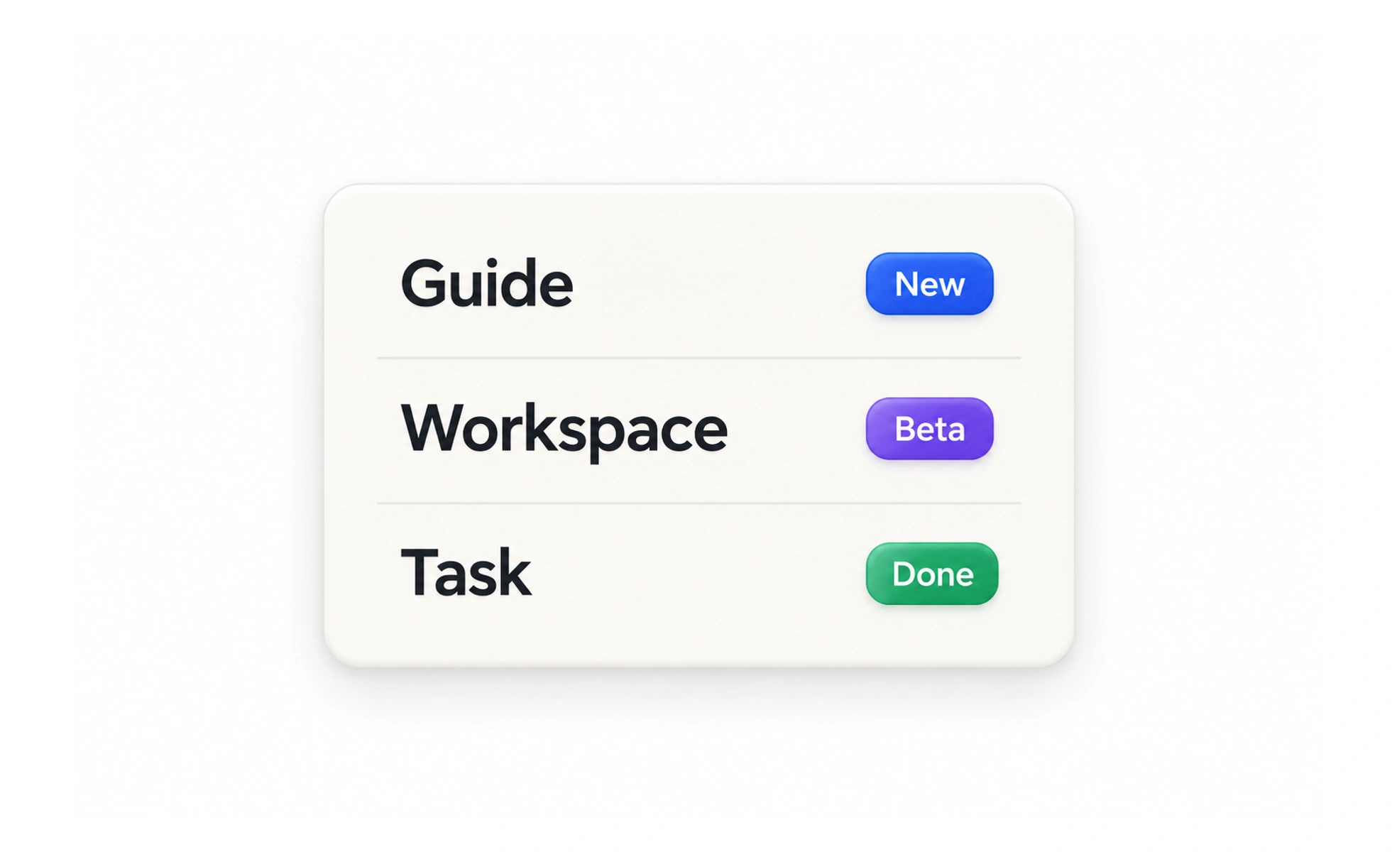
Badges draw attention to a small piece of information, such as a new message count, a verified state, or a completed milestone. Because they are visually prominent, their meaning and update rules should be clear and accurate.
A colored tag on a folder gives a quick clue about its contents; an interface badge provides a similar shortcut, provided the label is still understandable.
Use the right kind of badge
A count badge signals quantity, a status badge communicates a current state, and an achievement badge recognizes a completed goal. These meanings should not be mixed. For example, a red dot for unread activity should not look like a permanent award earned by the user.
Keep the meaning available
A badge’s color or icon may help recognition, but include text or an accessible name when the information matters. A number should have a defined meaning and a sensible upper limit. If a decorative badge adds no information, avoid exposing it as a confusing control to assistive technology.
Make status truthful
Only show a badge when its underlying condition is true. Achievement awards should be based on recorded criteria, and progress should not be presented as earned status. If a count is delayed or approximate, avoid wording that suggests exact real-time data.
Use visual restraint
Badges work because they are small and selective. Too many competing labels weaken their signal and make dense screens harder to scan. Use consistent shape, placement, and color for the same meaning, and verify contrast in every supported theme.
Frequently asked questions
Key takeaways
- Distinguish counts, current statuses, and earned achievements.
- Do not rely on color or icon shape as the only explanation.
- Tie awards and counts to accurate underlying data.
- Use badges selectively so important signals remain noticeable.