

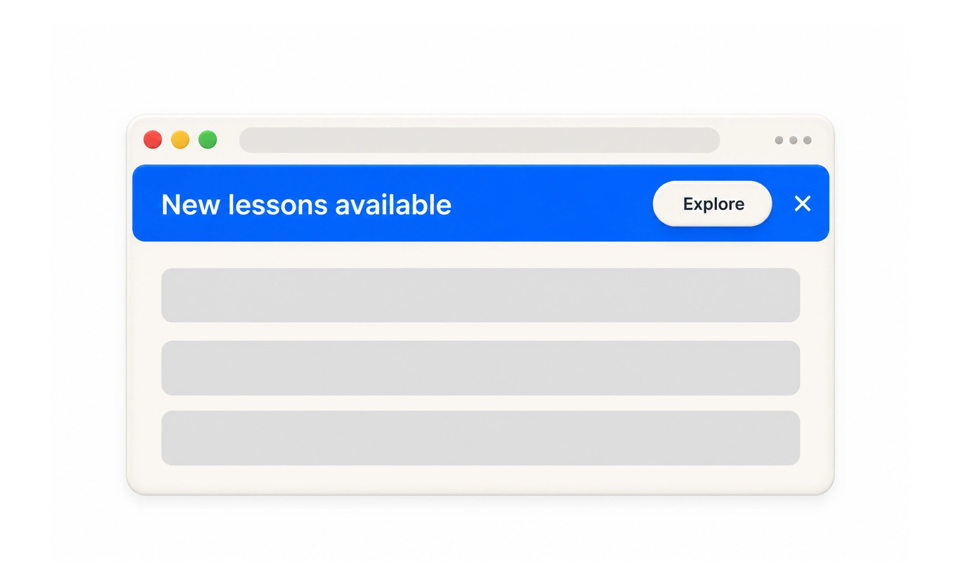
Banners may appear within a page or across an application. They are useful for information that needs visibility, but persistent or oversized banners can interrupt tasks and compete with the content people came to use.
A sign near a building entrance can guide visitors to a temporary change; a banner is a digital sign placed where people can notice it.
Match prominence to importance
Use a banner for information that affects a meaningful number of users or changes what they should do. Small, local feedback belongs closer to the affected control. A message shown everywhere should justify the attention it takes from every page.
Write a clear message
Explain what is happening, who is affected, and what action is available. Put the most important detail first and use a direct action label. Avoid vague promotional language when users need to understand an outage, deadline, policy change, or required step.
Choose placement and duration
Place the banner where it is easy to see without covering controls or pushing essential content out of view. Give temporary messages a clear end condition and make dismissal available when the message can be safely ignored. Do not repeatedly show a dismissed notice without a reason.
Preserve accessibility and responsiveness
Use sufficient contrast, readable text, and a logical focus order. On narrow screens, allow content to wrap and actions to remain reachable. Announce urgent dynamic messages appropriately, but avoid announcing routine promotional banners in a way that interrupts screen-reader users.
Frequently asked questions
Key takeaways
- Reserve banners for messages important enough to interrupt attention.
- State the impact and next step in plain language.
- Control placement, dismissal, and display duration deliberately.
- Check keyboard access, contrast, and mobile behavior.