

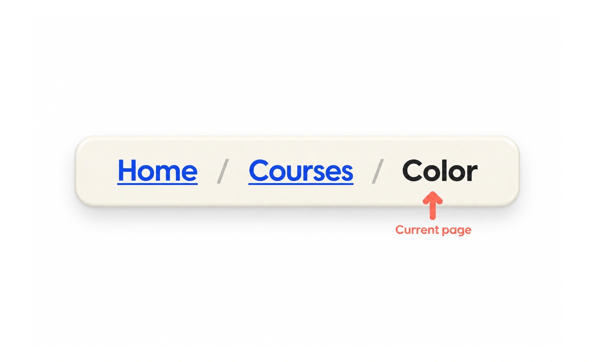
Breadcrumbs show a page’s place within a hierarchy and often provide links to its parent levels. They help people understand context and move upward, especially in deep content structures, but they do not replace primary navigation or a browser’s back button.
They are like a trail of signs that shows which larger places lead to the spot you are visiting.
Reflect the page hierarchy
Show a short path from a meaningful parent to the current page. Each step should match the product’s actual information structure, not simply repeat the sequence of clicks used to arrive. A person can reach a lesson from search, yet its breadcrumb should still show its course and learning area.
Make links and current location distinct
Parent levels are usually links; the current page is usually plain text and marked as the current location for assistive technology. Use a visible separator that is not mistaken for another link. Keep labels concise, but do not shorten them so much that their meaning disappears.
Use them where depth creates uncertainty
Breadcrumbs are useful in nested catalogs, documentation and account settings with clear parent-child relationships. They add little to a flat page or a short linear task. On narrow screens, preserve the most useful parent context instead of letting the trail wrap into a confusing stack.
Example: returning to a course
A learner opens “Color contrast” from a direct link. The breadcrumb “Courses › Accessibility basics › Color contrast” explains where the lesson belongs and lets the learner return to the course. A breadcrumb that instead says “Home › Search › Color contrast” would describe the entry route, not the content structure, and would be less useful to someone who arrived another way.
Frequently asked questions
Key takeaways
- Represent hierarchy, not click history.
- Make parent links distinct from the current page.
- Use breadcrumbs in genuinely nested structures.
- Keep the trail readable on small screens.