

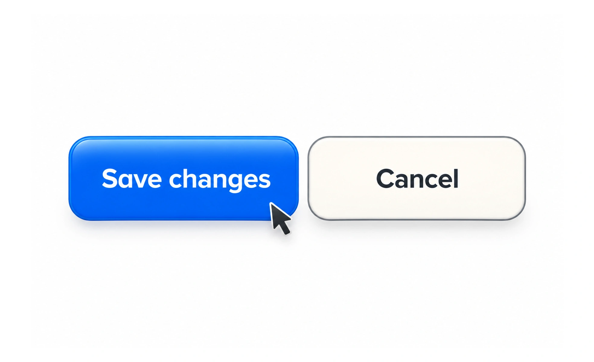
A button is a control that asks the interface to perform an action, such as saving a draft, submitting a form, or opening a dialog. Its label should describe the action people can expect when they activate it.
A button is like a clearly named switch at a control panel: its wording should tell you what will happen when you press it.
Use the right behavior
A submit button sends a form; a button inside a form may instead perform another action. Define the intended type so a nearby “Add another field” control does not accidentally submit the form.
Name the action
Labels such as “Save changes,” “Send invitation,” or “Choose a date” are more informative than “Click here.” If the action is destructive, say what will be removed and provide a safe confirmation when appropriate.
Show available and busy states
A disabled button should not be the only explanation for what is missing. When work is in progress, avoid duplicate submissions and tell the person what is happening; restore the control if the request fails.
Make the whole control usable
Provide a comfortable target, visible focus, and a label that works without the icon. If the control uses only an icon, supply an accessible name and ensure its purpose is clear in context. A submit button should communicate its action, such as “Send request,” and enter a busy or disabled state while duplicate submission is being prevented. If a request fails, restore a usable action and retain the answers. For destructive actions, name the consequence instead of using a vague label such as “Continue.”
Frequently asked questions
Key takeaways
- Use wording that describes the result.
- Set form-button behavior explicitly.
- Explain why an action is unavailable.
- Prevent duplicate actions while a request is pending.