

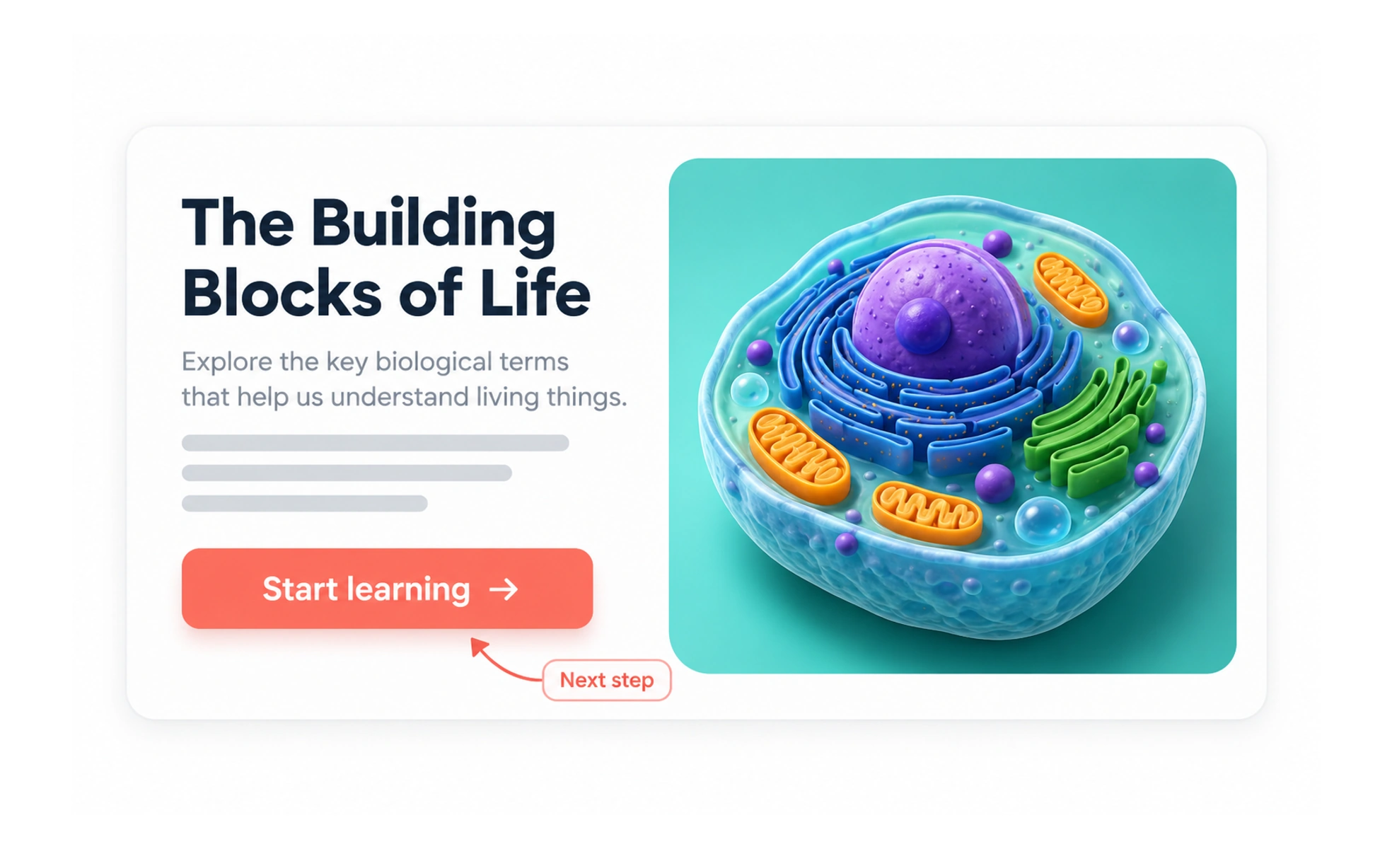
A call to action (CTA) is a prompt that helps someone take a meaningful next step. It may be a button, link, or another control. The CTA connects what a person is trying to do with the action the product makes available.
A CTA is like the next sign on a trail: it should point to the next useful step, not shout every possible destination at once.
Start with intent
Choose a primary CTA based on the page’s main user task. On a course page, “Start lesson” may be primary while “Save for later” is useful but secondary.
Describe the destination or outcome
A CTA should set a fair expectation. “Preview plan” is different from “Purchase plan,” and “Request access” is different from “Join now.” Do not use urgency to disguise what an action does.
Give alternatives their place
People may need to compare, defer, or exit. Secondary actions can remain available without competing visually with the main path. If there are several equally important actions, clarify the decision before styling one as primary.
Measure completion, not just clicks
A button click does not prove that the task succeeded. Check whether people reached the intended result, encountered errors, or backed out after learning what the action meant. “Start assessment” is clearer than “Go” when it opens an assessment. If the next step is irreversible or requires payment, state that before the person commits. Keep the primary action visually distinct from secondary routes, but make sure both remain understandable and operable by keyboard and touch.
Frequently asked questions
Key takeaways
- Choose a CTA around the person’s next task.
- Make the result clear before activation.
- Keep secondary actions available but quieter.
- Measure task completion, not only button clicks.