

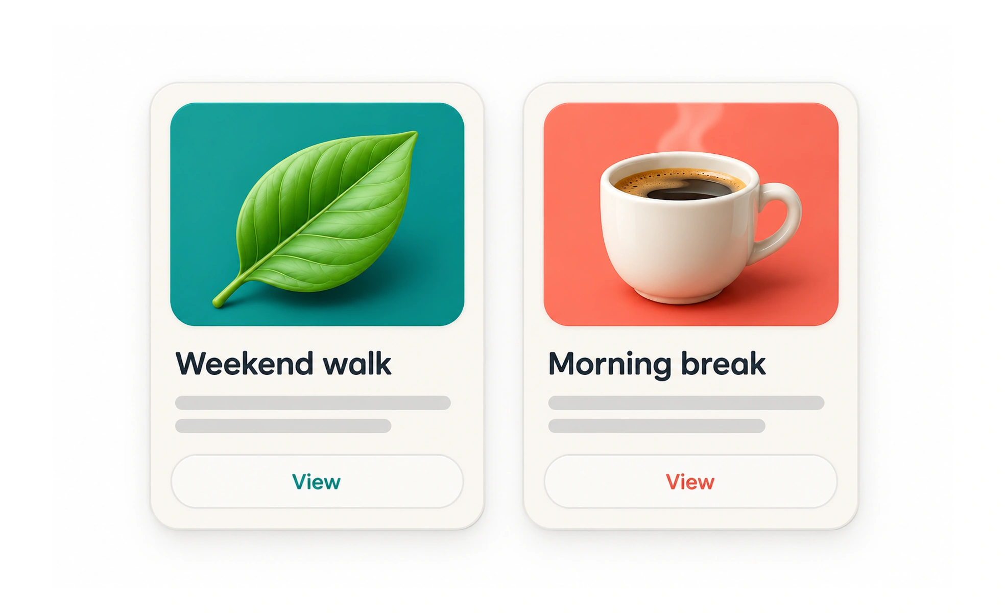
A card groups a small set of information and actions about one item, such as a course or project. Cards help people scan a collection of distinct items, but repeating the same container around every piece of content can create visual clutter.
A card is like a labeled file in a tray: it summarizes one item so people can decide whether to open it.
Give each card one clear subject
A card should represent one recognizable item and include the details needed to choose it. A course card may show its title, level and estimated time. Avoid packing it with every possible statistic, badge and secondary action; the collection becomes harder to compare when each card competes for attention.
Make interaction boundaries obvious
If the whole card opens an item, make that behavior clear and avoid nesting several unrelated clickable controls inside it. If only the title or a button is interactive, style that target accordingly. Ensure keyboard users can reach each action in a logical order.
Design for scanning and variation
Keep a consistent structure across a collection so people can compare items. Plan for long titles, missing images, localization and different content lengths. Do not force every card to the same height by clipping useful information or leaving awkward blank space.
Example: recommended lessons
A learner sees three lesson cards with a clear title, course name, reading time and exercise count. The bookmark control is separate from opening the lesson, with its own accessible label and feedback. If a lesson has no image, a neutral placeholder preserves the layout without inventing artwork or distorting the text.
Frequently asked questions
Key takeaways
- Use cards for distinct items people need to scan.
- Keep the main action and other controls unambiguous.
- Plan for varied content and missing media.
- Avoid adding containers without a useful grouping.