

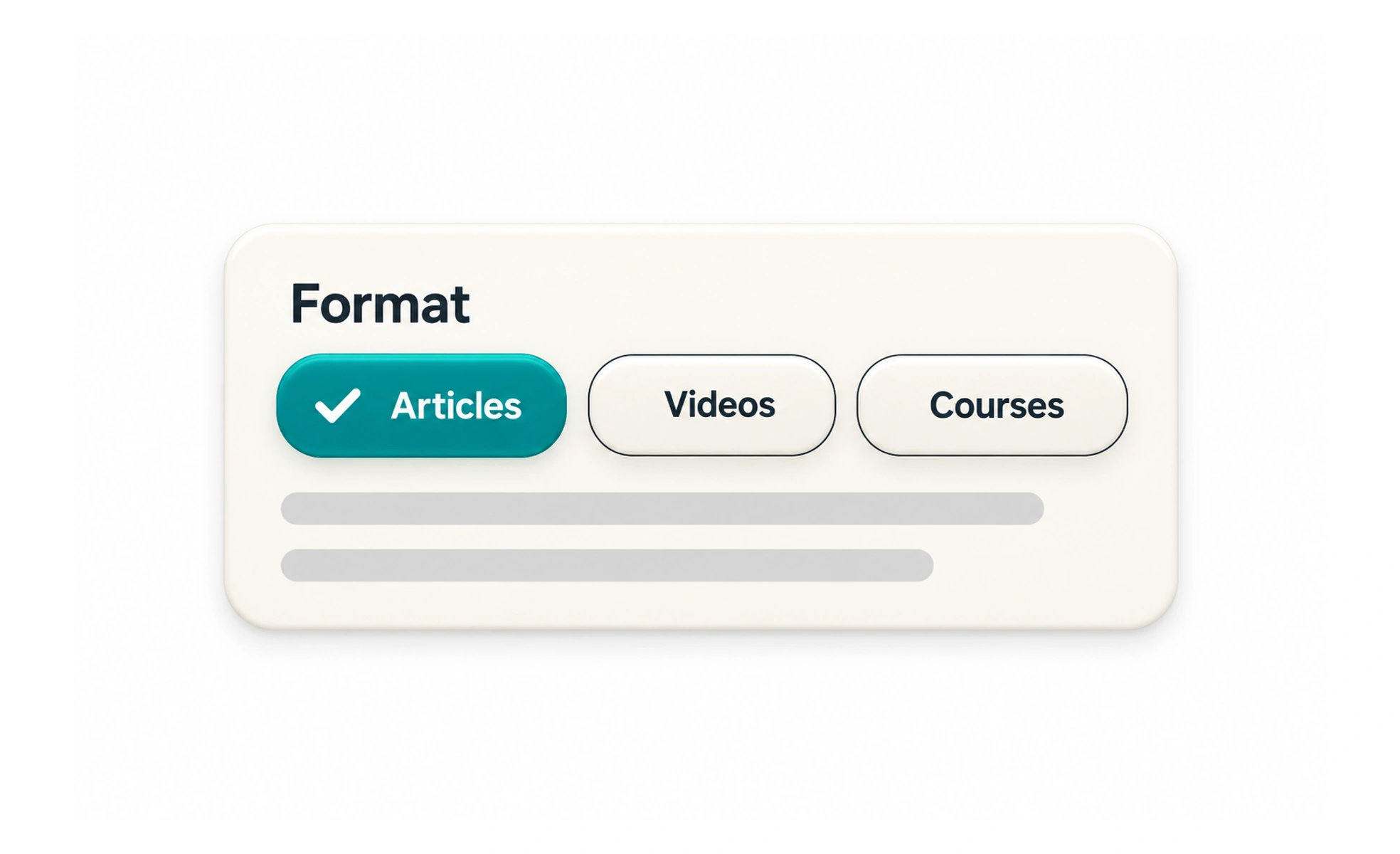
Chips often appear in search, forms, and content filters. Their visual size is small, but the interaction should still make it clear whether a chip can be selected, removed, or opened.
A labeled tag on a tray identifies one choice; a chip is a small, interactive version of that label inside a digital interface.
Choose one clear role
A chip may be a selectable filter, a selected value that can be removed, or a static label. These roles should not look identical if their behavior differs. Use a button or other suitable semantic control for interactive chips, not a decorative element with a click handler.
Make selection visible
When a chip is selected, communicate the state with more than a subtle color shift. A check, pressed state, or explicit label can help users understand what is active. If several filters are selected, make it easy to see and clear them.
Keep targets usable
Compact does not mean inaccessible. Provide a comfortable touch target, visible keyboard focus, and a meaningful accessible name. A small close icon should have a label that says which value will be removed rather than only saying “close.”
Prevent surprising behavior
If selecting a chip updates results immediately, make that response predictable and preserve the selection as users browse. If changes apply only after submission, show an apply action or another clear cue. Avoid chips that appear removable but silently change an unrelated setting.
Frequently asked questions
Key takeaways
- Use distinct visual and semantic patterns for selectable, removable, and static chips.
- Expose selected state clearly and provide a way to reset filters.
- Use accessible labels, focus states, and touch-sized targets.
- Make it clear when a selection changes results.