

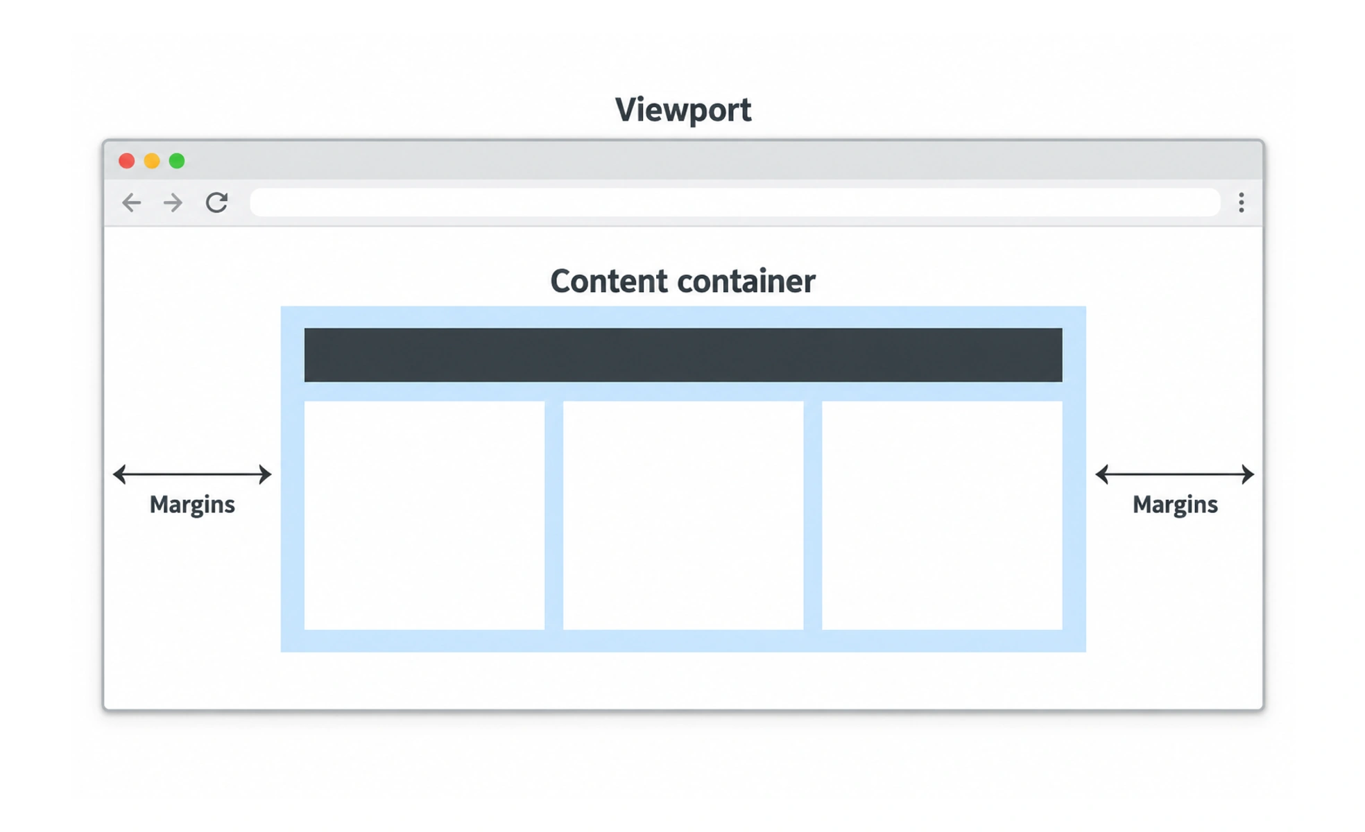
In interface design, containers help establish alignment and readable content widths. In code, a container may also group related elements or provide a boundary for layout behavior; the exact meaning depends on the system being discussed.
A tray keeps related objects together and gives them a shared boundary; a layout container does something similar for interface content.
Create a useful boundary
A container can align a page’s main sections, keep text from becoming too wide, or group related controls. Its boundary may be visible, such as a card, or invisible, such as a centered content wrapper. Choose the boundary based on structure rather than adding boxes around every element.
Set width and spacing deliberately
A maximum width can support readable line lengths on large screens, while flexible width uses available space on smaller screens. Internal padding should keep content away from edges without wasting room. Consider nested containers carefully because repeated padding can make layouts feel cramped.
Keep semantics separate from styling
A visual container does not automatically need a special semantic element. Use HTML structure that reflects the content and use CSS for layout. In component systems, define reusable container behavior so pages do not accumulate slightly different width and spacing rules.
Test content changes
Long labels, localization, zoom, and dynamic content can expose fixed-size assumptions. Let containers grow when their content needs more space, and avoid clipping text or controls. Check how the layout behaves at the narrowest supported widths as well as on a large display.
Frequently asked questions
Key takeaways
- Containers group content or constrain its layout in a consistent way.
- Use width and padding to support readability and alignment.
- Do not confuse a visual container with semantic HTML meaning.
- Test flexible content, zoom, and narrow screens.