

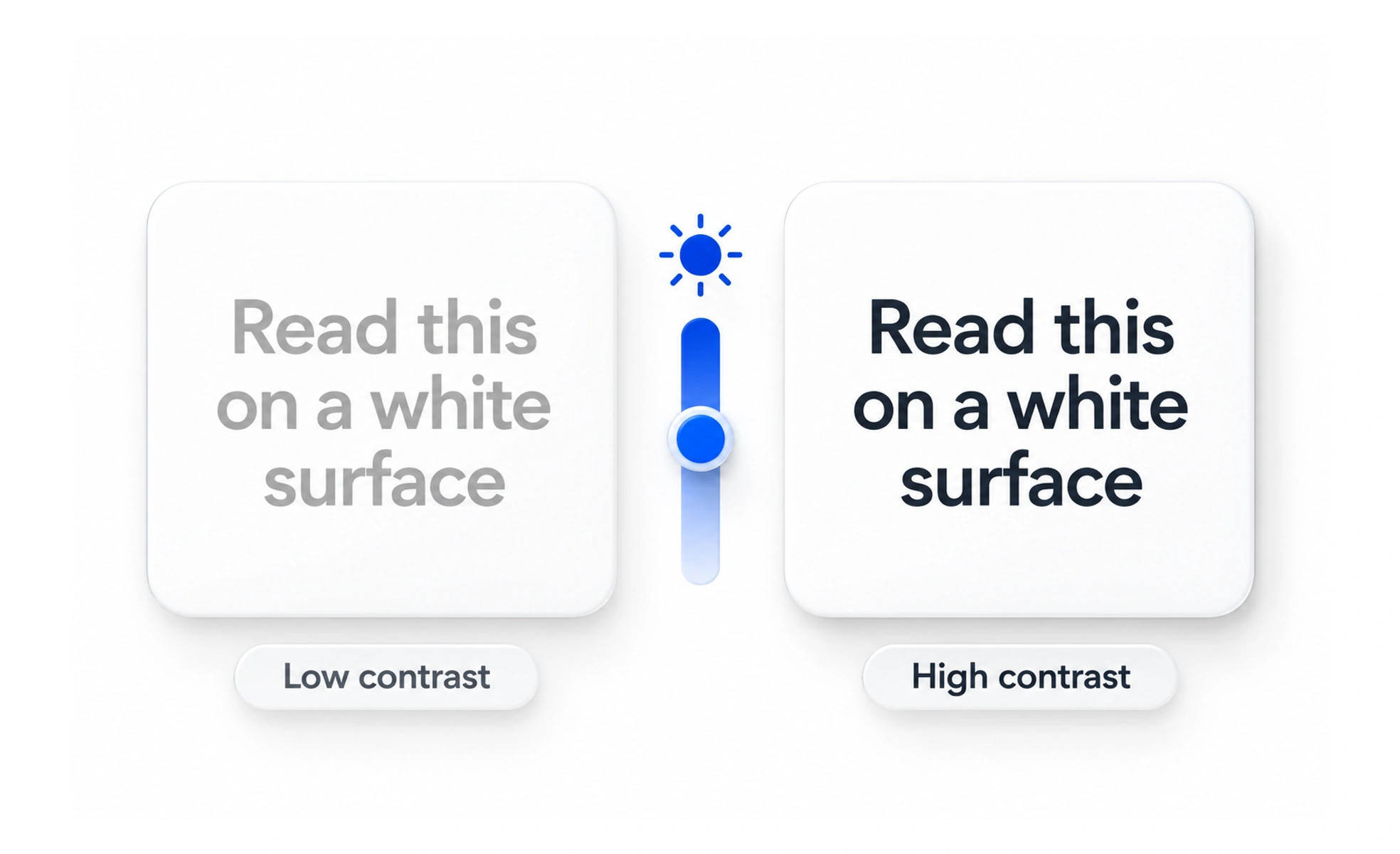
Expressed from 1:1 (zero contrast, white on white) to 21:1 (maximum contrast, black on white), it determines readability. Web Content Accessibility Guidelines mandate specific minimum ratios to ensure content is readable by people with low vision.
Think of it like this. Black letters on a bright yellow construction sign stand out from a mile away, while light gray letters on a silver sign blend into the sky.
How it works
WCAG Level AA requires at least 4.5:1 for regular text and 3:1 for large text (18pt or 14pt bold). Non-text elements like button borders and icons also need at least 3:1 against their backgrounds.
When to use it
Check contrast whenever selecting brand colors, styling buttons, designing dark mode themes, or displaying placeholder text inside input fields.
Common mistakes
Using faint gray text on white backgrounds to look minimal and modern, which makes the text impossible to read in bright daylight or for older users.
Frequently asked questions
Key takeaways
- Standard body copy requires a minimum 4.5:1 contrast ratio under WCAG AA.
- Interactive components and icons require at least 3:1 contrast.
- Good contrast helps all users in high-glare environments, not just those with visual impairments.