

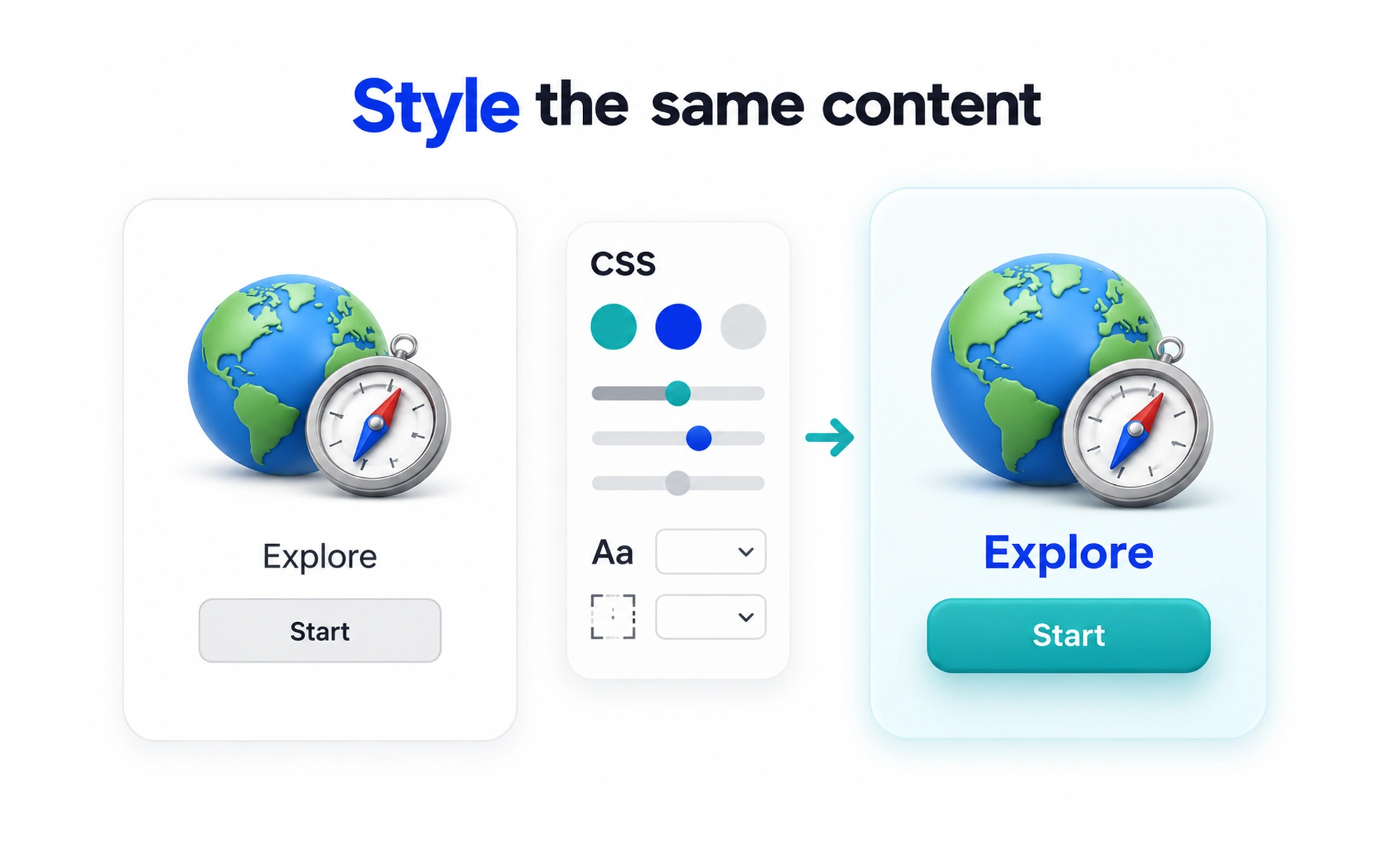
Browsers apply CSS rules to elements using selectors, declarations, and the cascade. CSS can express shared design tokens, component states, and layouts that adapt to different screen sizes and user preferences.
HTML describes the parts of a house; CSS is like the plans for how those rooms are arranged, painted, and lit.
Understand rules and selectors
A CSS rule targets elements with a selector and applies declarations such as color, spacing, or display. More specific rules can override broader ones, and source order can matter when specificity is equal. A predictable naming and layering strategy makes these interactions easier to maintain.
Use layout tools for relationships
Flexbox is useful for arranging items along one axis, while Grid supports rows and columns together. Normal document flow remains valuable for content that should expand naturally. Choose the simplest layout model that describes the relationship instead of positioning every element manually.
Adapt to users and viewports
Media queries can change layout at responsive breakpoints, while relative units and flexible sizing allow content to grow. CSS also supports preferences such as reduced motion and increased contrast. A responsive interface should preserve usability when text is zoomed or translated, not merely fit a list of device widths.
Keep styling maintainable
Shared variables and reusable component styles help teams maintain consistent colors, spacing, and states. Avoid overly broad selectors and unexplained overrides that make future changes risky. Test focus, hover, disabled, loading, and error states in both themes when the product supports them.
Frequently asked questions
Key takeaways
- CSS controls visual presentation and layout through rules applied to content.
- The cascade and selector specificity determine which declarations win.
- Use flexible layout and responsive rules that follow user needs.
- Shared tokens and clear component styles reduce inconsistency.