

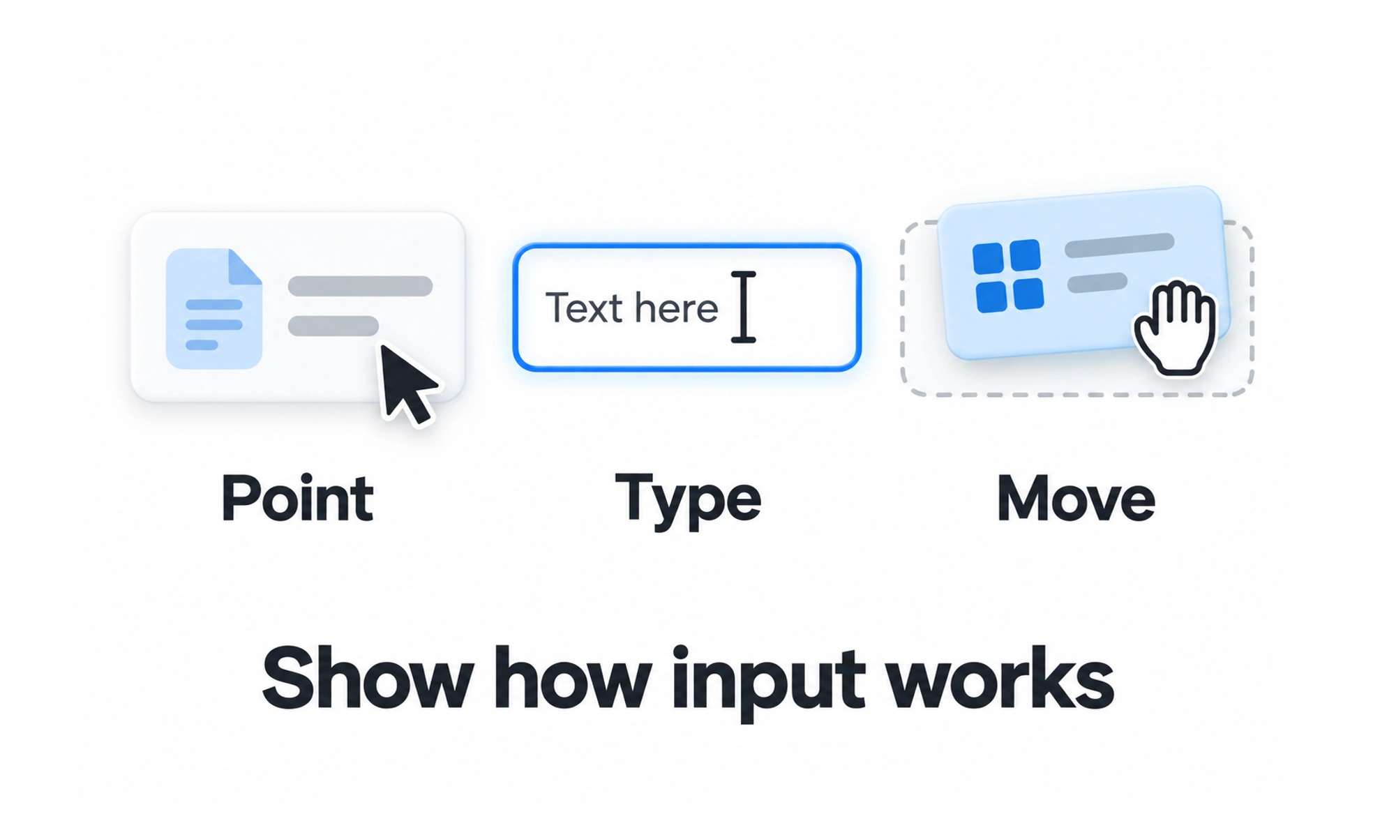
The term can refer to a text insertion point, a mouse or trackpad pointer, or a visual marker used in collaborative software. Each type helps people understand location, focus, or available interaction.
A pencil tip shows where a mark will appear on paper; a cursor gives a digital clue about where an action will take effect.
Distinguish pointer and text cursors
A pointer cursor moves across the interface and can change shape to indicate an action, such as selecting text or resizing a panel. A text caret marks the insertion point inside editable content. Their appearance should follow familiar platform conventions unless a clear reason requires a change.
Make interaction cues reliable
A hand pointer often suggests that an element is clickable, while a text cursor suggests editable text. These cues should agree with actual behavior. Do not show a clickable pointer on a decorative element or remove it from a control in a way that hides its interactivity.
Do not rely on cursor shape alone
Touch devices may have no pointer cursor, and keyboard users navigate through focus rather than hover. Provide visible control styling, labels, focus indicators, and semantic behavior so an action remains discoverable without a mouse.
Use custom cursors sparingly
A custom pointer can support a brand or specialized task, but it must remain visible against varied backgrounds and must not obscure content. Keep its size and movement comfortable, and test zoom, high contrast, and touch fallback behavior.
Frequently asked questions
Key takeaways
- Cursors indicate position, focus, or possible pointer behavior.
- Keep cursor cues consistent with what an element actually does.
- Provide interaction cues for keyboard and touch users too.
- Custom cursors should remain visible and avoid blocking content.