

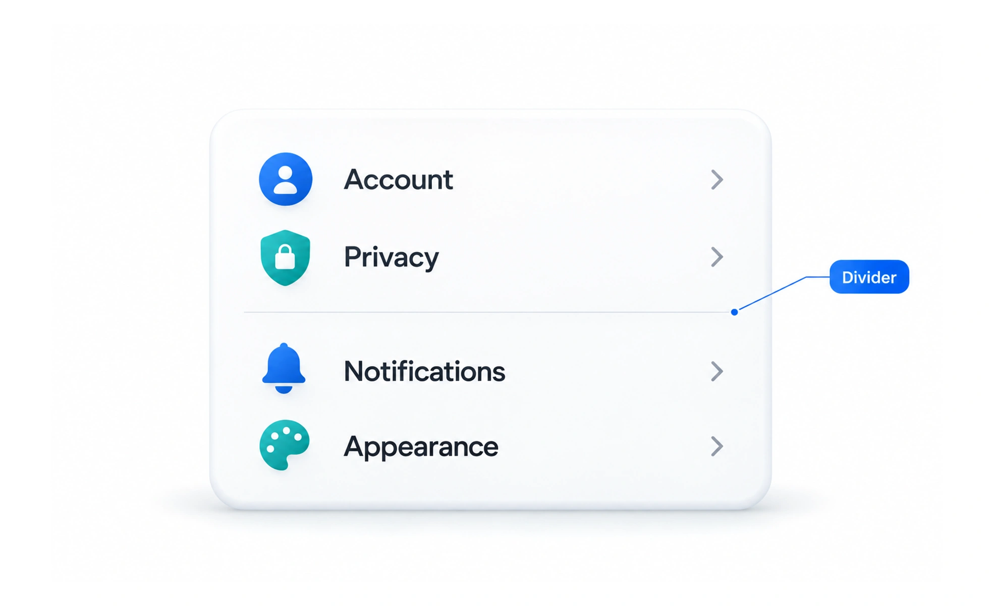
Dividers may use a line, spacing, or a change in surface. They help structure dense interfaces, but excessive separators make a screen feel fragmented and compete with more meaningful hierarchy cues.
A thin rule on a page separates one section from another without needing a new page; a digital divider provides a similar pause.
Separate meaningful groups
Use a divider when it helps people understand that one group ends and another begins. In a list, a subtle line can separate rows; in a settings page, spacing and headings may communicate the structure better. Do not add dividers between every element by default.
Choose visual weight carefully
A divider should be noticeable enough to support scanning but quieter than the content it organizes. Consider contrast, thickness, and the surrounding surfaces in both light and dark themes. If the line becomes the strongest visual element, reduce its emphasis or use spacing instead.
Preserve layout relationships
A divider should align with the content it separates and respond to the same container rules. On narrow screens, check whether it creates awkward breaks or extends into unrelated areas. Keep interactive controls away from the line so it does not look like a boundary users must cross.
Use semantics only when needed
A decorative divider can be hidden from assistive technology. If a separator communicates a structural boundary that matters in a menu or list, use the appropriate semantic pattern. Avoid announcing purely decorative rules as if they were content.
Frequently asked questions
Key takeaways
- Use dividers to communicate meaningful grouping, not decoration alone.
- Keep contrast and thickness subordinate to content.
- Align separators with their content containers and responsive layout.
- Expose a divider semantically only when the boundary matters.