

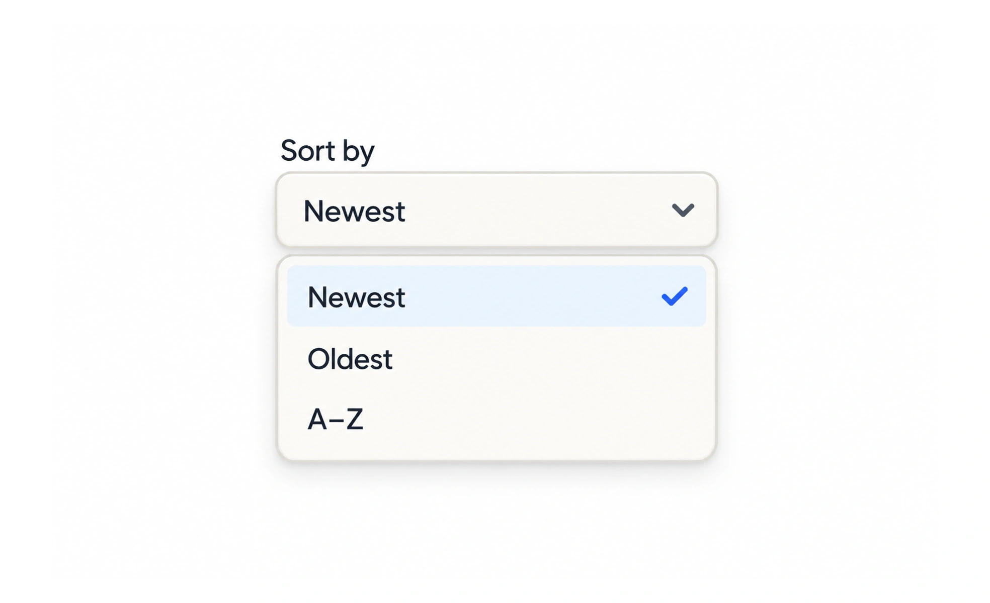
A dropdown is a compact control that reveals a list of choices or actions. The term is used for several different patterns, so first decide whether the person is selecting a value, searching suggestions, or choosing a command.
It is like a closed menu at a counter: the closed state should show what is selected or what action will be available when opened.
Choose the right pattern
A native select works well for a straightforward fixed choice. An editable combobox supports typing and suggestions. A menu button reveals commands rather than a stored field value. They may look similar but behave differently.
Make the current value visible
When a choice has been made, show it in the collapsed control. A placeholder such as “Choose a region” should not replace the selected value or make it look like no choice was saved.
Support finding an option
For a long list, provide type-ahead or search, and keep keyboard focus predictable as the list opens. A short list may be quicker when all choices remain visible.
Handle no match and dismissal
If search returns no options, explain that clearly and preserve the typed query. Escape should close a popup without unexpectedly replacing the prior selection. A country field with a small, stable list may work as a select; a company field with thousands of matches needs search and a clear loading state. Keep the popup attached to its trigger, let keyboard users move through options, and show which value is selected without relying only on a color change.
Frequently asked questions
Key takeaways
- Do not use one dropdown pattern for every need.
- Show the selected value while closed.
- Add search only when it helps with a long list.
- Preserve a choice when someone dismisses the menu.