

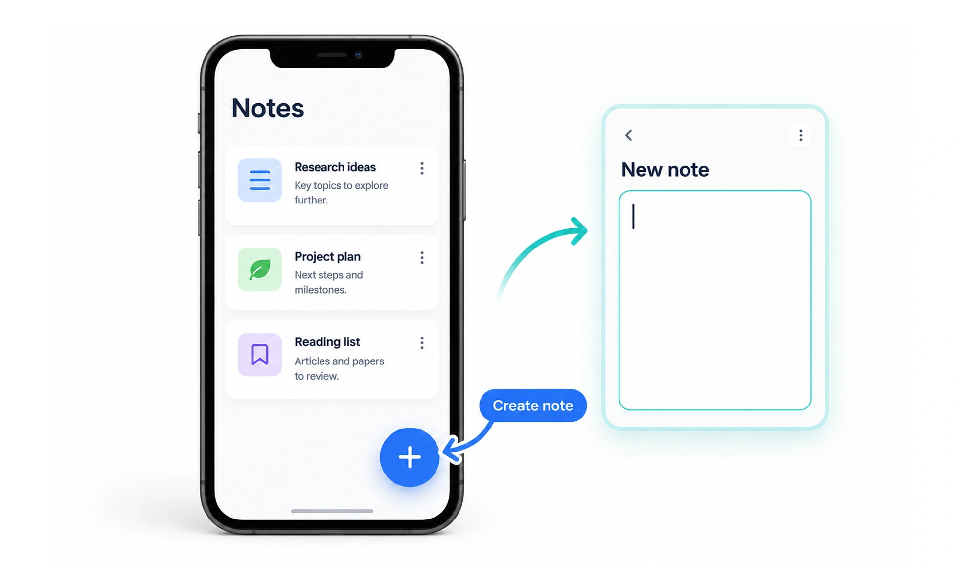
A FAB stays visually distinct from surrounding content and is often positioned above it. It works best when one action is clearly more important than the others, such as creating an item or starting a task. Its placement and behavior should remain predictable as the page changes.
It is like a clearly marked shortcut on a workbench: useful when it leads to the task people most often need, distracting when every tool gets one.
Choose one primary action
A FAB draws attention, so reserve it for the screen’s most useful action. If several actions have equal importance, place them in a toolbar or menu instead. Adding multiple floating buttons weakens the visual hierarchy and makes it harder to know where to begin.
Place it where it stays reachable
Keep the button clear of navigation, dialogs, device gestures, and important content. On small screens, consider how a thumb reaches it and whether scrolling or an on-screen keyboard covers it. Its position should be consistent across related screens, not jump without a reason.
Make the action recognizable
A familiar symbol can make a compact button efficient, but an unfamiliar icon needs a label or accessible name. Explain the action on hover or focus when space allows. After activation, provide visible feedback so people know the action started or completed.
Check changing states
A floating control can overlap content as lists grow, banners appear, or responsive layouts change. Test these states and provide enough page padding for the final item to remain readable. If the action is unavailable, explain why instead of leaving an inert button that looks active.
Frequently asked questions
Key takeaways
- Use a FAB for one clearly primary action.
- Keep it reachable and away from essential content.
- Give icon-only controls an accessible name and clear feedback.
- Test overlap and reachability at narrow widths and changing states.