

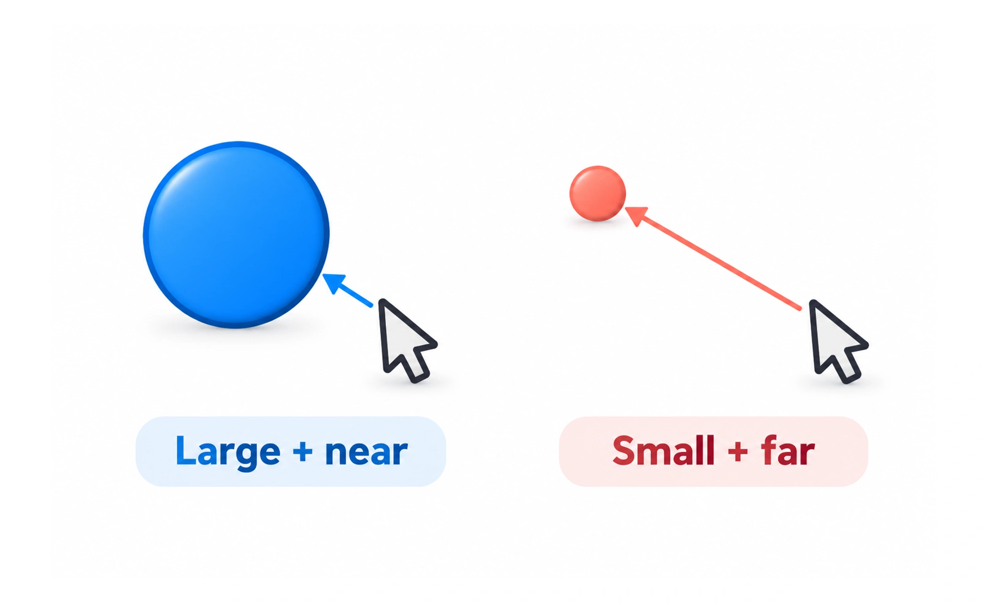
First formulated by psychologist Paul Fitts in 1954, it models human motor movement. In user interfaces, it dictates that critical actions should be large and positioned close to where the cursor or thumb rests.
Think of it like this: throwing a basketball into a giant hoop five feet away is quick and easy, while tossing a coin into a tiny jar across the room requires slow, careful aim.
How it works
The time to reach a target decreases when the target is made wider, or when the starting distance to the target is reduced. Screen corners and edges have infinite width for mouse cursors because the cursor cannot overshoot the physical display.
When to use it
Apply it when sizing primary call-to-action buttons, choosing navigation bar positions, and designing mobile touch layouts where fingers need large hit areas to avoid mis-taps.
Common mistakes
Shrinking critical buttons down to small text links, or placing frequently used controls in hard-to-reach corners of massive smartphone screens.
Frequently asked questions
Key takeaways
- Larger targets are faster and more accurate to tap or click.
- Placing buttons closer to the user's current resting position cuts interaction time.
- Screen boundaries give desktop menus an effective infinite hit area.