

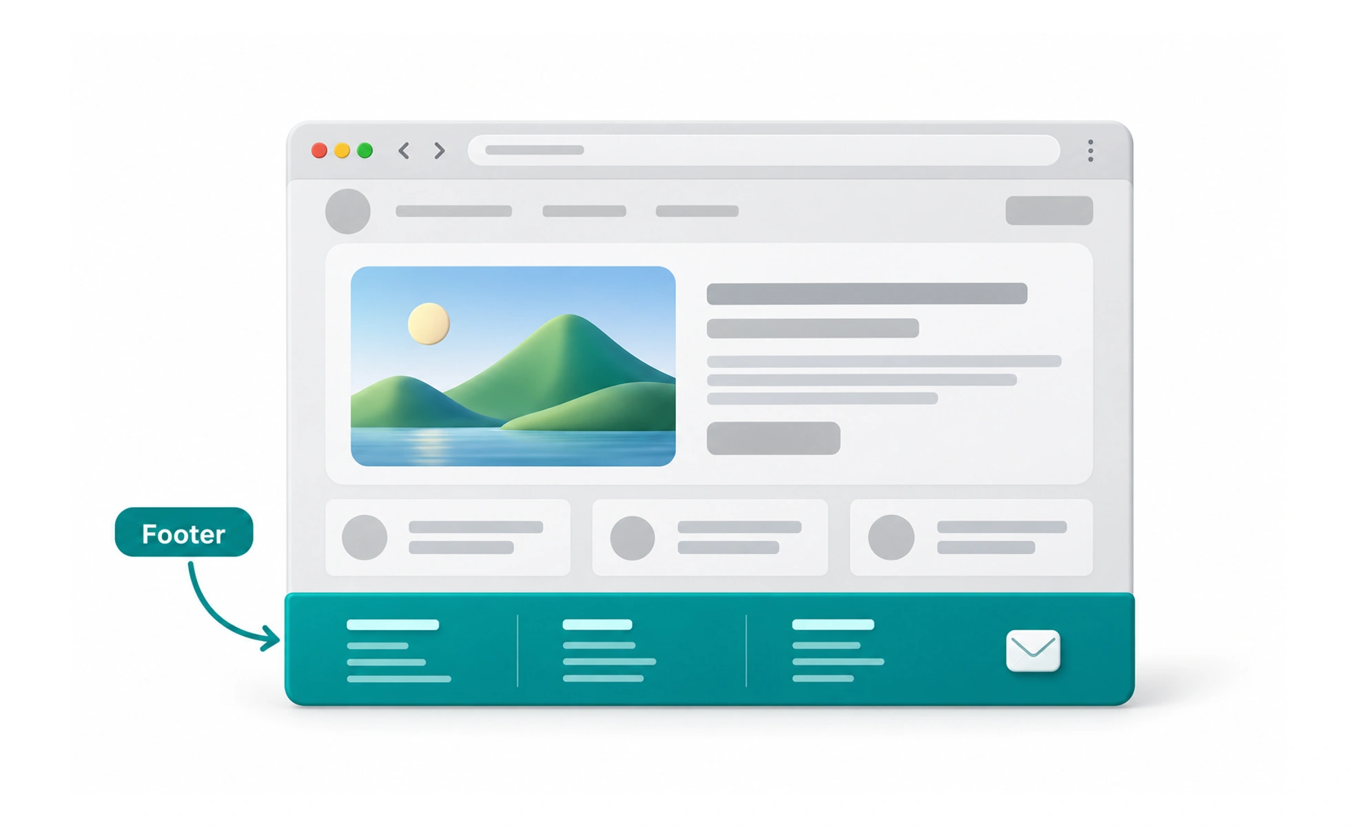
A footer gives people a predictable place to look for information that supports the main task but does not belong in the primary content. Its contents vary by product and page. A footer should be useful without becoming a dumping ground for every link the team cannot place elsewhere.
Like the reference desk at the back of a library, a footer helps people find supporting information after they have explored the main area.
Include useful supporting information
Common footer content includes contact details, privacy and legal links, help resources, and secondary navigation. Choose items based on user needs and product obligations. Avoid duplicating every top-level link unless that repetition helps people navigate a long or unfamiliar site.
Group links for scanning
Organize related links under short, descriptive headings. Keep the number of groups manageable and use a reading order that works across screen sizes. A long unstructured list is hard to scan, while vague labels such as More tell people little about what lies behind them.
Design for different screens
A wide footer may use columns, while a narrow screen can stack or collapse groups. Preserve clear labels, touch-sized targets, and logical keyboard order. Do not hide important policies or support access behind a layout that is difficult to discover on mobile.
Keep the information current
Outdated dates, broken links, and retired product names reduce trust. Give an owner responsibility for reviewing footer content when policies or site structure change. If the footer is sticky rather than at the end of content, ensure it does not obscure page text or controls.
Frequently asked questions
Key takeaways
- Use a footer for supporting information and secondary navigation.
- Group links under labels that describe their destination.
- Keep responsive and keyboard access straightforward.
- Review footer links and legal details as the product changes.