

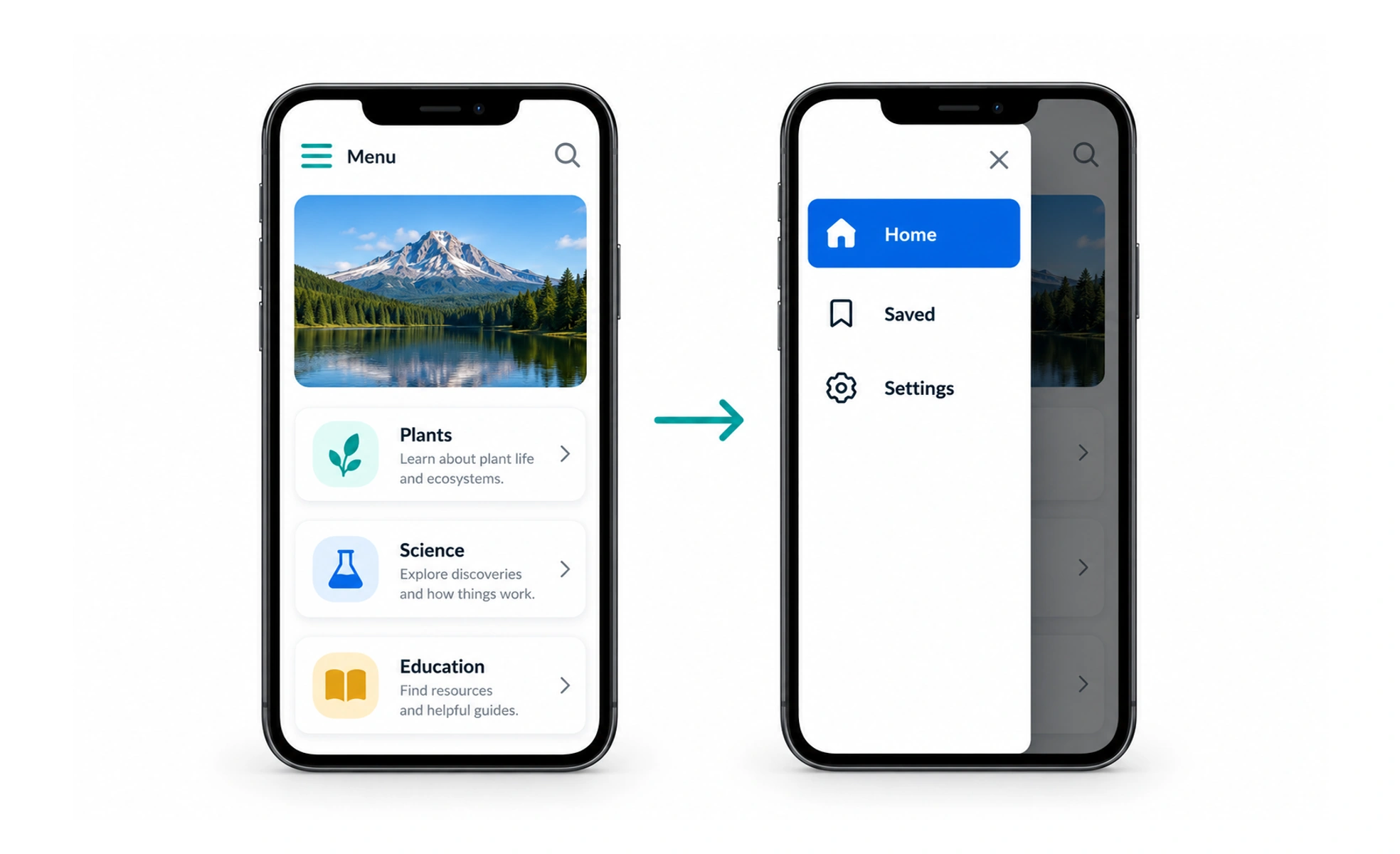
A hamburger menu is a control, often shown as three horizontal lines, that reveals navigation when activated. It can preserve space on a small screen, but it also hides routes, so it should be used when the space saved is worth the extra step and reduced visibility.
It is a folded map: compact while closed, but a person must know to open it before seeing the routes.
Balance space and discoverability
On a narrow screen, a compact menu can make room for the current task. Hiding the main destinations also means people cannot scan them immediately. Keep the most important route or action visible when it is central to the experience, and use the menu for the remaining destinations.
Name and identify the control
Pair the icon with a visible “Menu” label when space allows, or provide an accessible name when it does not. Make the control large enough to use comfortably and show whether the navigation is open. Do not rely on an animated icon alone to communicate the state.
Example: a learning app on a phone
A learner needs Courses every day, but rarely uses Help and account settings. Keep Courses reachable from a visible bottom or top navigation and place lower-frequency destinations in the hamburger menu. If testing shows that learners repeatedly open the menu to switch between core sections, reconsider which destinations remain visible.
Frequently asked questions
Key takeaways
- A hamburger menu trades visible choices for saved space.
- Keep frequent destinations easy to reach.
- Expose the open state and a clear close action.
- Make the panel work with touch, keyboard and assistive technology.