

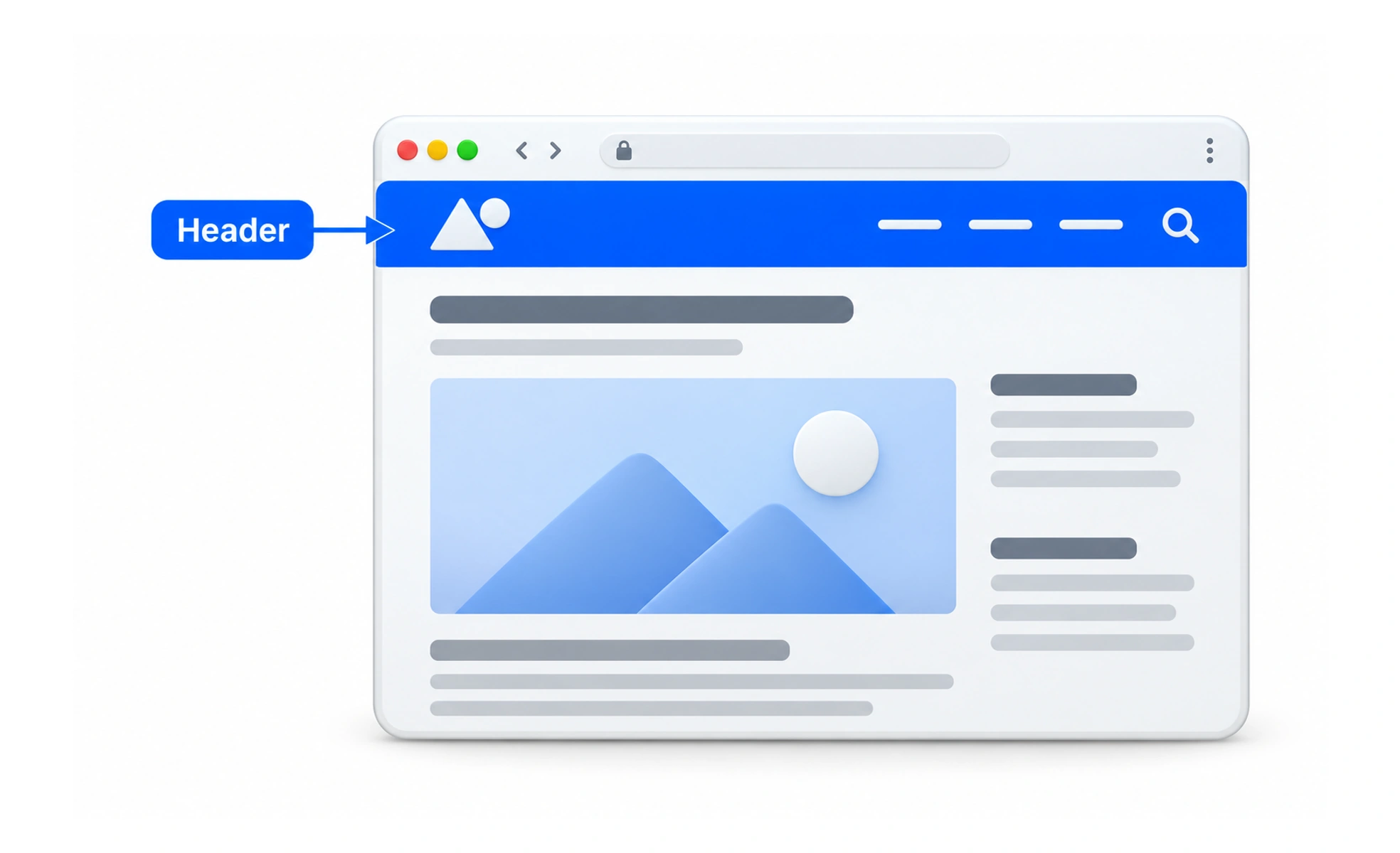
Headers help establish where people are and provide access to important destinations. Their contents depend on the product and screen. A useful header gives priority to frequent tasks, works at narrow widths, and does not take so much space that it competes with the page itself.
A sign at the entrance of a building tells visitors where they are and points toward the main places they can go.
Prioritize essential destinations
A header often includes a brand mark, navigation, search, or account controls. Include only what helps people orient themselves or reach common tasks. Too many links compete for attention and can make the main content harder to find.
Make current location clear
People should be able to recognize the product or section they are using and understand which navigation item is active. Use text labels where icons are unfamiliar. If a header changes between sections, preserve enough consistency to avoid making the interface feel like a different product.
Adapt across viewport sizes
At smaller widths, navigation may collapse into a menu, but important tasks must remain easy to reach. Keep the menu name visible to assistive technology and preserve keyboard access. Test long names, localization, zoom, and text scaling rather than designing only for one size.
Use sticky behavior carefully
A persistent header can keep navigation available while scrolling, but it reduces visible content and may cover focused elements. Account for anchor targets and keyboard focus. Consider whether the header should shrink or disappear on scroll, and make the behavior consistent and understandable.
Frequently asked questions
Key takeaways
- Use the header for orientation and high-value navigation.
- Keep the active location and control meanings clear.
- Design collapsed navigation for keyboard, zoom, and localized text.
- Check that sticky headers do not cover content or focus.