

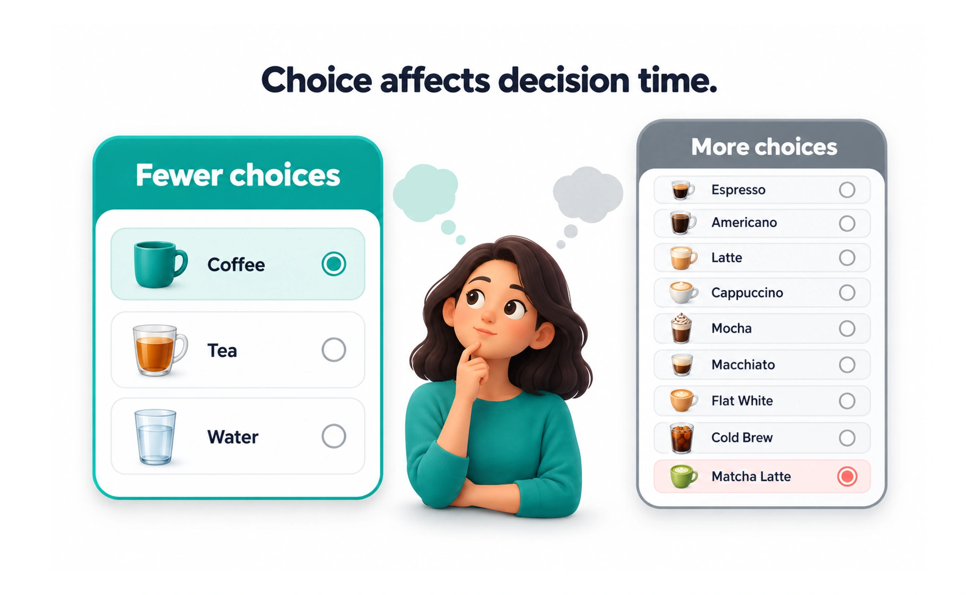
Named after psychologists William Edmund Hick and Ray Hyman, it proves that giving users too many options at once causes cognitive overload and decision paralysis. Good interfaces break complex decisions into smaller sequential steps.
Think of it as looking at a restaurant menu with two hundred items versus a cafe menu with five curated meals. The five-item menu lets you pick dinner in seconds.
How it works
Reaction time grows logarithmically as the number of options increases. Sorting options into clear logical categories cuts down the mental search time, but reducing raw option count remains the most effective fix.
When to use it
Use it when designing navigation menus, product pricing tables, user onboarding flows, and multi-step checkout processes to prevent drop-off.
Common mistakes
Presenting all available product features on a single dashboard screen instead of using progressive disclosure to show advanced options only when needed.
Frequently asked questions
Key takeaways
- More choices lead directly to slower decision times and higher abandonment.
- Progressive disclosure keeps initial screens clean while preserving depth.
- Categorizing long lists helps users mentally rule out irrelevant options faster.