

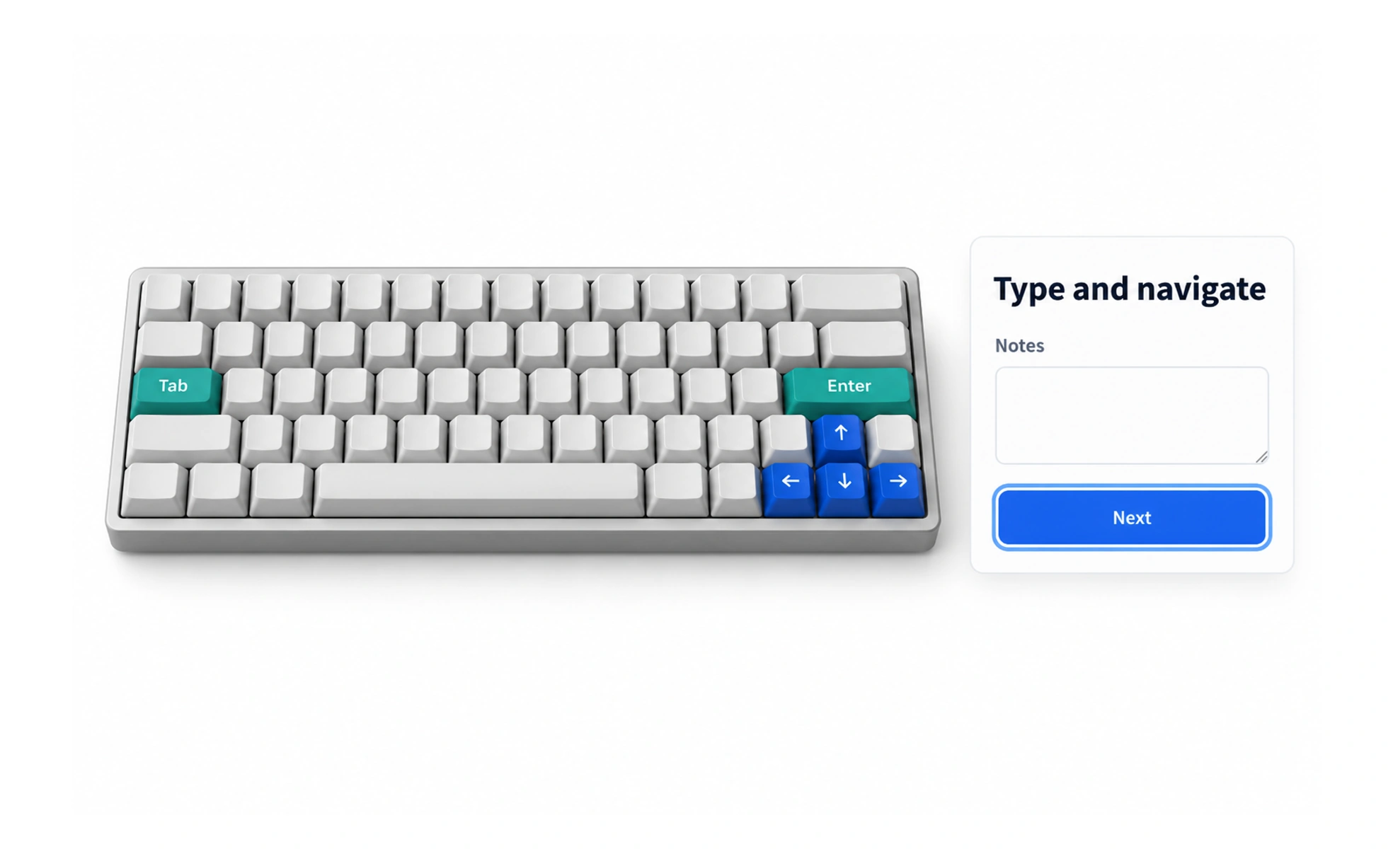
Keyboard interaction matters for people who prefer it, cannot use a pointer, or rely on assistive technology. A well-designed interface makes controls reachable in a logical order, exposes visible focus, and supports familiar keys without trapping or surprising the user.
A keyboard is a route through an interface: clear signposts and predictable turns help people reach each destination without a mouse.
Make every action reachable
Interactive controls should be operable with a keyboard, including menus, dialogs, tabs, and custom widgets. Use native controls where possible because they already support expected behavior. When a custom component is necessary, implement its focus and key interactions deliberately.
Show where focus is
A visible focus indicator helps users know which control will respond to a key press. Do not remove the browser outline without providing a clear replacement. Check that focus remains visible against every background and is not hidden beneath sticky headers or overlays.
Keep the order meaningful
The focus sequence should follow the visual and task order. Avoid positive tabindex values that create a separate, fragile navigation sequence. When a dialog opens, move focus into it; when it closes, return focus to the control that opened it.
Support expected keys and recovery
Use familiar keys such as Tab, Enter, Space, and Escape where they fit the control. Do not create keyboard traps, and give people a way to cancel or undo consequential actions. Test the whole journey rather than checking isolated buttons.
Frequently asked questions
Key takeaways
- Make all meaningful interface actions available from a keyboard.
- Keep focus visible and aligned with the task order.
- Prefer native controls and familiar key behavior.
- Avoid focus traps and restore focus after dialogs close.