

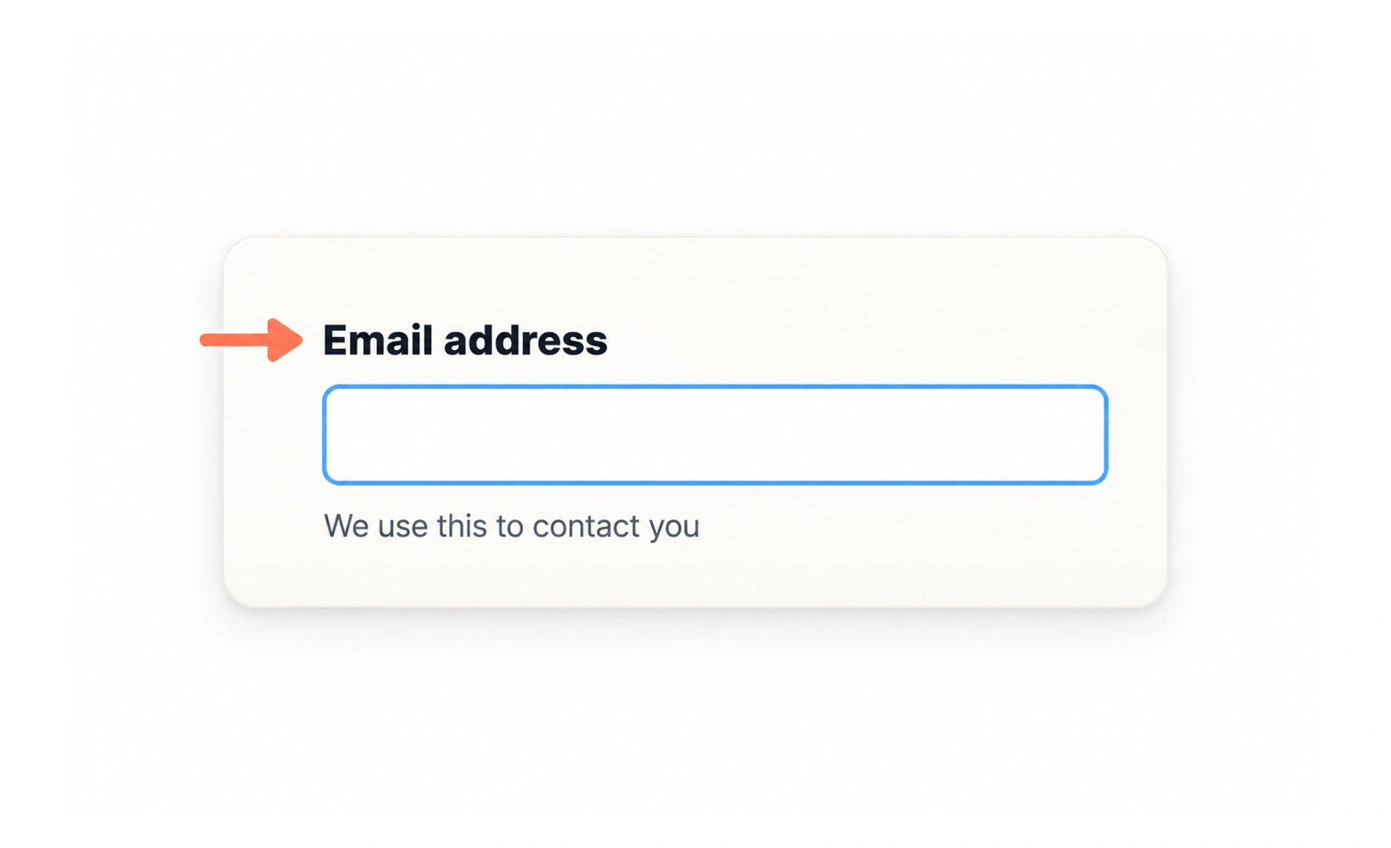
A label names a control and tells people what answer or action it expects. A field can look obvious to one person and still be unclear to someone using a screen reader, voice input, translation, or a different layout.
A label works like the name on a drawer: it should identify what belongs there even when the surrounding room changes.
Say what is needed
Use a short, specific phrase such as “Work email” or “Appointment date.” Avoid labels that only describe appearance, like “Blue field,” or vague prompts such as “Details” when the form has several kinds of details.
Connect name and control
The text should be programmatically associated with its input, not merely placed nearby. This lets assistive technology announce the right name and lets people activate a small checkbox by selecting its label.
Keep instructions separate
A label names the answer; supporting text can explain a format, consequence, or choice. For example, “Phone number” can be followed by “Include your country code.” The helper text should remain connected to the field.
Do not rely on position alone
Responsive layouts, zoom, and translated text can change where a field appears. A persistent label is more reliable than assuming a placeholder, icon, or nearby paragraph will always explain the control. A label such as “Email address” remains useful after someone types, autofills, zooms in, or returns to correct an error. Avoid labels like “Your details” that do not say what a particular field expects. If a field needs a format, add a short instruction next to it and connect that instruction programmatically.
Frequently asked questions
Key takeaways
- Give each control a clear name.
- Associate the visible label with its input.
- Use helper text for formats and consequences.
- Do not use position or icons as the only label.