

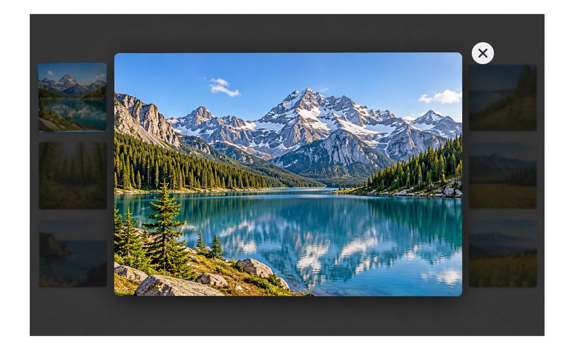
The background is usually dimmed so the overlay receives attention. A lightbox can help people inspect a large image or complete a focused task, but it interrupts the page beneath it. Its content, controls, and dismissal behavior should be clear and accessible.
It is like placing a photograph on a clear viewing stand while the rest of the gallery remains visible but temporarily out of focus.
Use an overlay for focused content
A lightbox is useful when a larger view or a short task benefits from remaining in context. If the content is substantial or needs a stable URL, a dedicated page may be better. Do not use an overlay simply because it is visually prominent.
Make controls and context clear
Provide a visible close control and explain what is being shown. For image viewing, consider captions, zoom, and previous or next navigation when relevant. Keep controls separate from the content so they do not obscure details people are trying to inspect.
Handle focus and dismissal
Move keyboard focus into the overlay when it opens, keep it within the dialog while open, and return it to the trigger when it closes. Support Escape when appropriate and allow outside-click dismissal only when it will not discard work unexpectedly.
Protect the underlying page
Prevent accidental interaction with the background and make the overlay fit small viewports and zoom. Preserve scroll position when it closes. Check that text remains readable, loading states are handled, and the overlay does not extend beyond the visible screen.
Frequently asked questions
Key takeaways
- Use a lightbox when focused content benefits from staying in context.
- Show what is open and provide clear controls to close or navigate.
- Manage keyboard focus and prevent interaction with the background.
- Test small screens, zoom, loading, and scroll restoration.