

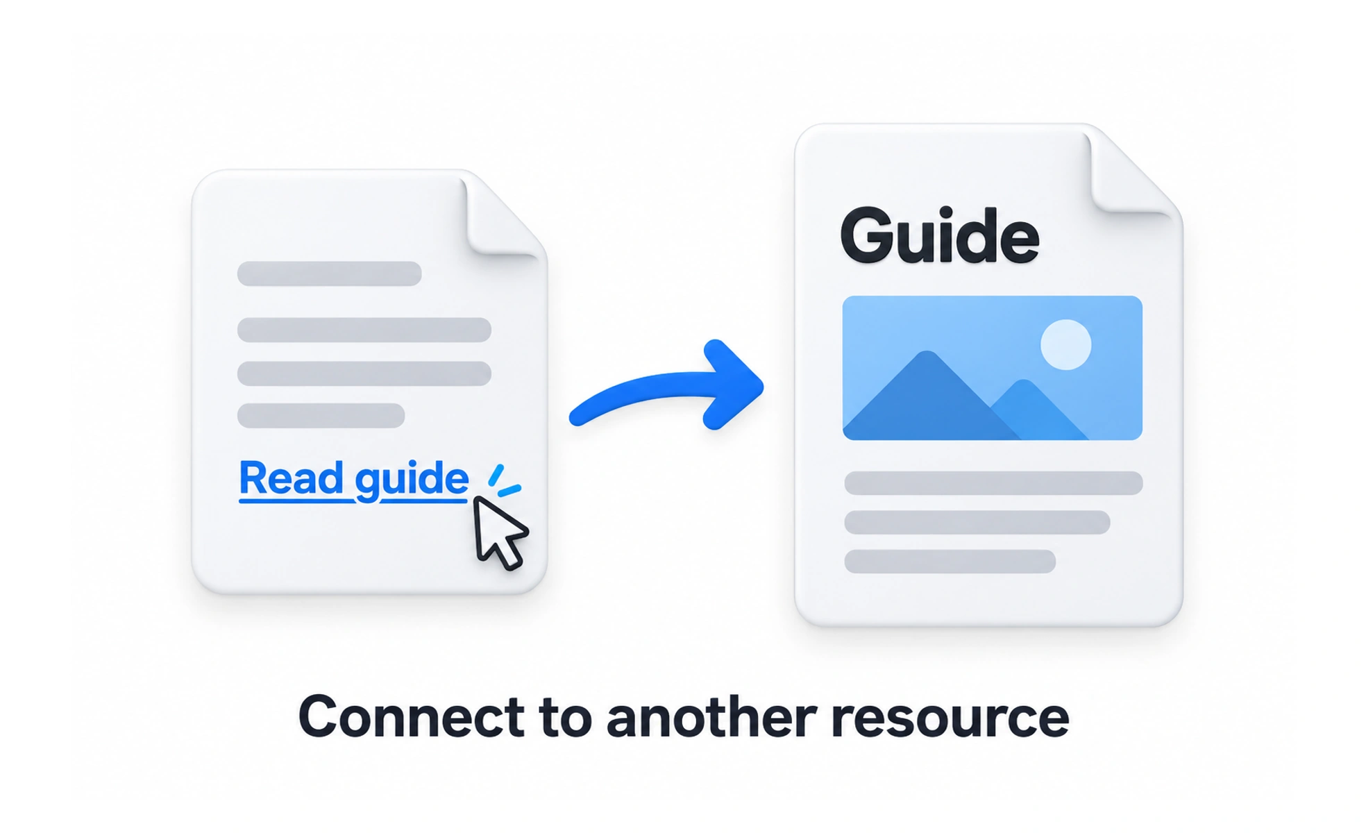
Links connect information and help people choose where to go next. Their labels should describe the destination or outcome, and their visual treatment should make them distinguishable from surrounding text. A link should behave predictably with keyboard, touch, browser navigation, and assistive technology.
A link is like a signpost on a path: it tells travelers where a route leads before they choose to follow it.
Write meaningful link text
Prefer labels such as Read the accessibility guide over vague wording such as Click here. A screen-reader user may navigate through a list of links without the surrounding sentence. When several links share a label, make their destinations distinguishable in context.
Make links look and act like links
Use a consistent visual treatment, such as an underline or a clear color difference, so links are not identified by color alone. Preserve familiar browser behavior like opening in a new tab only when requested. Avoid styling a link as a button if it performs navigation.
Be clear about destination and risk
Tell people when a link opens a new window, downloads a file, or leaves the current product if that information affects their decision. Keep URLs stable and descriptive where possible. Avoid misleading labels that conceal a different destination or unexpected action.
Support keyboard and touch
Links should be reachable in logical order, show visible focus, and have enough spacing to tap comfortably. Do not nest interactive elements or make an entire text block an ambiguous click target. Verify that the destination loads and that back navigation returns people to useful context.
Frequently asked questions
Key takeaways
- Use link labels that describe the destination or outcome.
- Make links visually distinct without relying on color alone.
- Explain new windows, downloads, or other unexpected behavior.
- Keep keyboard focus, touch targets, and destination behavior predictable.