

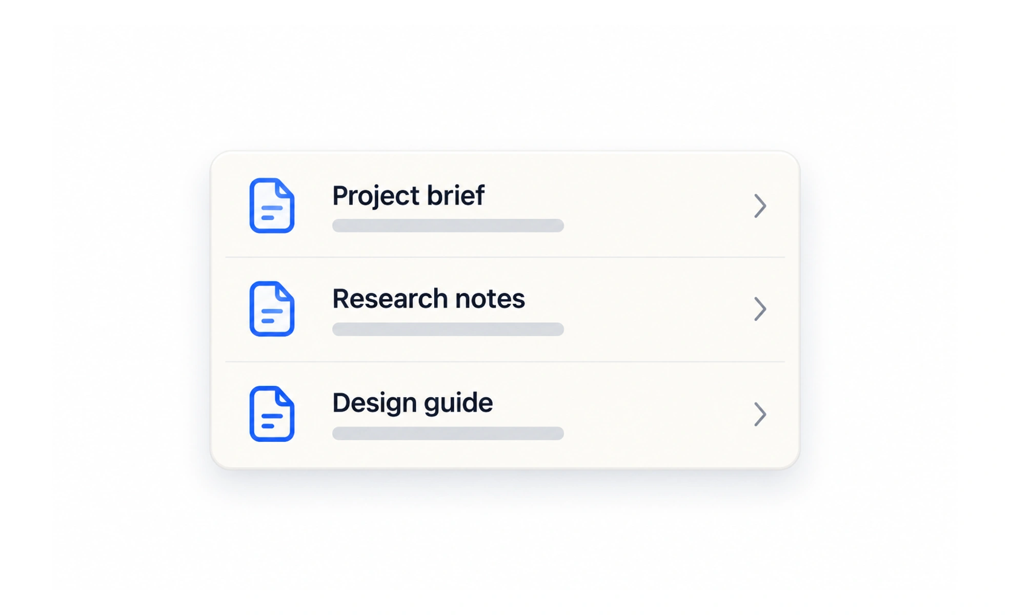
A user-interface list presents related items in a sequence, usually with a shared structure. Lists are efficient for scanning and comparing text, and can support actions on each item without the extra visual weight of separate cards.
A list is like a well-organized checklist: a repeated rhythm makes each entry easy to find and compare.
Choose a list for repeated items
Use a list when entries share a simple structure and people benefit from reading them in sequence. A notification inbox, settings menu or lesson history often works well as rows. If the items need rich visual comparison, a card grid may communicate their differences better.
Keep row structure consistent
Place the most useful label first and align supporting information in a predictable position. Give each row enough space for touch and longer text, and make secondary actions easy to distinguish. Do not use alignment alone to imply relationships that are not present in the data.
Support long and changing collections
Decide how loading, empty states, separators and grouping work before the list becomes large. Keep an item’s identity stable while it updates, and preserve focus when a row is removed. For a reordered list, communicate what changed if people need to understand the new order.
Example: saved lessons
A saved-lessons list puts the lesson title and course first, with reading time as secondary information and a separate remove control. Removing one row should not make keyboard focus jump to the page header. If there are no saved lessons, a short explanation and route back to browsing are more useful than an empty bordered box.
Frequently asked questions
Key takeaways
- Use lists for repeated items with a shared structure.
- Put the most useful information in a consistent place.
- Keep row actions and updates understandable.
- Design empty and loading states as part of the list.