

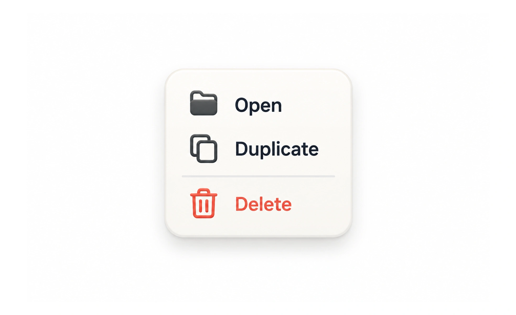
A menu presents a set of commands or destinations that a person can choose from. Menus save space when their choices are secondary, but hiding essential actions in a menu can make them harder to discover and use.
A menu is like a clearly labeled drawer: it keeps related tools together, but the drawer should be easy to find and open.
Make the trigger understandable
Use a clear label or familiar icon and give the control an accessible name. A generic three-dot icon can work for a compact overflow menu when its surrounding context makes the contents predictable. It is less useful when the menu hides unrelated actions across the entire application.
Design the open and close behavior
A menu should open from its trigger, expose its items in a predictable order and close after a choice or an intentional dismissal. Support keyboard use, visible focus and escape-key dismissal. Do not close it unexpectedly while a person is moving focus between the trigger and its options.
Frequently asked questions
Key takeaways
- Hide secondary actions, not essential ones.
- Make the menu trigger clear in its context.
- Support focus, keyboard navigation and dismissal.
- Give destructive commands extra care.