

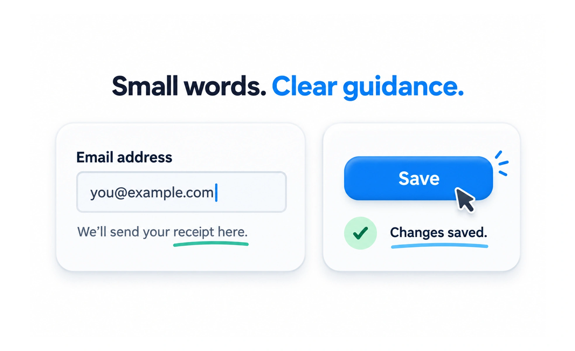
It includes button labels, form field hints, error messages, empty state descriptions, and privacy reassurances. Great microcopy removes ambiguity right at the moment a user decides whether to take an action.
Think of it as the clear, friendly signs in an airport telling you which baggage carousel belongs to your flight, keeping you calm and moving in the right direction.
How it works
Effective microcopy anticipates user anxiety and answers unspoken questions before they arise, such as clarifying that clicking a button will not charge a credit card yet.
When to use it
Write microcopy for form field hints, tooltips on complex metrics, error recovery prompts, and confirmation modals.
Common mistakes
Writing generic button text like 'Submit' instead of specific action verbs like 'Create Account', or displaying cryptic technical error codes.
Frequently asked questions
Key takeaways
- Small words have outsized impact on user confidence and conversion.
- Clear, plain language always beats clever or cute branding.
- Reassuring copy near conversion points reduces checkout anxiety.