

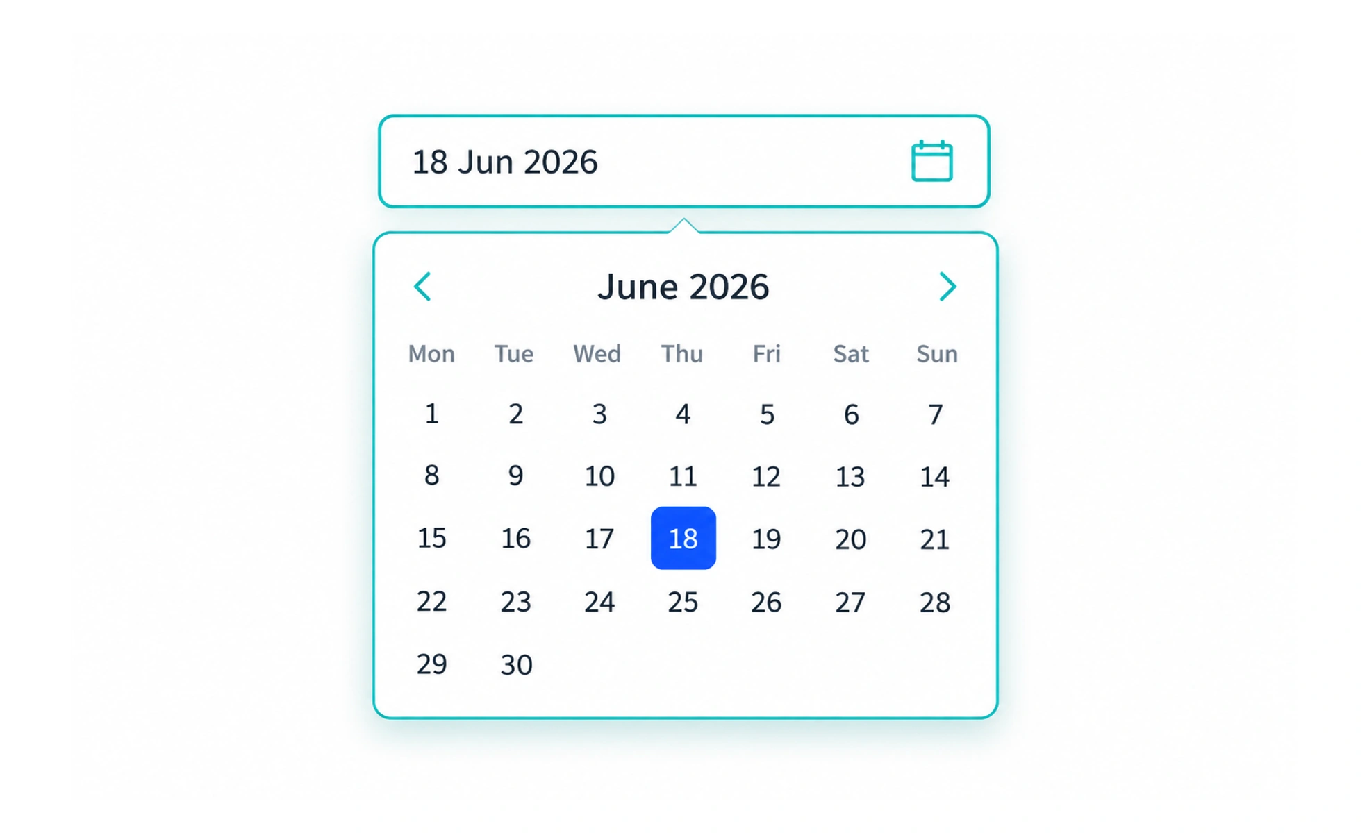
A picker helps someone choose a value from a structured set, such as a date, time, location, or color. It can present a calendar or list, but the person should still understand the value and be able to correct it.
A picker is like a small measuring guide beside an answer: it helps choose a valid value without hiding what was chosen.
Match the picker to the value
A calendar is useful when a date’s weekday or nearby dates matter. A plain date field may be faster for a known date. A time picker can help avoid invalid times, while a clear typed format may be faster for people who know the value.
Show constraints in context
Disable or explain dates that cannot be booked, and identify the relevant time zone when it changes the result. Avoid making unavailable choices silently disappear if people need to understand why they cannot select them.
Keep text entry possible where useful
A visual picker should not trap someone who prefers typing or assistive technology. Support keyboard operation and announce the selected value in a familiar format.
Confirm boundaries
When a range is required, show the rule such as “Choose a return date after departure.” Do not make people discover the valid range through repeated failed submissions. A date picker can help people choose a date, but it should not be the only way to enter one. Let people type a date in a familiar format and explain the expected format. For time zones, show the zone used so that a selected time does not become ambiguous after saving.
Frequently asked questions
Key takeaways
- Use a picker only when it makes choosing easier.
- Explain unavailable values and date boundaries.
- Support keyboard use and understandable value text.
- Show relevant time zones when they affect the answer.