

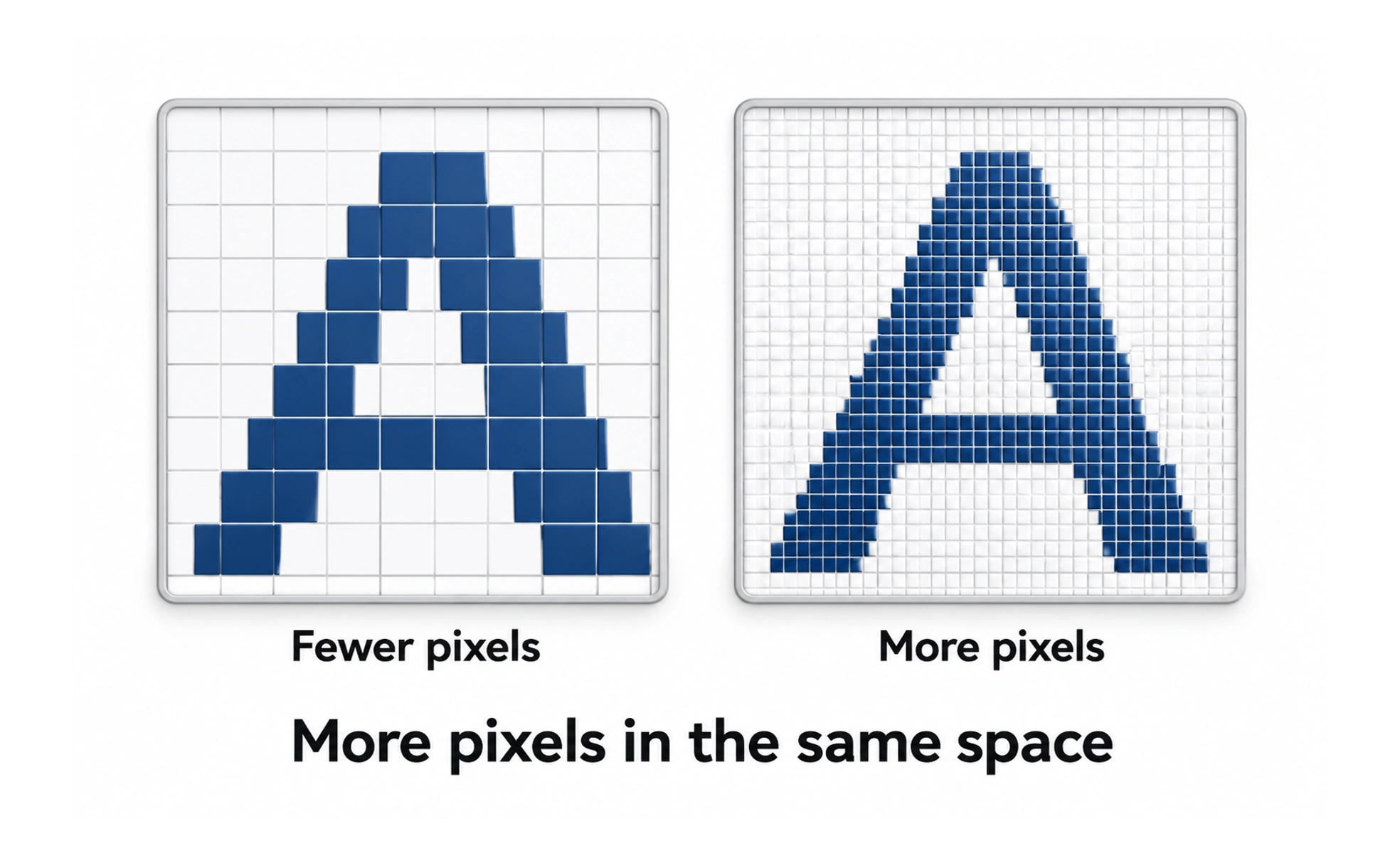
High-density displays pack multiple physical device pixels into a single logical CSS pixel. This creates the distinction between logical dimensions and physical asset rendering, requiring exported graphics at multiple resolutions.
Think of it like this. A mosaic made of tiny glass beads creates smooth curves and fine details, whereas large ceramic tiles produce jagged edges.
How it works
A standard screen has a 1x ratio where one CSS pixel equals one hardware pixel. High-DPI screens pack 2x or 3x physical pixels into the same space, requiring higher resolution images to prevent blurry rendering.
When to use it
Account for pixel density when exporting raster images like photographs, serving scalable SVGs for icons, and defining responsive srcset image attributes in HTML.
Common mistakes
Serving only 1x resolution raster images on modern smartphones, resulting in blurry, fuzzy graphics on high-end Retina displays.
Frequently asked questions
Key takeaways
- High pixel density makes text and vectors sharp by fitting more pixels per inch.
- Raster images must be supplied at 2x and 3x scale to look crisp on Retina displays.
- Vector SVGs scale automatically across all densities without extra files.