

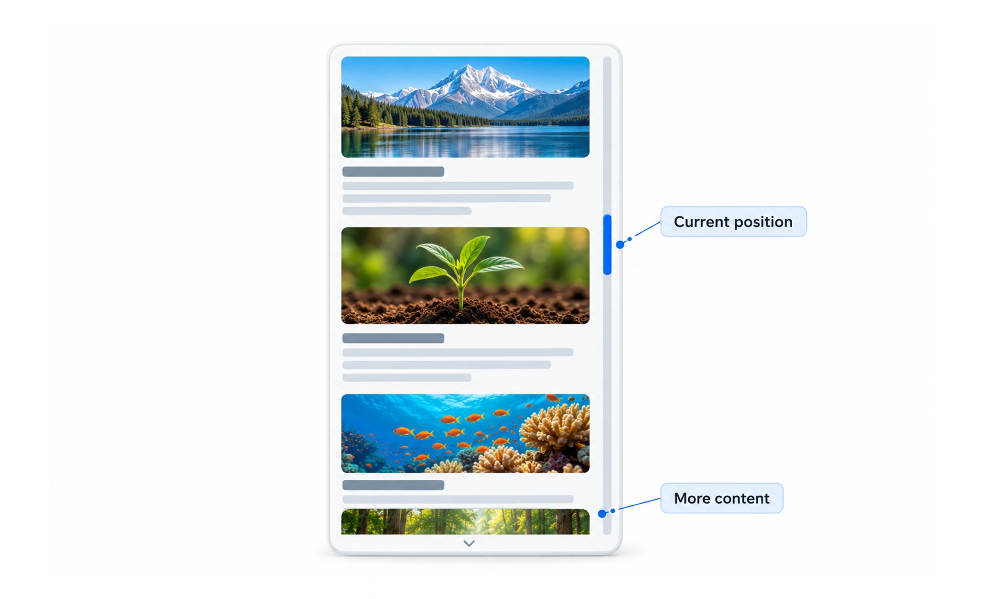
Many operating systems hide scroll bars until a person scrolls or points at an area. The content must still communicate that it continues, and scrolling should work with touch, wheel, keyboard, and assistive input rather than depending on dragging a small thumb.
A scroll bar is like a map’s position marker: it shows where you are in a larger area and gives a way to move through it.
Make overflow discoverable
A clipped panel can look complete when no scroll indicator is visible. Use layout, partial content, a fade, or another cue to show that more content is available. Do not rely on a thin custom bar as the only way to discover or operate a scrollable region.
Preserve expected input
Support standard wheel, touch, and keyboard scrolling. Keep focusable controls within the scrollable area reachable, and avoid scroll hijacking that prevents the page from moving as expected. A custom scrollbar should not replace the browser or operating system’s established behavior without a strong reason.
Choose the right scroll container
Nested scrolling can be useful for a focused panel, but competing scroll areas make it difficult to know which region will move. Keep boundaries visible and test trackpad, touch, and keyboard behavior. On mobile, consider whether content should expand the page instead of trapping it in a short panel.
Test accessibility and content changes
Check zoom, text enlargement, reduced motion, and keyboard navigation. When content is added or removed, avoid unexpectedly jumping the user away from their reading position. If new content loads, preserve context and make the updated state understandable.
Frequently asked questions
Key takeaways
- Make scrollable content discoverable even when bars are hidden.
- Support native touch, wheel, keyboard, and assistive input.
- Avoid confusing nested scroll regions and scroll hijacking.
- Preserve reading position when content or layout changes.