

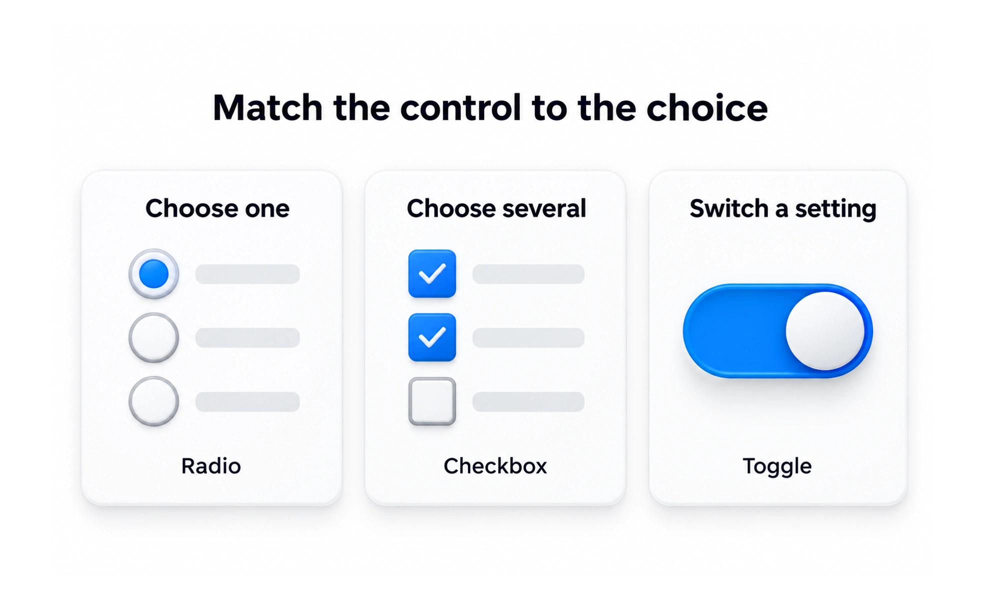
Selection controls let people choose among available values. Checkboxes, radio buttons, switches, selects, and comboboxes are all selection controls, but each tells a different story about whether choices are independent, exclusive, immediate, or searchable.
They are different tools for making a choice, like a checklist, a single-answer ballot, and a searchable catalog.
Model the choice first
Ask whether people may choose several values, exactly one, or turn a setting on and off. This decision usually points toward checkboxes, radios, or a switch before visual styling begins.
Consider list size and comparison
Keep a short, meaningful set visible when comparison helps. For a long list, search or a select control can reduce page length, but it should not make options hard to find.
Make selection state clear
The selected value should be visible and programmatically exposed. If a choice controls dependent fields, make the relationship understandable and preserve the answer if the user changes their selection.
Respect commitment timing
Some choices save on submit; some settings apply immediately. Design feedback around the real save behavior and let people recover if the update fails. A list of notification categories may use checkboxes because several can be active at once; a plan selector may use radio buttons because only one plan can be active. Choose based on the actual data rule, then ensure the interface and server enforce the same rule when changes are saved.
Frequently asked questions
Key takeaways
- Choose by the choice model, not by appearance.
- Use visible lists when comparison is useful.
- Make selected and dependent states clear.
- Explain whether selection saves now or later.