

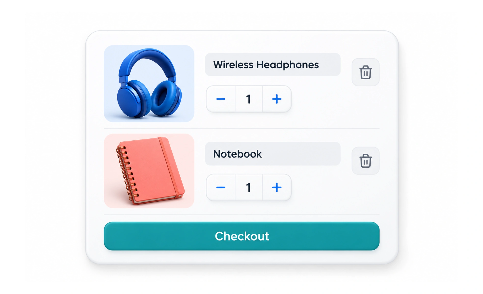
A shopping cart holds the items someone is considering purchasing and summarizes the order before checkout. It should make quantities, costs, changes, and the next step easy to understand.
A physical basket lets a shopper review and change their selection before paying. A digital cart needs the same clarity while also explaining costs and availability.
Represent the selection accurately
Show recognizable item names, important options, quantities, and relevant availability. Let people change or remove items without losing their place. If an item changes or becomes unavailable, explain what happened instead of silently replacing it or allowing an invalid order to proceed.
Make costs understandable
Display the known total and identify costs that depend on later choices, such as delivery details. Explain discounts and recurring charges clearly. Avoid presenting a partial amount as the full payable total or surprising people with material charges only at the final step.
Keep updates dependable
A responsive interface can show a quantity change quickly, but it must reconcile with the service’s confirmed price and stock. Prevent accidental duplicate submissions and provide recovery if an update fails. Important pricing and eligibility rules belong in trusted processing, not only in the browser.
Example: a digital course order
A cart containing two courses should make access type and price clear, including whether either item is part of a subscription. If someone removes one course, update the summary and preserve the remaining selection. Confirm the final terms before the person commits to payment.
Frequently asked questions
Key takeaways
- Show items and options accurately.
- Explain known costs and pending calculations.
- Reconcile changes with confirmed service state.
- Make review and removal straightforward.