

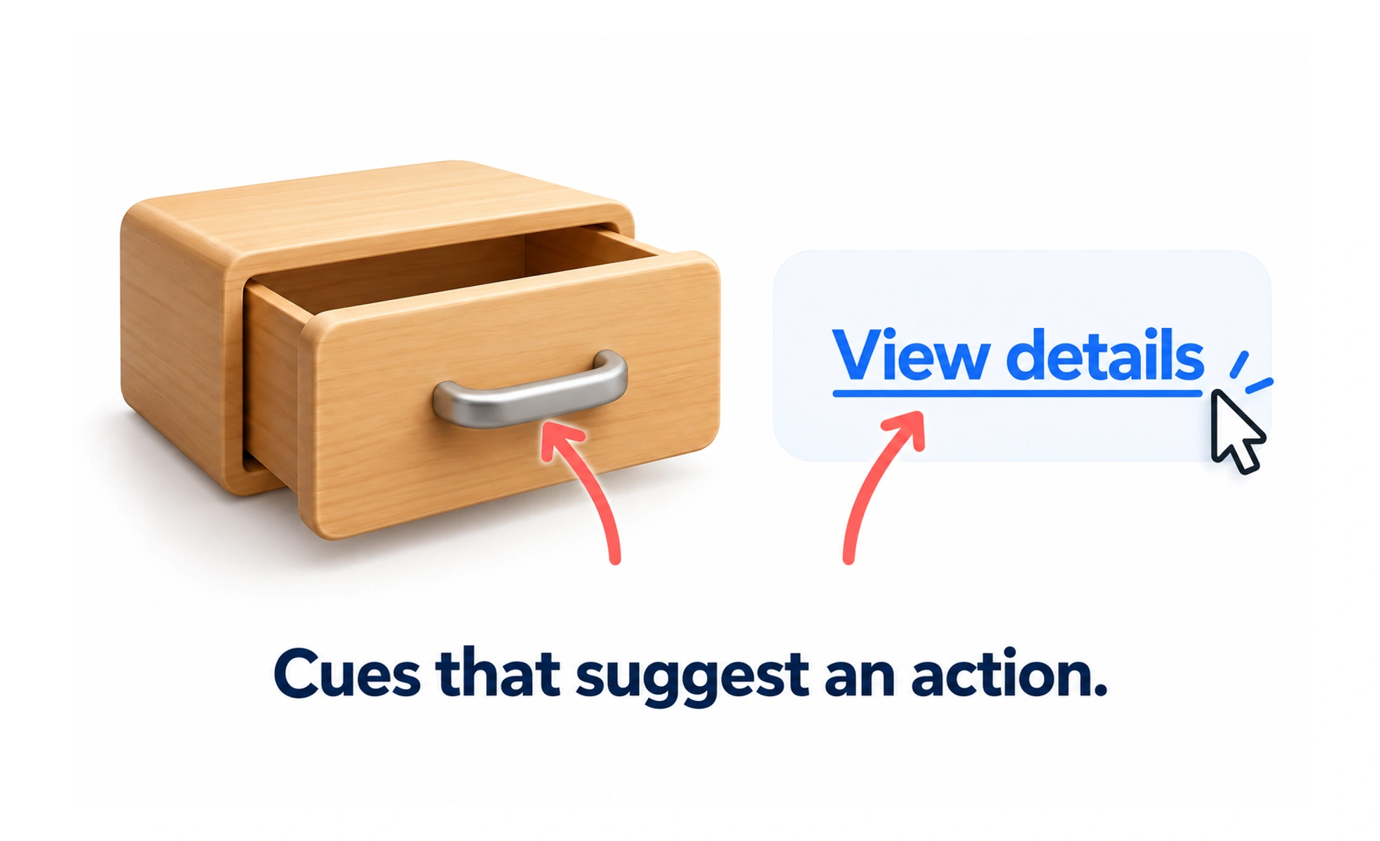
In Donald Norman's design framework, affordances represent physical action possibilities, while signifiers show users where to interact. On a flat glass phone screen, a button border or drop shadow is the signifier that invites a tap.
Think of it as a sign on a glass door that reads PUSH. The glass affords pushing anywhere, but the printed sign tells you exactly where and how to push.
How it works
Signifiers bridge the gap between system capabilities and human perception. Styling an element with contrasting color, elevation, an underline, or a chevron icon immediately signals to the user that it responds to touch or click.
When to use it
Every interactive element in a digital product must include unambiguous signifiers so users never have to guess whether something is clickable.
Common mistakes
Using flat, unstyled text for interactive links, or conversely, styling inert informational cards so heavily that users repeatedly tap them expecting a reaction.
Frequently asked questions
Key takeaways
- Signifiers tell users where and how to interact on digital screens.
- An affordance without a signifier is invisible to the user.
- Misleading signifiers cause users to tap non-interactive elements in frustration.