

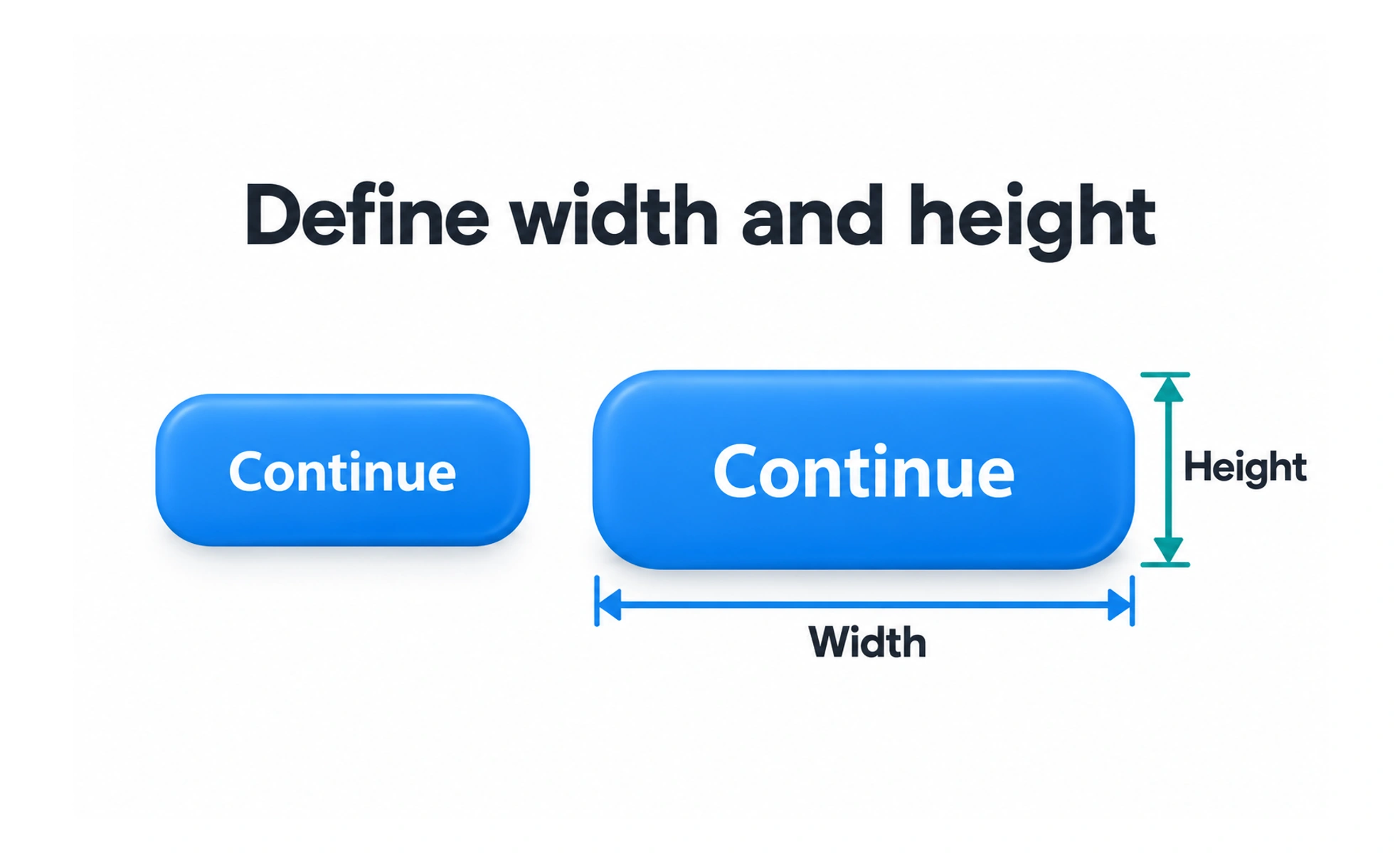
Size affects hierarchy, readability, touch accuracy, and how much content fits on screen. The right dimensions depend on the element’s role, its content, surrounding spacing, and user settings; a single fixed measurement rarely works well in every context.
Element sizing is like choosing a container for an object: it needs enough room to hold the contents and enough clearance to be handled safely.
Match size to purpose
A primary action may need greater visual weight than a secondary link, while repeated data rows should remain compact enough to scan. Size contributes to hierarchy alongside color, spacing, and typography. Do not enlarge everything to signal importance, because the screen then loses contrast.
Allow content to fit
Buttons, cards, and labels may need to grow when text wraps, a language changes, or a person increases font size. Use minimum and maximum constraints thoughtfully, and avoid fixed heights that clip meaningful content. Check empty, loading, error, and unusually long values.
Make controls comfortable to use
Interactive targets should provide enough area for their input method and include spacing that reduces accidental activation. This matters especially for small touch screens and people with limited dexterity. Keep visible icons and hit areas aligned so the target does not feel misleading.
Validate responsive behavior
Test components at narrow and wide viewports, browser zoom, and increased text settings. Ensure larger components do not cover adjacent controls or force unnecessary scrolling. When space becomes constrained, reorganize content based on priority rather than shrinking all elements equally.
Frequently asked questions
Key takeaways
- Use size to support hierarchy, content, and the component’s task.
- Let elements expand for wrapping, localization, and text enlargement.
- Give interactive controls usable target areas and spacing.
- Check size across viewports and accessibility settings.