

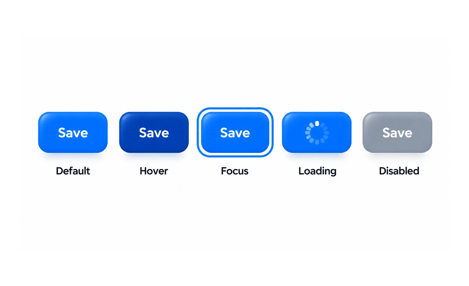
An interface element state is a condition that changes how a control or component appears or behaves. Common states include default, hover, focus, pressed, disabled, loading, selected, and error.
A traffic signal uses different visible states to communicate what people should expect next. Interface controls also need clear signals for availability, focus, and results.
List states from the interaction
Consider how a component responds before, during, and after an action, including input validation and network delay. Not every control needs every state, but important transitions should be designed rather than left to browser defaults or a developer’s guess.
Make state changes perceivable
Use more than a subtle color shift when a state carries meaning. Provide visible keyboard focus, sufficient contrast, clear selected or disabled treatment, and text for errors where needed. The signal should remain understandable to people using assistive technology and to people who cannot distinguish particular colors.
Connect appearance to behavior
A loading control should prevent confusing duplicate actions when appropriate and explain what is happening. Disabled controls should have a reason that users can discover. Error and success states should reflect the actual result, not just the click, and should include a path to retry or recover.
Test transitions and combinations
Check state changes with mouse, keyboard, touch, reduced motion, and realistic data. Components can be focused while selected, or loading after a validation error, so define how combinations work. A component library should document supported states and keep their behavior consistent across contexts.
Frequently asked questions
Key takeaways
- Design states around the complete interaction.
- Make important differences perceivable beyond color.
- Tie feedback to real outcomes and recovery.
- Test transitions, input methods, and state combinations.