

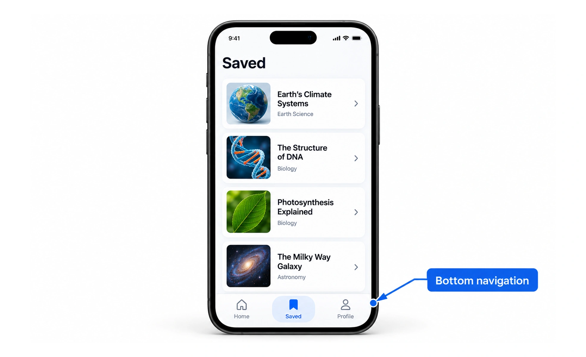
A tab bar is a row or strip of controls used to switch between a small set of related views. It is common in mobile interfaces, where the available width and touch behavior affect how many options can remain visible.
It is like a row of labeled stations: each one offers a different view, while the person stays in the same overall space.
Fit labels and touch targets
Use a small number of concise labels that remain readable at common screen widths. Keep controls large enough for touch and avoid squeezing text until options look alike. If more destinations are needed, move lower-priority routes into a menu instead of adding a tiny horizontally scrolling strip without clear cues.
Keep the active view evident
Show selection with more than a subtle color shift: a clear underline, shape or weight can help. Announce the selected state to assistive technology and make the current destination recognizable after navigation. Preserve the state when returning if it helps people resume their task.
Example: a mobile learning product
A bottom bar offers Home, Courses, Search and Profile. These are stable destinations, so each item navigates to a section rather than swapping a small content panel. If the learner opens a course and then returns to Courses, restoring their previous list position is more useful than resetting the tab to an unexplained state.
Frequently asked questions
Key takeaways
- Decide whether the bar switches panels or navigates.
- Keep labels legible and controls touch-friendly.
- Show and announce the active destination.
- Avoid overloading the bar with too many choices.