

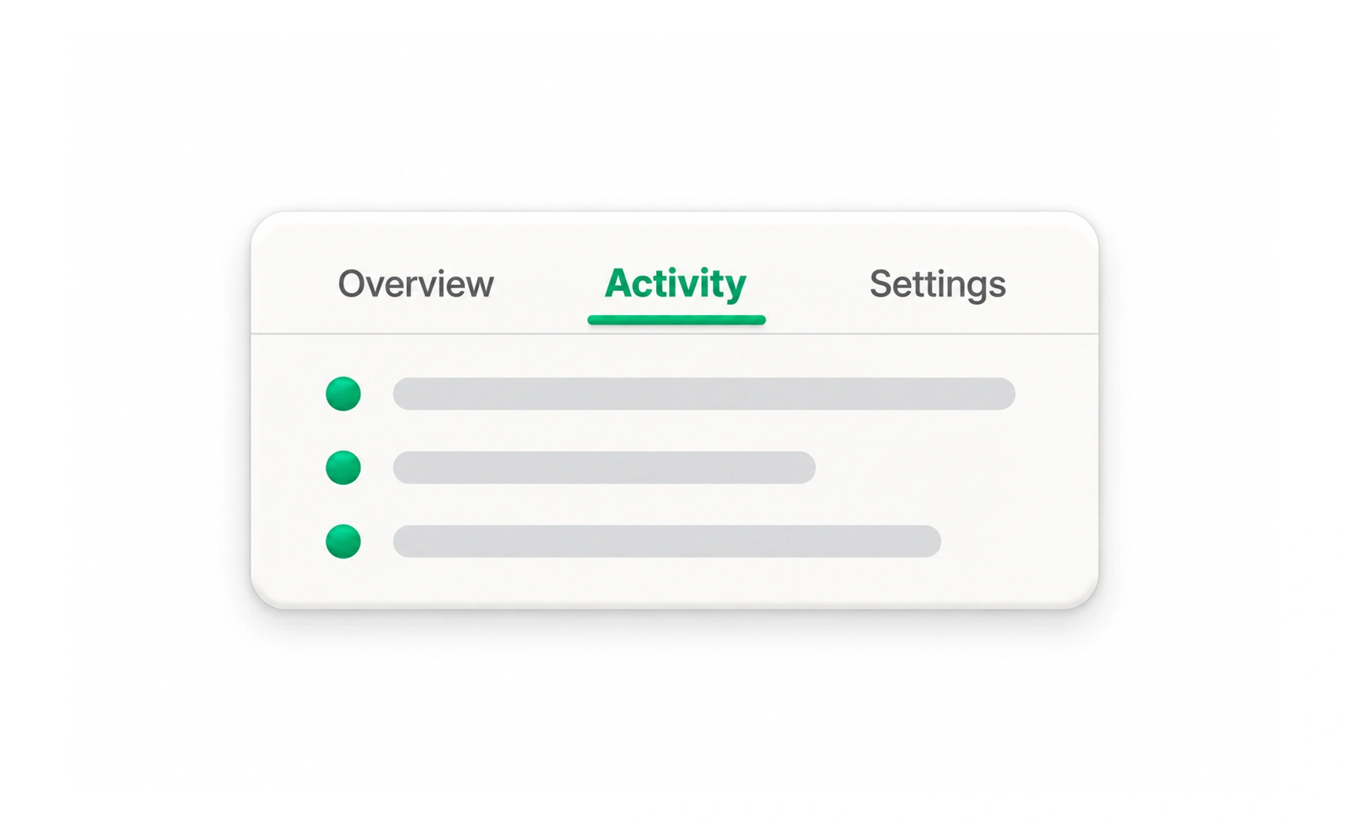
Tabs divide related content into labeled panels within the same context. They let people switch views without leaving the page, but work best when the panels are peers and users benefit from comparing or revisiting them.
They are like labeled dividers in one folder: each tab reveals a related section without changing the folder itself.
Use tabs for peer views
A set of tabs should contain sections at the same level, such as Overview, Activity and Settings for one project. If the choices lead to separate tasks or different parts of a hierarchy, navigation links may be clearer. Tabs are not a good way to hide unrelated content simply to make a page look shorter.
Use concise, distinguishing labels
Each label should tell people what its panel contains. Avoid several vague labels such as “More” or “Details” that cannot be distinguished before activation. Keep the selected tab visually clear and expose its selected state programmatically, so the difference is not conveyed by color alone.
Make switching predictable
Support keyboard movement and activation in line with the tab pattern used by the interface. Keep focus visible, associate each tab with its panel and decide whether switching is automatic or requires confirmation with Enter or Space. Automatic activation is suitable when panels appear immediately; slow-loading content can make manual activation less frustrating.
Example: profile sections
A profile has About, Projects and Activity tabs, all describing the same person. Selecting one preserves the profile context and changes the panel. If Projects opens a different route, make it a navigation link instead or ensure the tab pattern and URL behavior clearly support that navigation. Do not make a tab disappear when selected; people need to switch away again.
Frequently asked questions
Key takeaways
- Group related peer panels, not unrelated destinations.
- Use labels that explain each panel.
- Show and announce which tab is selected.
- Consider loading speed when choosing activation behavior.