

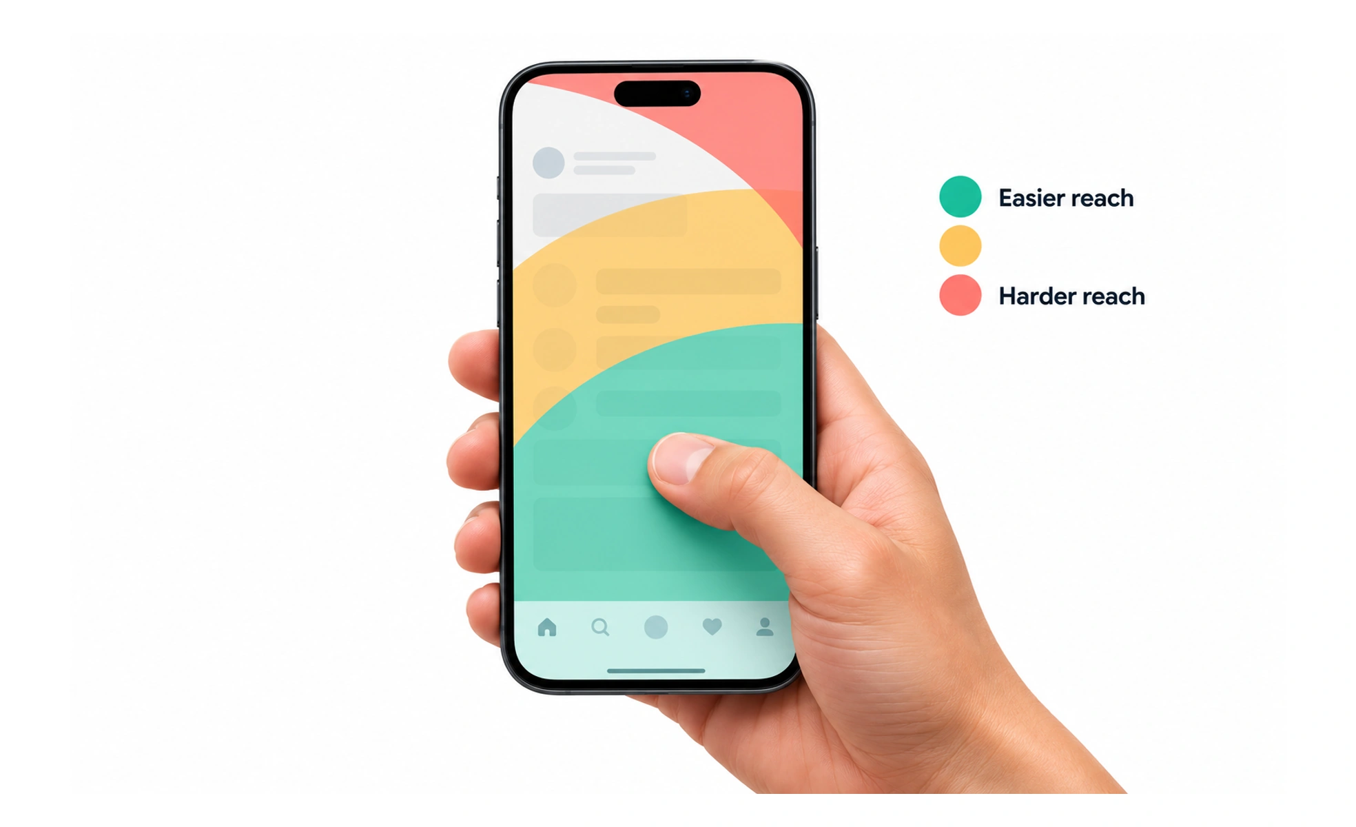
Pioneered by mobile researcher Steven Hoober, ergonomic studies show that over 75% of users operate phones with a single thumb. Placing primary navigation and key action buttons in the natural thumb zone prevents hand strain and drops.
Imagine reaching for items on your kitchen counter versus climbing a stepstool to reach the top cabinet shelf. The thumb zone is your easy-reach countertop.
How it works
The screen divides into three zones: the Natural Zone at the bottom, which is easy to reach; the Stretch Zone in the middle, reached with slight effort; and the Hard-to-Reach Zone at the top corners, which requires changing grip or using a second hand.
When to use it
Use it to guide mobile app layouts: place tab bars, primary action buttons, and search inputs in the bottom third, and place infrequent or destructive actions like logout at the top.
Common mistakes
Placing primary submit and navigation buttons at the very top edge of large mobile screens, forcing users into clumsy two-handed grips.
Frequently asked questions
Key takeaways
- Most smartphone users interact using only one thumb.
- The bottom third of the screen is the most comfortable and accurate reach area.
- Critical buttons should live in the natural thumb sweep zone.