

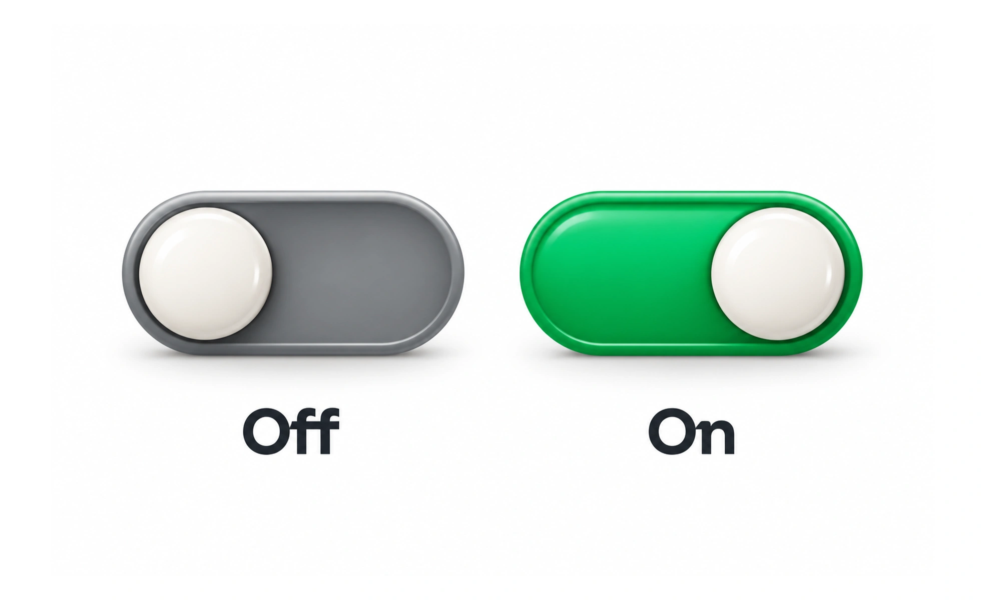
A toggle switch represents a setting that is either on or off, such as enabling a sound effect. It is most useful when the state itself is the main information and the change takes effect immediately.
It behaves like a light switch: the person can tell the current state and expects the setting to change when they flip it.
Use it for a persistent binary setting
A switch suits options such as “Email notifications on/off.” For a form choice that will be reviewed with other answers before submission, a checkbox may communicate the task better.
Keep the label stable
The setting name should not change from “Enable alerts” to “Disable alerts” as the switch moves. The control already communicates on or off; the stable label keeps its meaning predictable.
Show the actual state
The visual position, accessible state, and saved value should agree. If a network request is still pending, provide a clear pending or failure state instead of implying a change was saved when it was not.
Avoid ambiguous defaults
For settings with meaningful consequences, make the initial state explicit and explain the impact. A marketing opt-in should not be turned on just because the switch looks active by default. A setting such as “Keep my profile private” can apply immediately when switched, so the state should update and the save result should be clear. A control that only changes a draft form is not an immediate switch; a checkbox may better express that it will be saved with the form.
Frequently asked questions
Key takeaways
- Use switches for immediate on/off settings.
- Keep the setting name unchanged.
- Make the visual and saved states agree.
- Explain important defaults and consequences.