

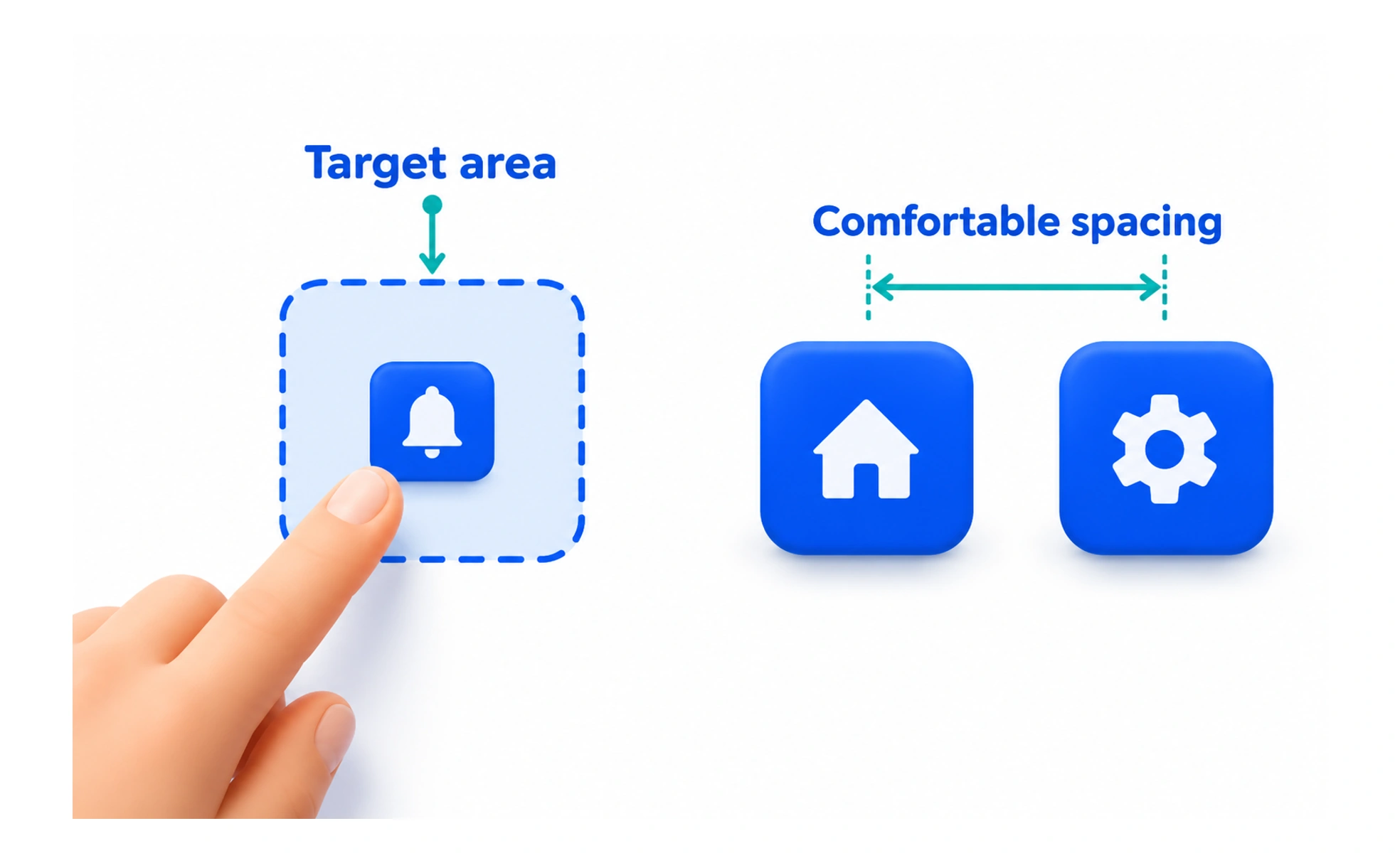
A touch target is the area that responds to a tap or touch. Its size and spacing affect how accurately people can activate controls, especially on small screens or with limited dexterity.
A larger door handle is easier to use than a tiny latch when someone is carrying bags or has limited grip.
Measure the interactive area
The visible icon is not always the full hit area. A small icon can sit inside a larger button that is comfortable to tap. Measure the actual clickable region and check the space around neighboring targets so an intended tap does not activate the wrong control.
Give frequent actions room
Primary and repeated actions deserve adequate target size and separation. If space is tight, combine related low-priority actions into a menu or increase row height rather than packing tiny controls together. Keep the target visually identifiable and provide feedback when it activates.
Support more than touch
A touch-friendly interface should still work with keyboard, switch devices, mouse or screen readers. Use semantic controls, visible focus and accessible names. Do not make a gesture the only way to complete a task.
Example: card bookmarks
A bookmark icon on a course card can be visually compact while its button has a larger padded area. Ensure that this target does not overlap the card’s navigation link, and expose whether the item is saved to assistive technology.
Frequently asked questions
Key takeaways
- Evaluate the full hit area, not just the icon.
- Separate nearby actions to reduce accidental activation.
- Prioritize adequate room for frequent actions.
- Keep keyboard and assistive-technology paths available.