

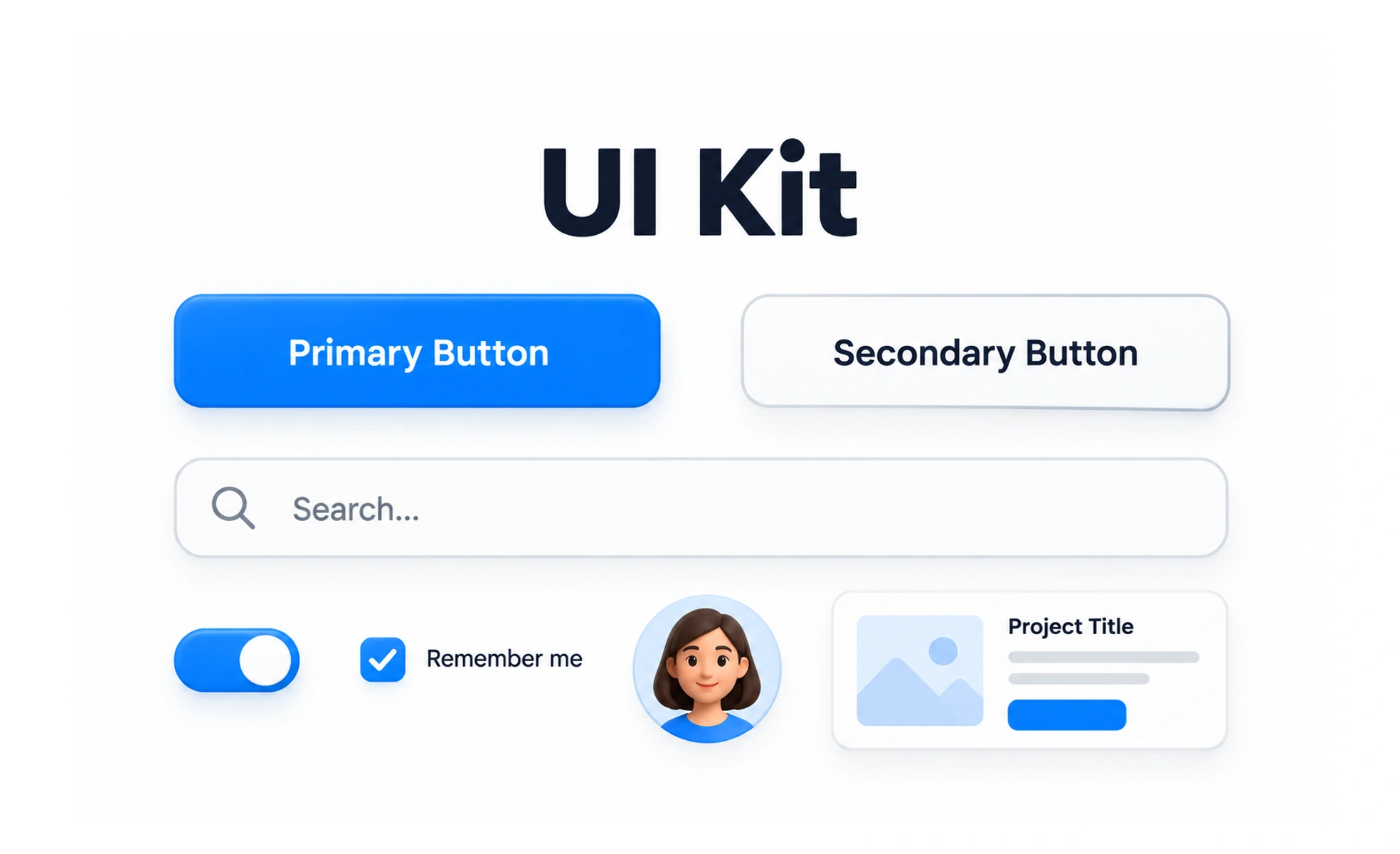
A UI kit is a collection of reusable interface elements and design resources, often arranged for use in a design tool. It helps teams assemble screens consistently, but it does not automatically define governance or production behavior.
A box of modular building pieces helps someone assemble structures from known parts. The kit does not decide what to build or prove that each piece works in a real building.
Understand what the kit contains
A kit may include buttons, fields, icons, layouts, color styles, and templates. Review naming, variants, constraints, and guidance before using a component. The contents reflect a particular scope and design-tool setup, which may not cover every product need.
Use components with intent
Reusable pieces speed up exploration and help keep repeated patterns aligned. Choose a component that fits the content and task instead of forcing every screen into a template. When a new need appears, check whether an existing pattern can be extended without making it confusing or inconsistent elsewhere.
Check implementation and accessibility
A component that looks correct in a design file may behave differently in production. Validate interaction, responsive layout, keyboard access, states, contrast, and content lengths. Designers and engineers should agree on which details are shared and how differences between the kit and coded component are handled.
Keep the kit dependable
Provide version information and document changes that affect shared work. Retire obsolete components clearly and help teams migrate. A kit becomes more useful when it connects to a maintained design system, but it should not be called production-ready solely because its components are visually polished.
Frequently asked questions
Key takeaways
- A UI kit offers reusable design-tool resources.
- Choose components based on the user task and context.
- Verify coded behavior and accessibility separately.
- Maintain versions and migration guidance.