Shadow opacity
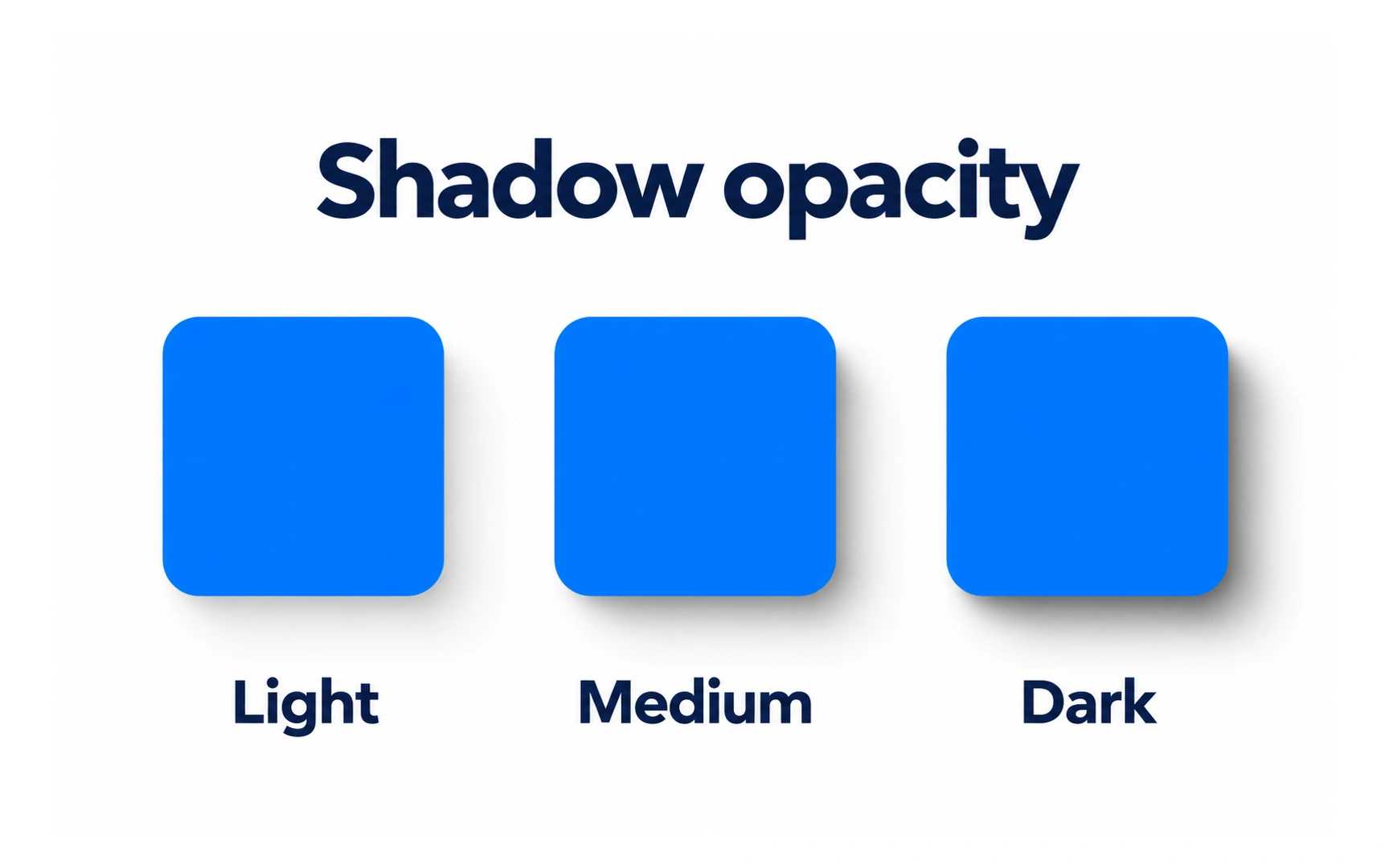
Opacity controls how dark a shadow looks. The example shows the same square with a light, medium and dark shadow.
Lighter shadows feel subtle and calm. Darker shadows lift an element more strongly from the page, which can help it stand out but can also look heavy.
Interface shadows are usually black or a dark tint of the background at low opacity. Around 10–20% is a good starting point; test it against the actual background. On dark backgrounds shadows are hard to see, so dark themes often show elevation with lighter surfaces instead.

