Shadows and Elevation
Learn how blur, spread, opacity and layering create shadows that show depth and hierarchy.
Shadows tell people what sits above what. This lesson covers the kinds of shadows used in interfaces, the settings that shape them, such as blur, spread and opacity, and how to use them to show elevation without cluttering a screen.
Shadow
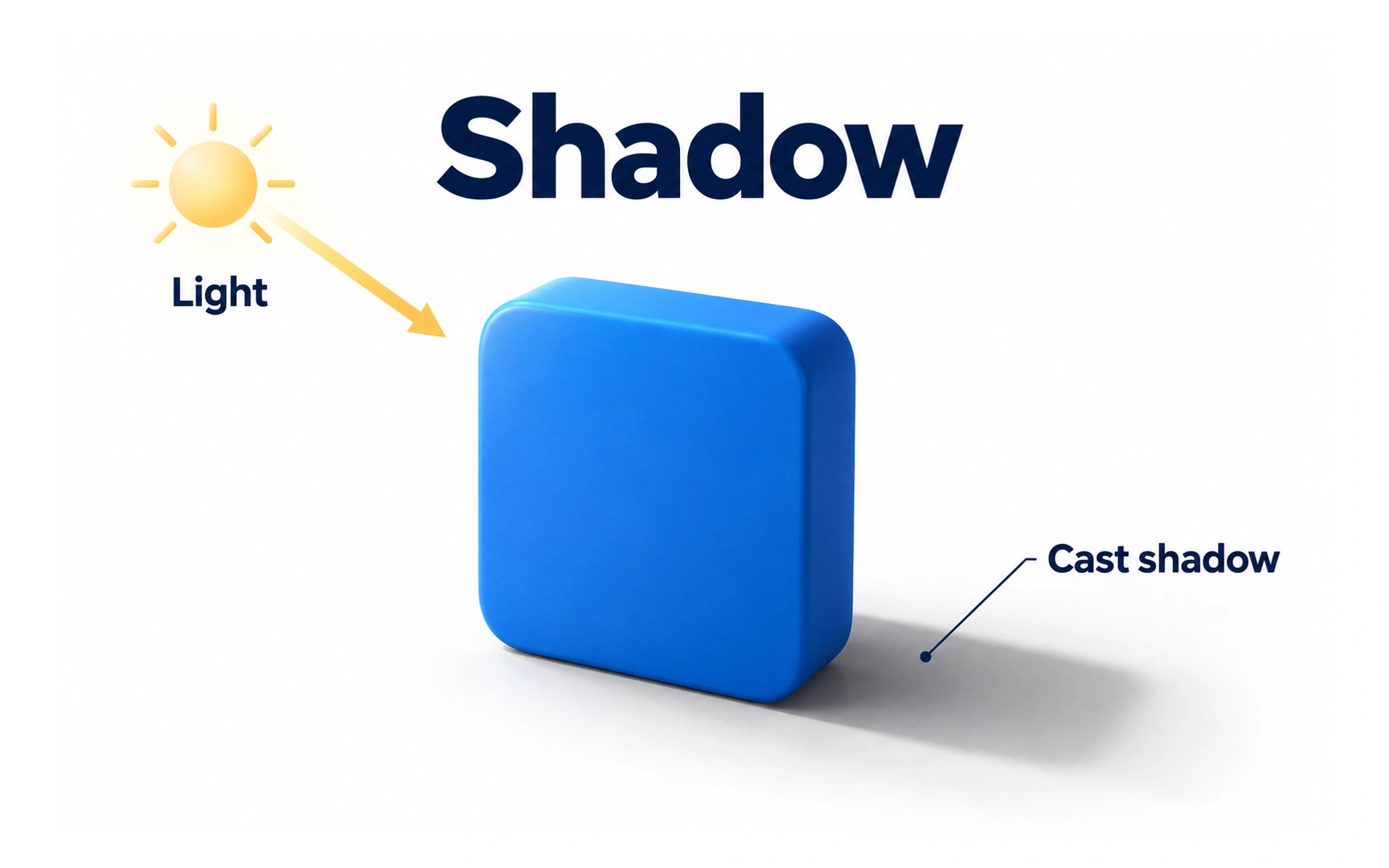
A shadow appears where an object blocks light. In the example, light comes from the top left, so the block casts its shadow down and to the right. Interfaces borrow this effect to show depth on a flat screen.
Shadows do three useful jobs in an interface:
- Show what you can interact with. A raised button looks pressable; a slightly sunken field looks like a place to type.
- Draw attention. A lifted card or a floating button stands out from the page.
- Show layers. Elements with bigger shadows look closer, so menus and dialogs read as sitting on top.
Used too often, shadows lose their meaning and make a screen look busy. Give every shadow a reason.
Hard shadow
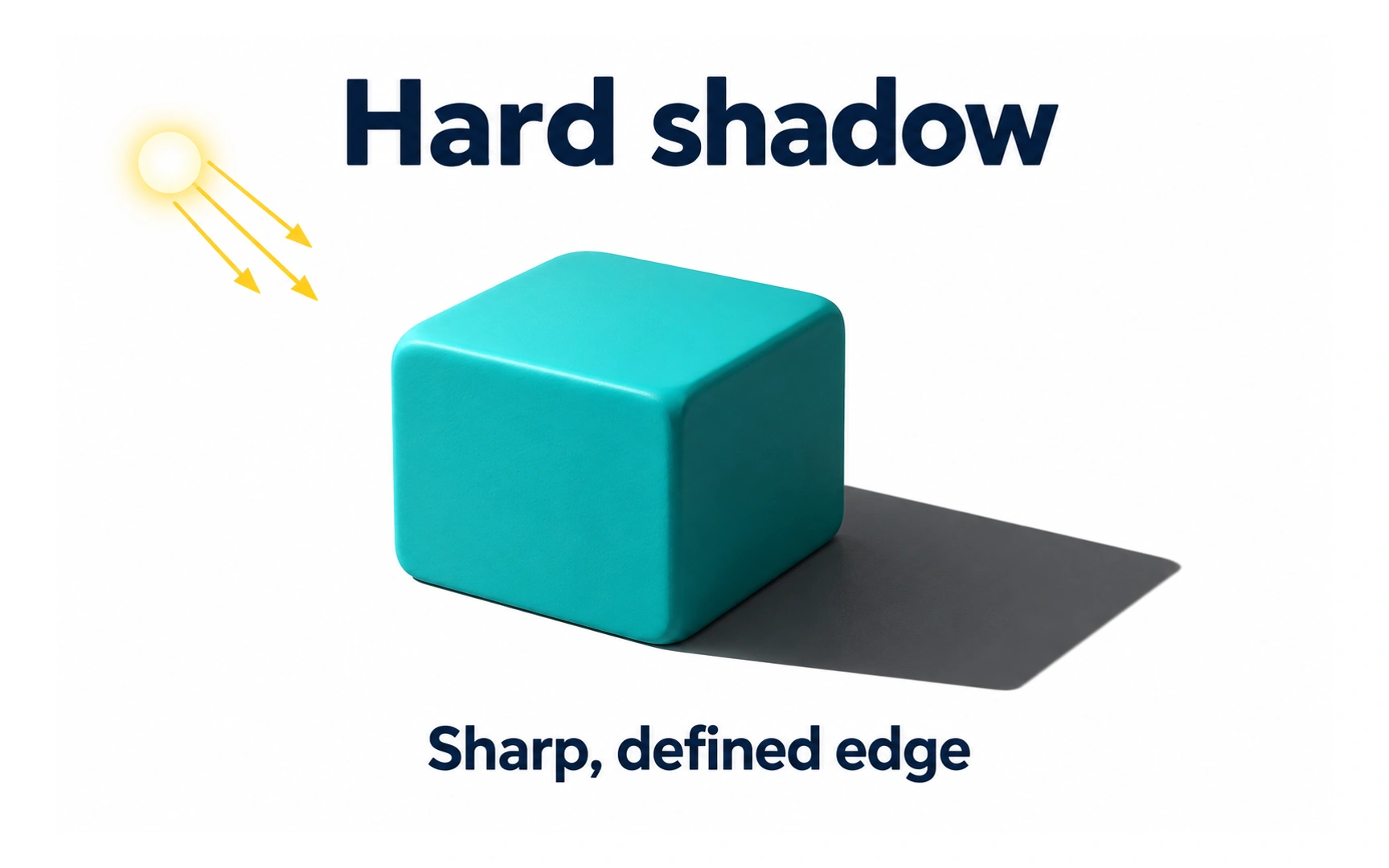
A hard shadow has a sharp, clearly defined edge, like the one under the block in the example. It comes from a small, concentrated light source, such as the midday sun or a bare bulb.
Hard shadows look bold and graphic. They suit playful or retro styles, such as buttons with a solid offset shadow.
Because they are so strong, hard shadows can feel heavy in a calm interface. Use them deliberately, not as the default.
Soft shadow
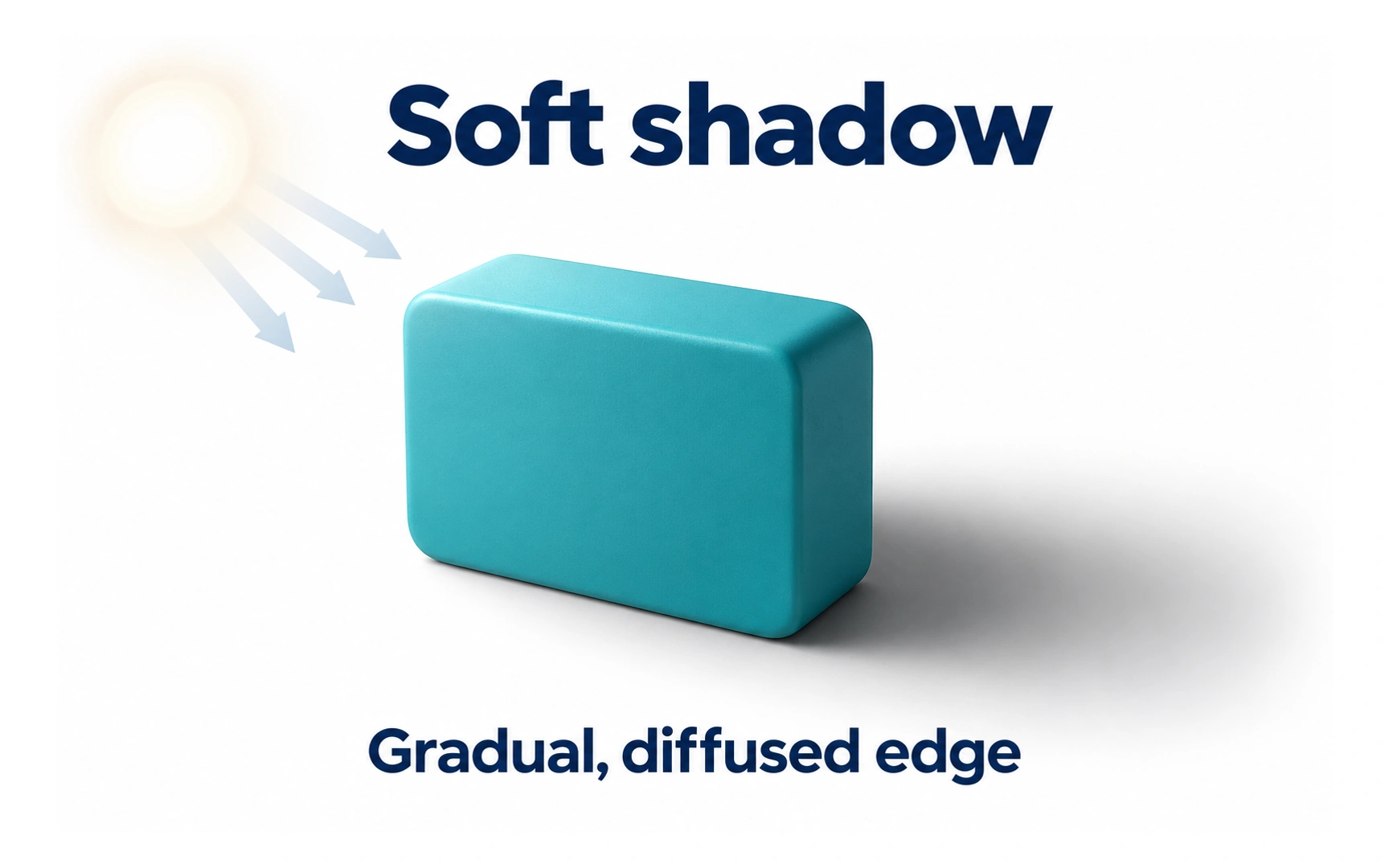
A soft shadow has a gradual edge that fades into the background, like the one in the example. It comes from diffused light, such as an overcast sky or a room lit by a large window.
Soft shadows feel natural and quiet, which is why most interfaces use them for cards, menus and buttons.
Pro tip: a soft shadow usually needs less darkness than you think. A gentle, wide shadow often looks more polished than a strong one.
Inner shadow
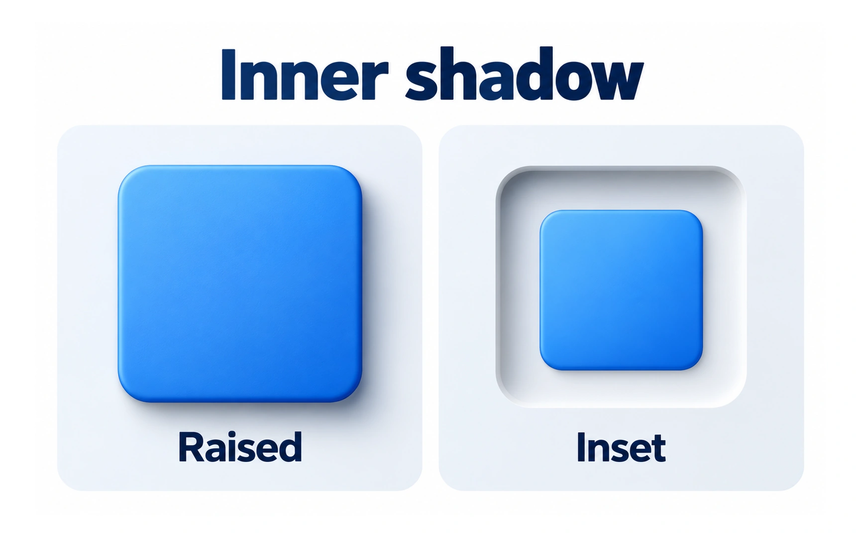
An inner shadow falls inside an element instead of outside it. In the example, the raised square sits above the surface, while the inset square looks pressed into it.
That sunken look is useful for pressed buttons, toggles, text fields and progress tracks. In CSS, you create it with the inset keyword in box-shadow.
Keep inner shadows subtle. Strong ones can make an element look broken or disabled rather than pressed.
Shadow blur
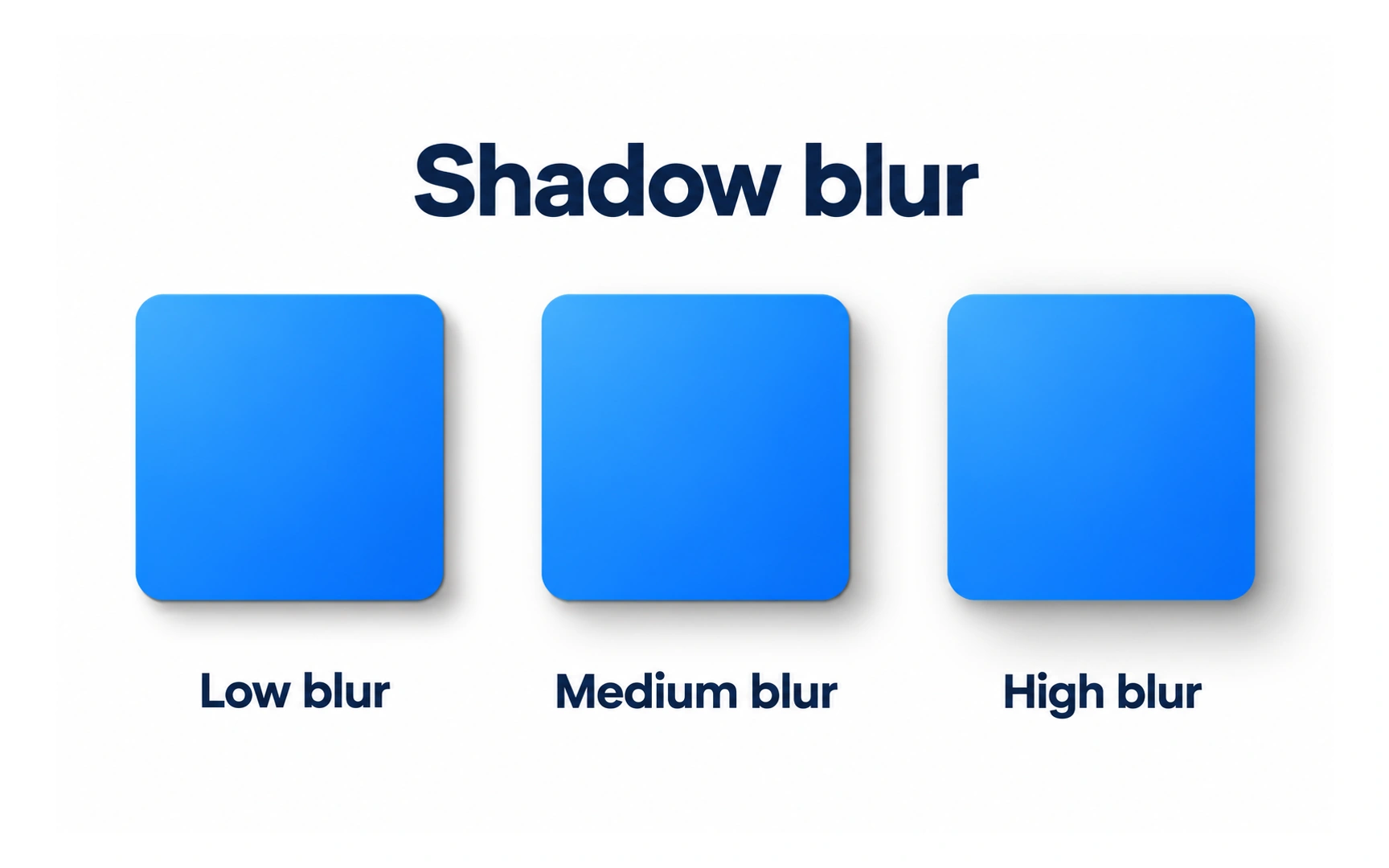
Blur controls how soft a shadow’s edge is. The example shows the same square with low, medium and high blur.
With little or no blur, you get a hard shadow. As blur increases, the edge fades more gradually and the shadow spreads over a larger, lighter area.
Blur also affects how high an element seems. A larger blur usually makes an element look further from the surface below it.
Shadow spread
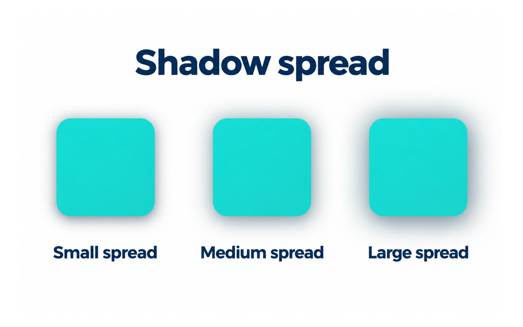
Spread changes the size of a shadow before it is blurred. The example shows small, medium and large spread on the same square.
A positive spread makes the shadow larger than the element in every direction. A negative spread makes it smaller, which is handy for a shadow that only peeks out underneath.
In CSS, spread is the fourth value in box-shadow: offset x, offset y, blur, spread, then color.
Shadow elevation
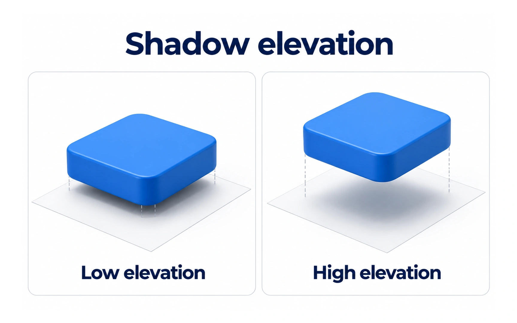
Elevation is how far an element seems to sit above the surface below it. In the example, the low card has a small, tight shadow, while the high card has a larger, softer one.
Higher elements cast shadows that are bigger, blurrier and further offset. That is how people read which surface is on top.
Most design systems define a few elevation levels. Cards sit low, menus and popovers sit higher, and dialogs sit highest, because they appear above everything else.
Shadow grouping
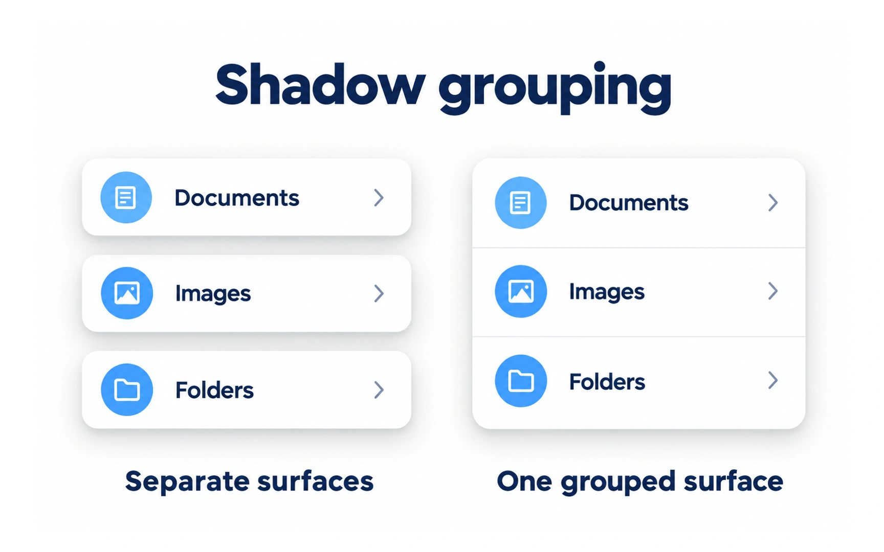
Related elements often belong on one surface. The example shows the same three rows as separate surfaces and as one grouped surface.
When rows belong to one list, give the whole group a single shadow and separate the rows with dividers or spacing. This makes the group easy to read as a unit.
Separate shadows suit items that can move or be used on their own, such as cards you can drag.
Shadow opacity
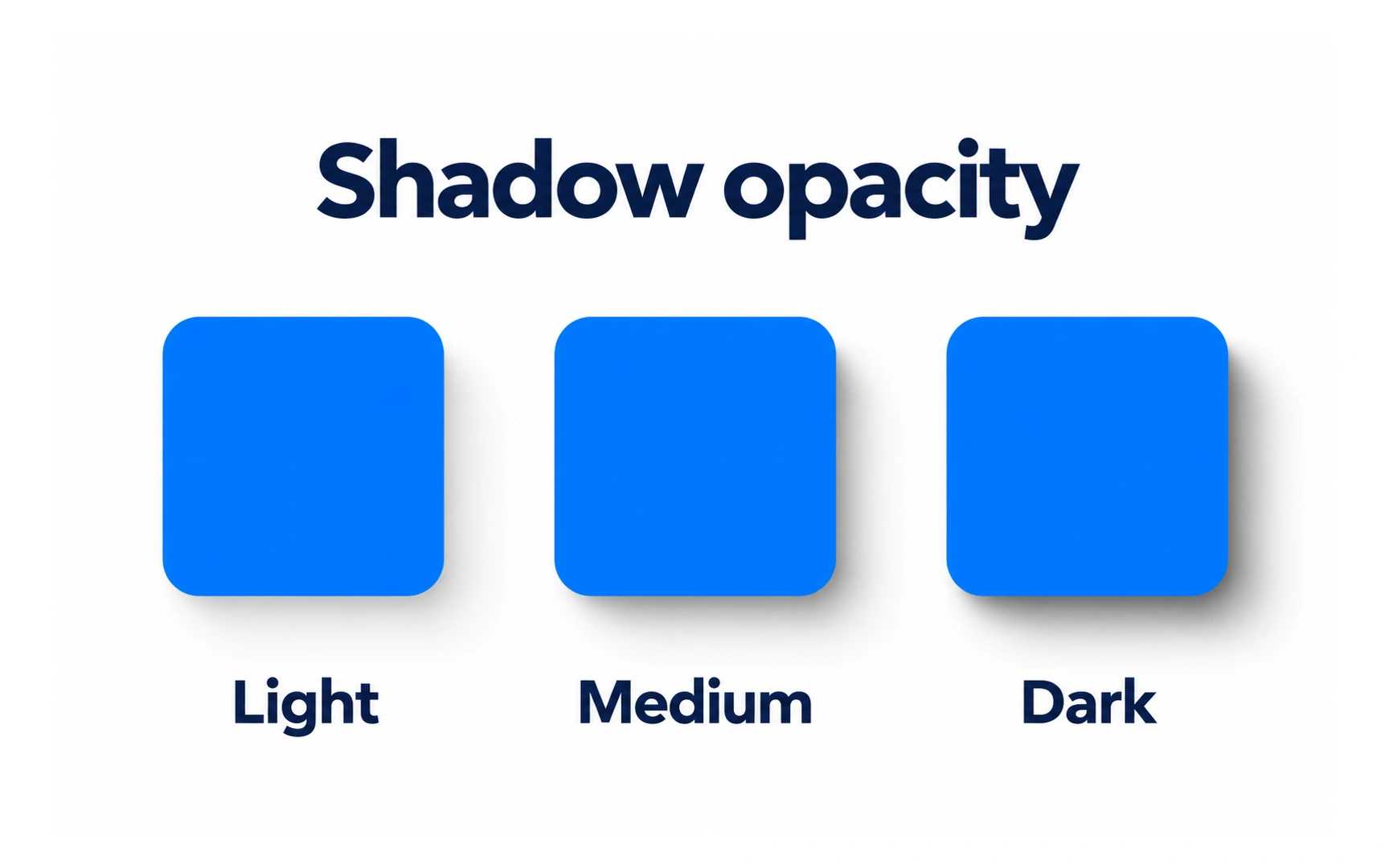
Opacity controls how dark a shadow looks. The example shows the same square with a light, medium and dark shadow.
Lighter shadows feel subtle and calm. Darker shadows lift an element more strongly from the page, which can help it stand out but can also look heavy.
Interface shadows are usually black or a dark tint of the background at low opacity. Around 10–20% is a good starting point; test it against the actual background. On dark backgrounds shadows are hard to see, so dark themes often show elevation with lighter surfaces instead.
Layered shadows
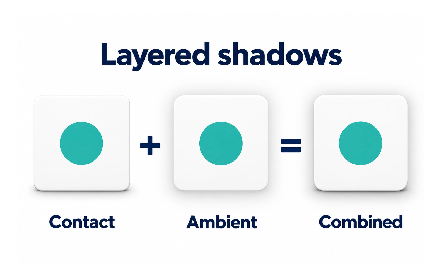
Interface designers often combine a tight contact shadow with a wider, softer shadow to suggest depth. The example layers a contact shadow and an ambient shadow into one combined shadow.
Layering the two often looks more natural than a single shadow. In CSS, you can list several shadows in one box-shadow, separated by commas.
When elements stack on top of each other, keep the light direction the same for every layer and element. Shadows pointing different ways make a screen confusing.
REFERENCES
TOPICS
FROM COURSE