Devices & Screen Sizes
Learn how people use watches, phones, tablets, TVs, computers and kiosks, and what each means for your design.
People use your product on very different screens, from a watch on their wrist to a TV across the room. This lesson looks at the common device types, how people use each one, and what that means for layout, text size and interaction.
Smartwatch
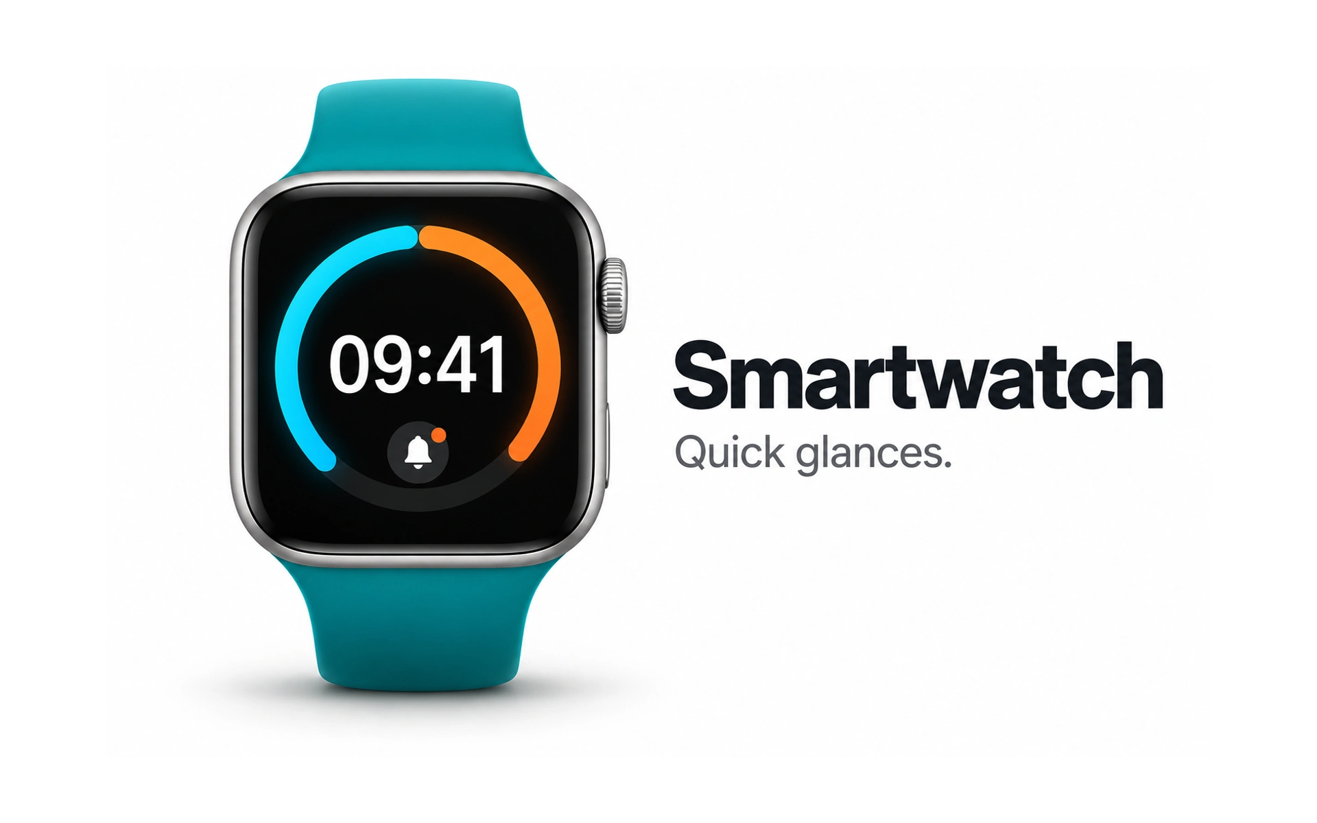
Smartwatches are made for quick glances. The example shows the time, a progress ring and a notification icon, all readable in a second or two.
People check a watch for short bits of information, such as the time, a message preview or a workout stat, and rarely for long reading.
Keep each screen to one idea, use large text and make controls easy to hit. Voice, haptics and the paired phone can handle what does not fit on the wrist.
Phone
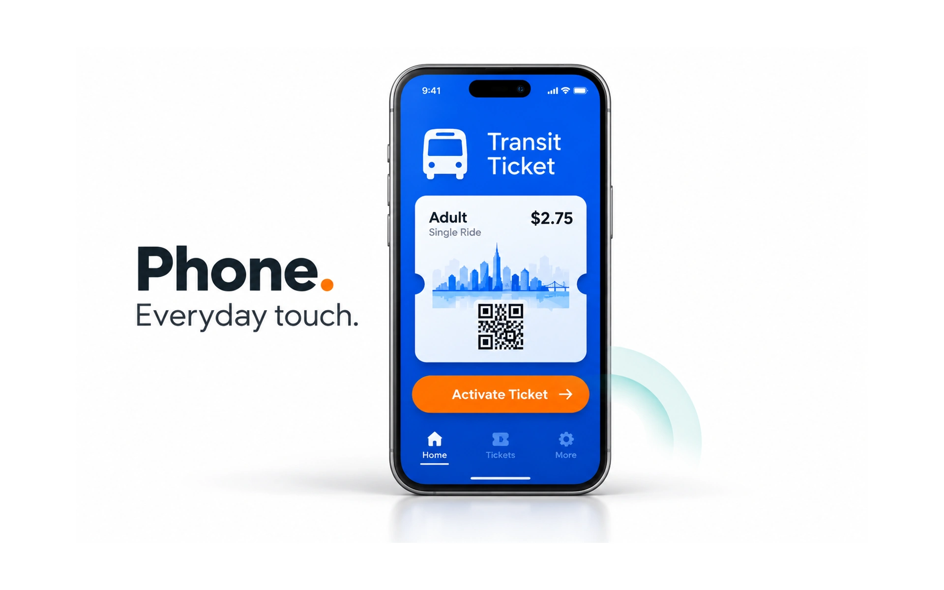
For many people, the phone is the main way they use the internet. The example shows a transit ticket: the key details and an Activate Ticket button fit on one screen.
People often use phones on the move, with one hand and with frequent interruptions. Tasks need to be quick to start and easy to resume.
When designing for phones:
- Put the most important information and action first.
- Make touch targets large enough to tap reliably, such as 44 × 44 pt on iOS or 48 × 48 dp on Android.
- Keep frequent actions within easy reach of the thumb.
Tablet
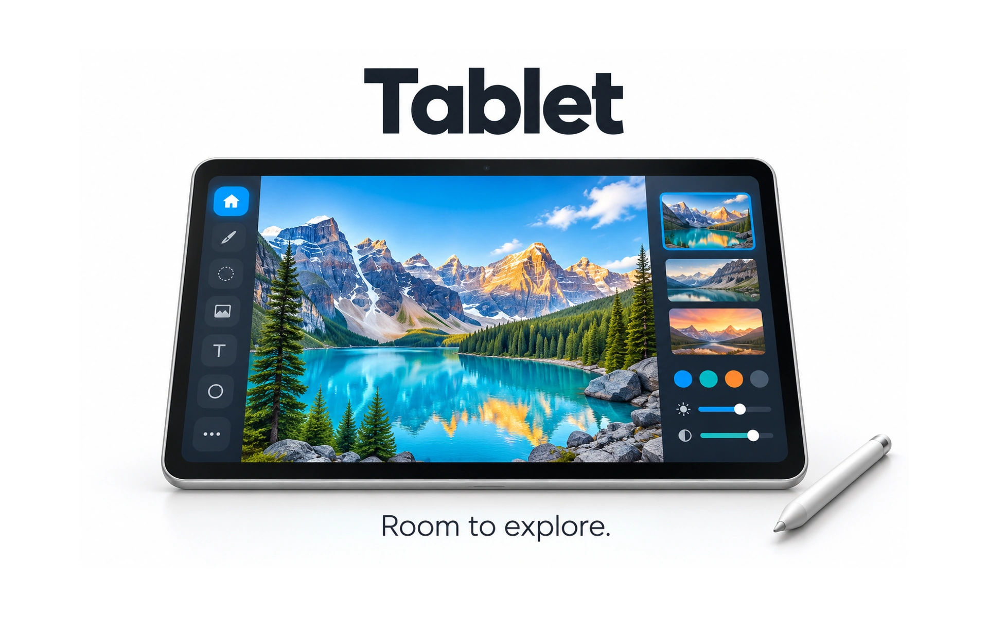
Tablets offer more room than phones. In the example, a photo editor shows tools on the left, a large image in the middle and thumbnails and sliders on the right.
People use tablets for entertainment, reading and creative or productive work, holding them in both portrait and landscape and sometimes using a stylus or keyboard.
When designing for tablets:
- Support both orientations and adapt the layout to each.
- Place frequent controls where hands naturally rest, often along the sides.
- Use the extra space to show more context, not just bigger versions of phone screens.
Smart TV
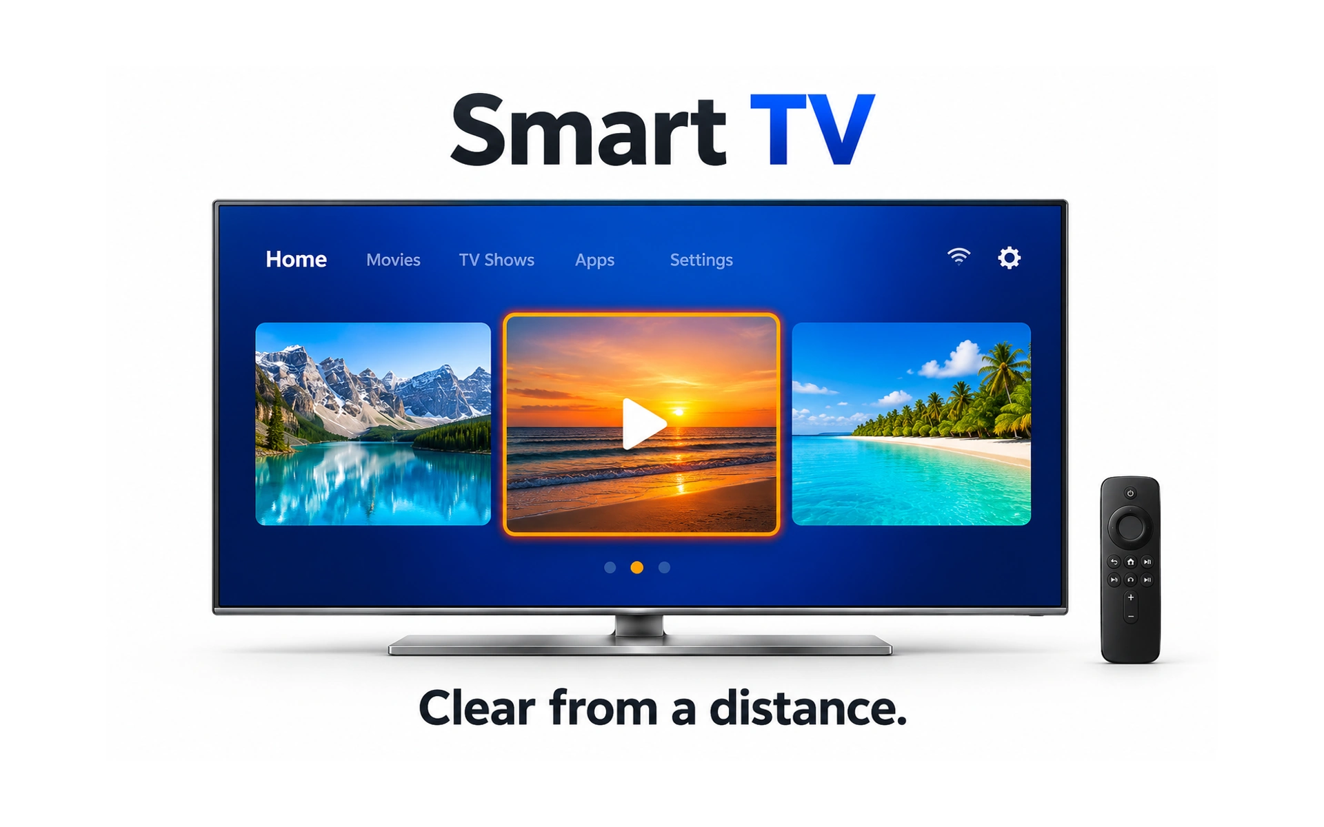
TVs are watched from across the room and controlled with a remote. In the example, a row of large thumbnails sits under a simple menu, and the one the remote is focused on is clearly highlighted.
Because people sit several meters away, text and images must be much larger than on a laptop, and contrast must be strong.
Navigation works step by step with arrow keys, so:
- Clearly highlight the item the remote is currently focused on, so people know what pressing Select will open.
- Keep menus short and simple.
- Reduce the number of steps to start watching.
- Support voice search where possible, since typing with a remote is slow.
Laptop
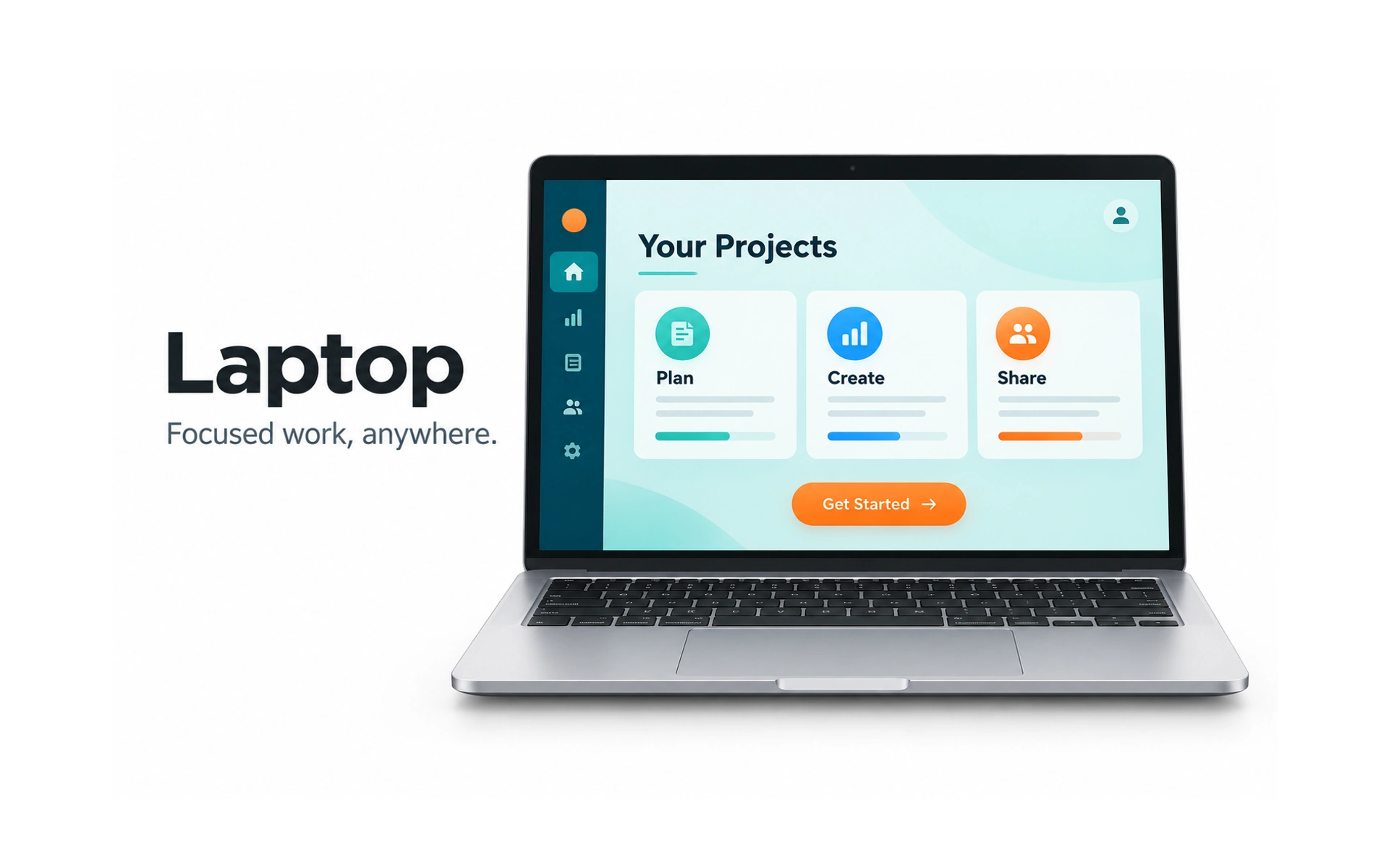
Laptops are the go-to device for focused work. The example shows a projects dashboard with Plan, Create and Share cards and a clear Get Started button.
Many people switch to a larger screen for complex tasks, such as writing, research and editing.
Laptop screens vary a lot in size, and people use them in many places, with changing light and posture. Use a clear hierarchy, and support both keyboard and pointer, including keyboard shortcuts.
Desktop
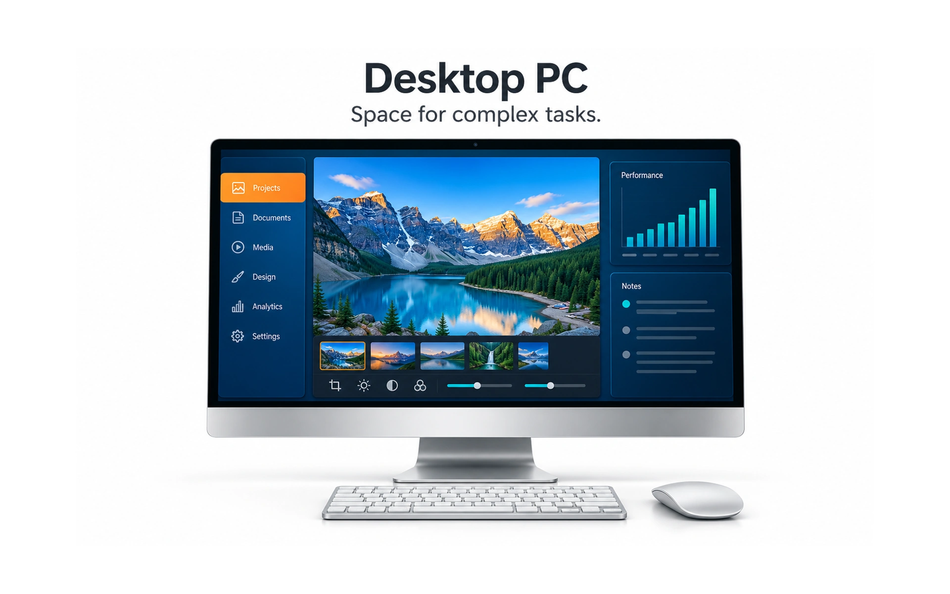
Desktop monitors offer the most room. In the example, a photo editor shows navigation, a large image, a filmstrip, editing tools, a performance chart and notes all at once.
That space suits complex tasks where people need several panels side by side.
More space is not a reason to add clutter. Group related tools, keep a clear hierarchy and limit very long lines of text on wide screens.
Self-service kiosks
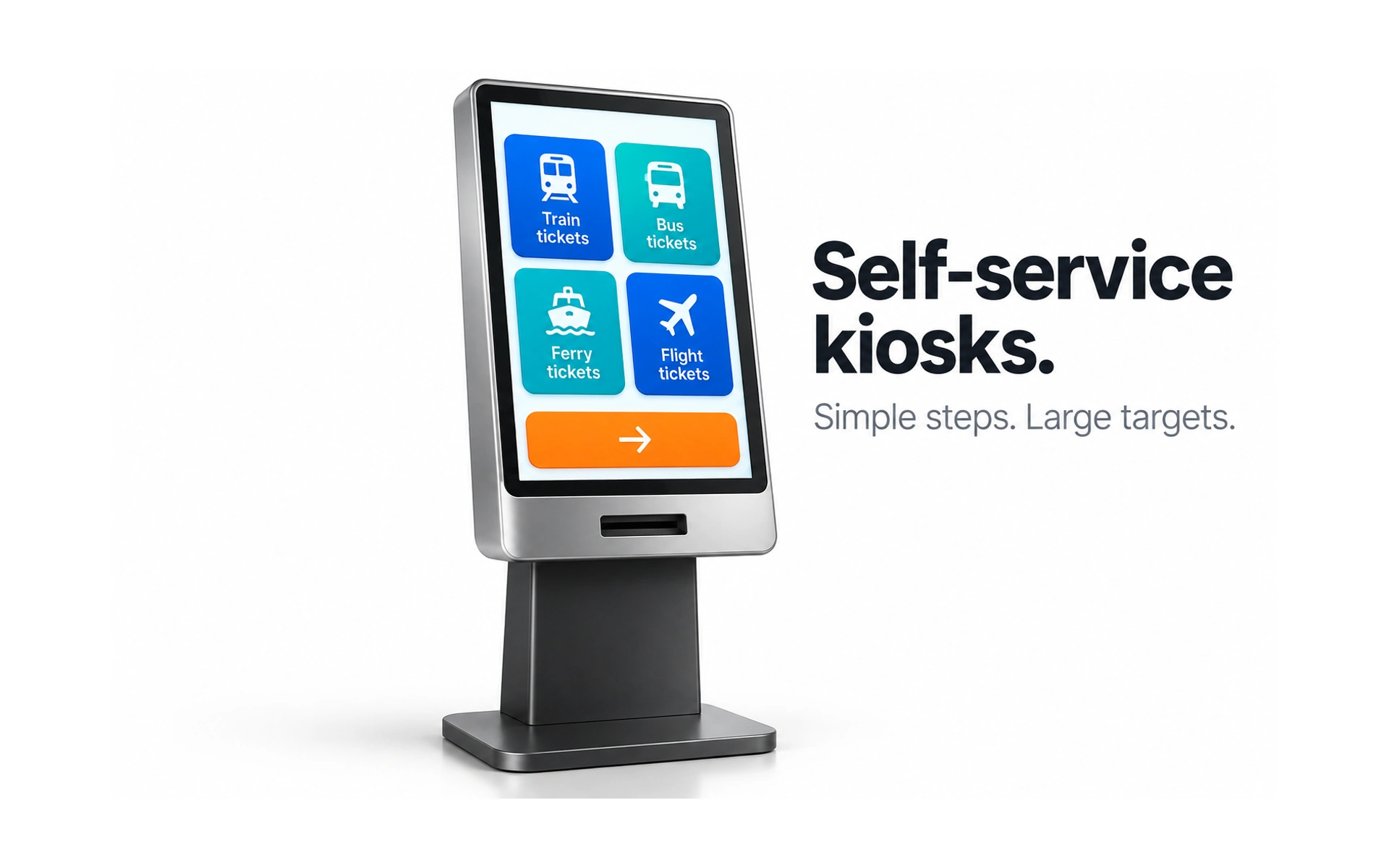
Kiosks are public touchscreens for tasks such as buying tickets, checking in or withdrawing cash. The example offers four large ticket options and one clear next button.
Anyone may use a kiosk, often in a hurry, standing up and with no instructions.
When designing for kiosks:
- Keep steps simple, with one task per screen.
- Use large touch targets and minimize typing.
- Consider glare, noise and people waiting behind.
- Support accessibility, including reachable controls and audio guidance.
- Clear the session and remove the previous user’s details from the screen when the task ends or after a period of inactivity. Warn users before timing out so they can keep going.
REFERENCES
TOPICS
FROM COURSE